
 by Matteo Modica
3 MIN. READ
13.07.2023
by Matteo Modica
3 MIN. READ
by Matteo Modica
3 MIN. READ
13.07.2023
by Matteo Modica
3 MIN. READ

These four venue branding examples show how venue branding has its own rules: the brand doesn’t live in a vacuum but needs to interact with the place, in a constant interplay.
In case you are wondering, venue branding is a branch of branding focused on physical places like restaurants, bars, and hotels. When branding a place, you want to make sure that the physical and the immaterial components of the brand speak the same language and convey the same feelings. The image of the place will become part of the guest’s experience.
The four venue branding examples we have selected from our portfolio will give you an idea of how a strategic and well-aligned brand can add value to a place, anticipate the experience and even enhance it.

Venue Branding Example #1: Hilton Galaxy Bar, Athens
Situated on top of Athens’ prestigious Hilton Hotel, overlooking the Acropolis, the Galaxy Bar needed a brand image that would reflect its unique location.
We took inspiration from the galactic imagery to develop an identity that would feel exclusive and ethereal, as if climbing to the top of the building would unlock a different dimension. Our objective was to position the Galaxy Bar as a gravitational center for the international fashion culture.
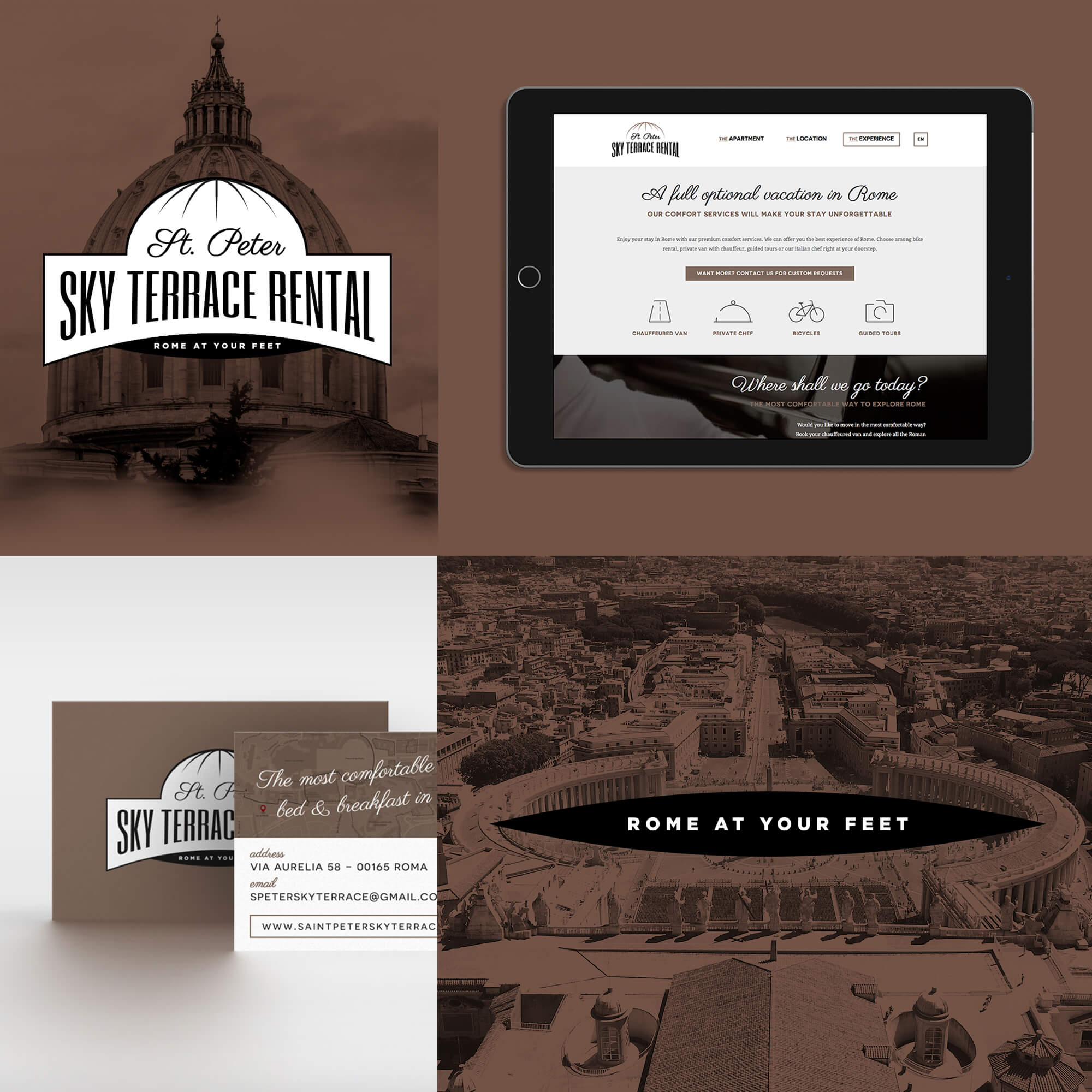
Venue Branding Example #2: St. Peter Sky Terrace, Rome
Sometimes, branding literally creates a place. Smaller venues can gain a disproportionate impact with the proper brand image.
It’s the case of St.Peter Sky Terrace: a rental apartment in Rome with a breathtaking view of St.Peter’s dome. Such an incredible distinctive trait led its owner to want an equally distinctive brand, not to be just “another rental apartment”.
This guided us to create a light but confident identity, where St.Peter plays a huge part both in terms of logo design and imagery.
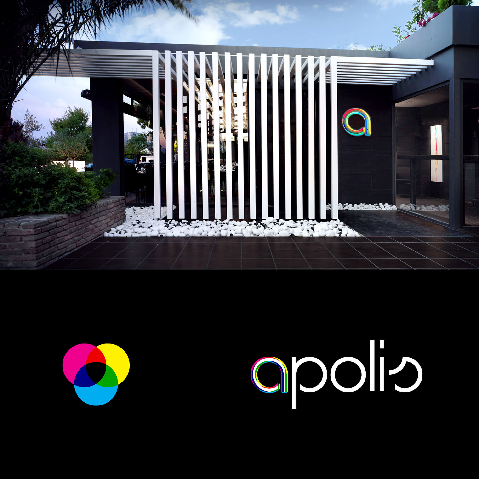
Venue Branding Example #3: Apolis Restaurant & Bar, Athens
Venue branding makes it possible to develop a visual concept across a variety of touchpoints, creating a truly immersive experience.
For the Apolis Restaurant & Bar in Athens, we started with the chromatic experiment of the logo, a playful overlapping of the four printing colors and the three primary colors, that created an elegant but also very lively image, fitting for this kind of place. The same visual idea would live in all the details, from the furniture to the labels on water bottles.
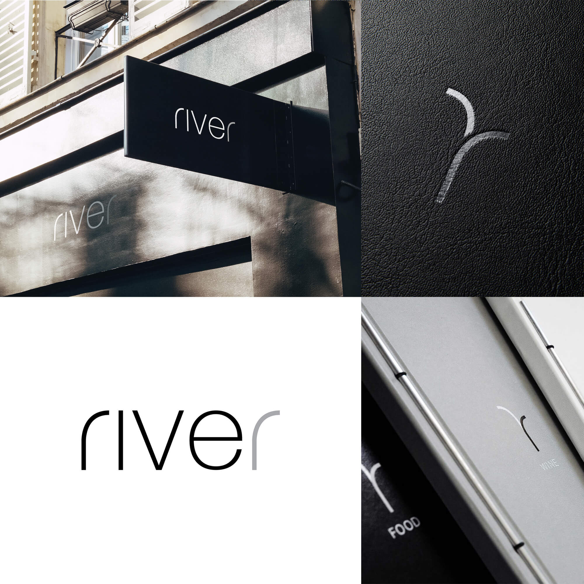
Venue Branding Example #4: River Winebar, Rome
Sometimes, location becomes the key inspiration for the brand. This also helps customers position the venue and can create strong and easy distinctiveness.
It’s the case of the River Winebar in Rome. The name is a straightforward reference to its position, right on the banks of River Tevere. This theme also plays out in the logo: a minimal representation of a bisecting river, from which we extract the initial “r” of the name.
Takeaway: where to start with venue branding?
A place will give you a lot of possible ideas on how to build a brand. The neighborhood, the type of building, and the view are all valid starting points. Just make sure you select the most distinctive, memorable, and appealing for your audience.
READ MORE ON
The comma nobody sees: why attention to detail in branding still matters
Nobody notices when I change the color of a comma, and that’s exactly why I keep doing it. A case for perfectionism and attention to detail in branding.

Before you hire a branding agency, ask to see the drafts
A while ago, at Sublimio we started sharing with potential clients not just our portfolio, but our past presentation. Here’s why.
Can AI do your brand strategy?
AI can craft a pretty believable brand strategy, but will it hold? Here are some things to know before you forward it to the team.
Rejected Logo Designs We Still Love
Not all logo designs get accepted. Actually, most of them get rejected, and that’s ok. Here’s why we don’t throw ours away.
our newsletter
SUMO is one of the few newsletters I don’t archive when my inbox gets full. Each edition feels crafted with care - the links are genuinely interesting, the curation is thoughtful, and the newsletter design itself is a delight to consume.

Content curation at its finest. Doesn't overdo it on commentary, and has probably the highest signal-to-noise ratio among the design newsletters out there. Never a dull entry! Every issue feels handpicked rather than churned out.

Sublimio Monthly is always a breath of fresh air. I especially like how each issue explores one timely theme, turning Andrea and Matteo’s perspectives into a clear takeaway I can immediately apply to my work—often before the topic becomes mainstream.

You know that feeling as a kid, waiting for your favorite magazine to hit the stands? That's what SUMO is for me.

SUMO is much more than a newsletter: it's a guide. In a world of information overload, having someone who does real curation work is invaluable. What I find there is always worth my time. I read it eagerly every time, and I often share it with friends and colleagues because there's always something useful and genuinely interesting.

SUMO has a level of intentionality that sets it apart from most newsletters I read. Each edition is built around a theme that feels considered without being overworked, with Matteo and Andrea’s dual perspectives adding depth and a set of curated links that feel carefully chosen. It’s a newsletter worth reading properly.

SUMO has quickly become one of my favourite newsletters. Every issue leaves me with a fresh perspective on how I see my brand and the world around it.




© 2009—2026 Sublimio


