
 by Matteo Modica
7 MIN. READ
14.07.2026
by Matteo Modica
7 MIN. READ
by Matteo Modica
7 MIN. READ
14.07.2026
by Matteo Modica
7 MIN. READ
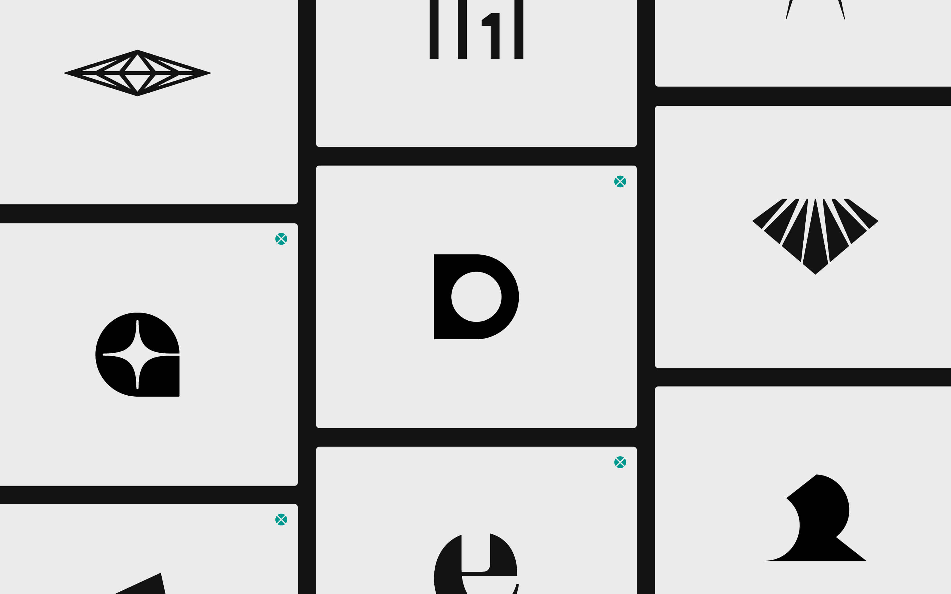
We have been creating brands for many years and we have had our fair share of rejections. But we still love those logos: let us show you.
If you are afraid of rejection, I suggest you avoid working in design or branding. Having been in the industry for most of my professional life, I can tell you that rejection is a fundamental part of the game. Even design legend Paul Rand had a logo rejected by Ford.
Rejection doesn’t necessarily mean failing. Most of the time, clients will pick an option over another – so the job is done, anyway. And yet, irrationally, you might have wanted all proposals to succeed, because all of them carried a part of you.
Logo design is an especially clear example of this. While some designers will show the client just one logo proposal, at Sublimio we have always preferred giving them a few more options, in the vein of a more collaborative spirit.
But as one option gets approved, the others get rejected. And I can tell you: we have so many rejected logos we loved I lost track.
What happens to rejected logo designs? Well, they mostly sit in our hard drives or cloud storage, little mementos of what could have been.
Sometimes I like going over them. Not just to find inspiration, but to evaluate the process, what worked and what didn’t, and maybe compare them to how the winning logo design is faring.
Today, I’d like to share some of these with you, and reflect on the reasons why they didn’t make it.
Frontman: a logo design for a complex strategy
We have written about Frontman quite often on this blog and for a reason: we loved working for this brand, as it was bringing a very fresh vision to the world of tech, fighting the minimalism that was dominating device design in that time (not that it changed much).
The brand strategy here was walking a fine line, trying to address a young élite audience while mixing in a punk rock ethos. Conceptually fascinating, but also very challenging to channel through a logo design.
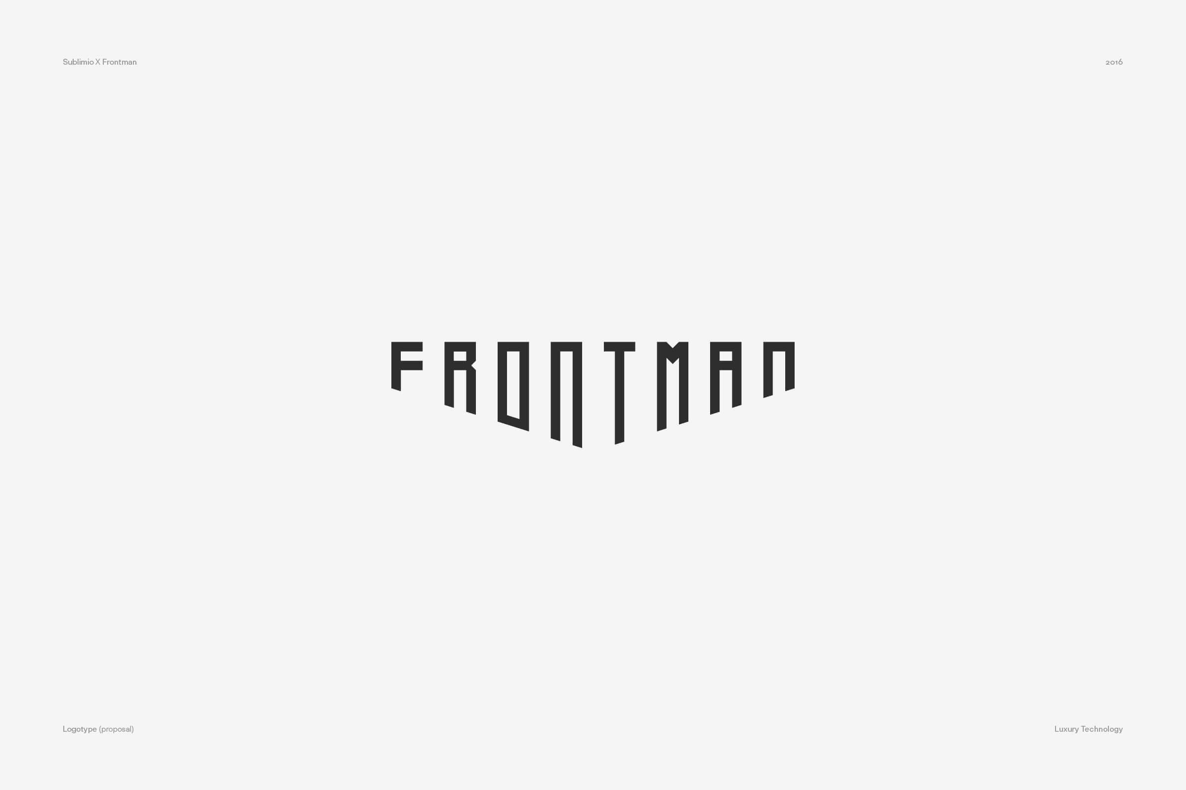
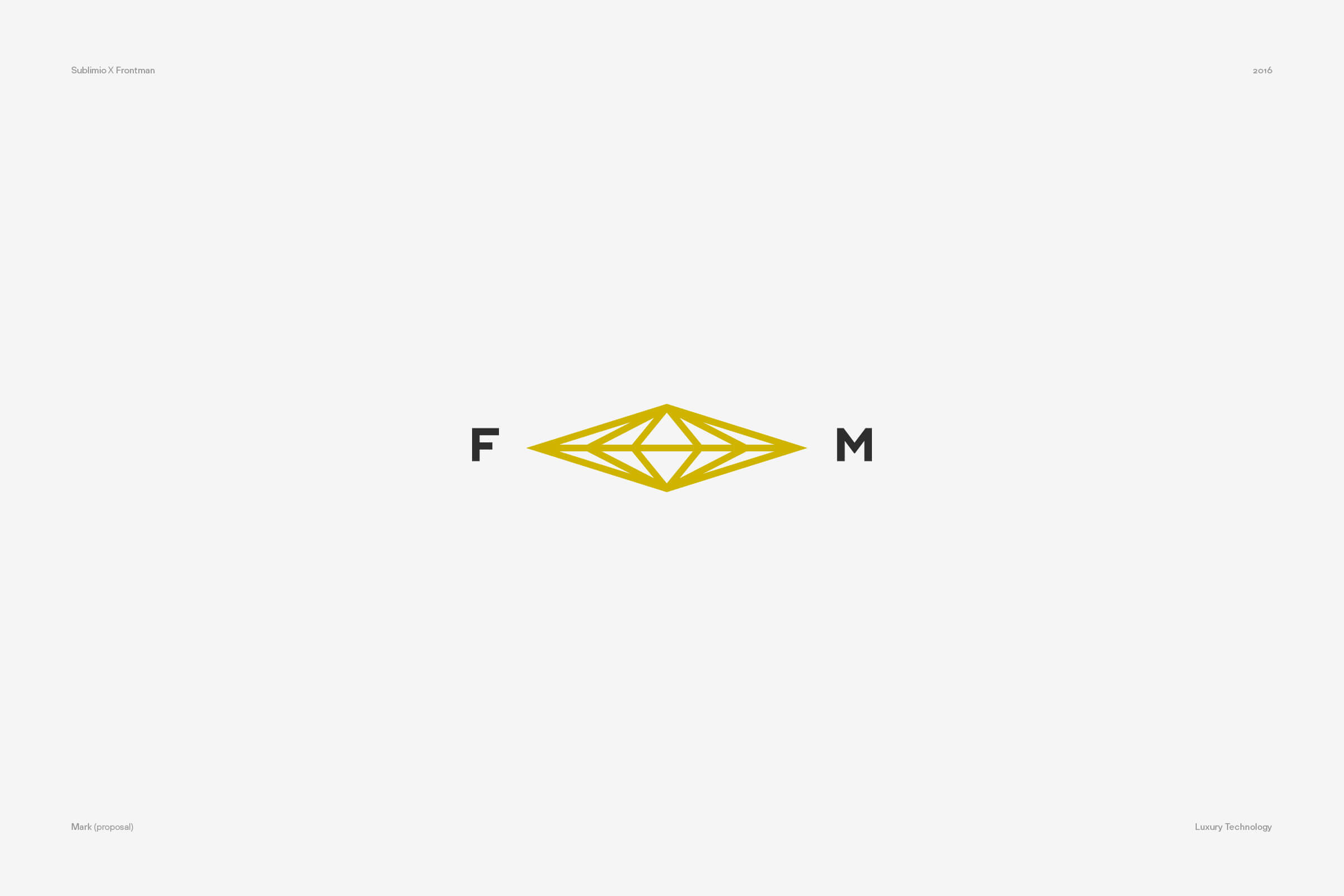
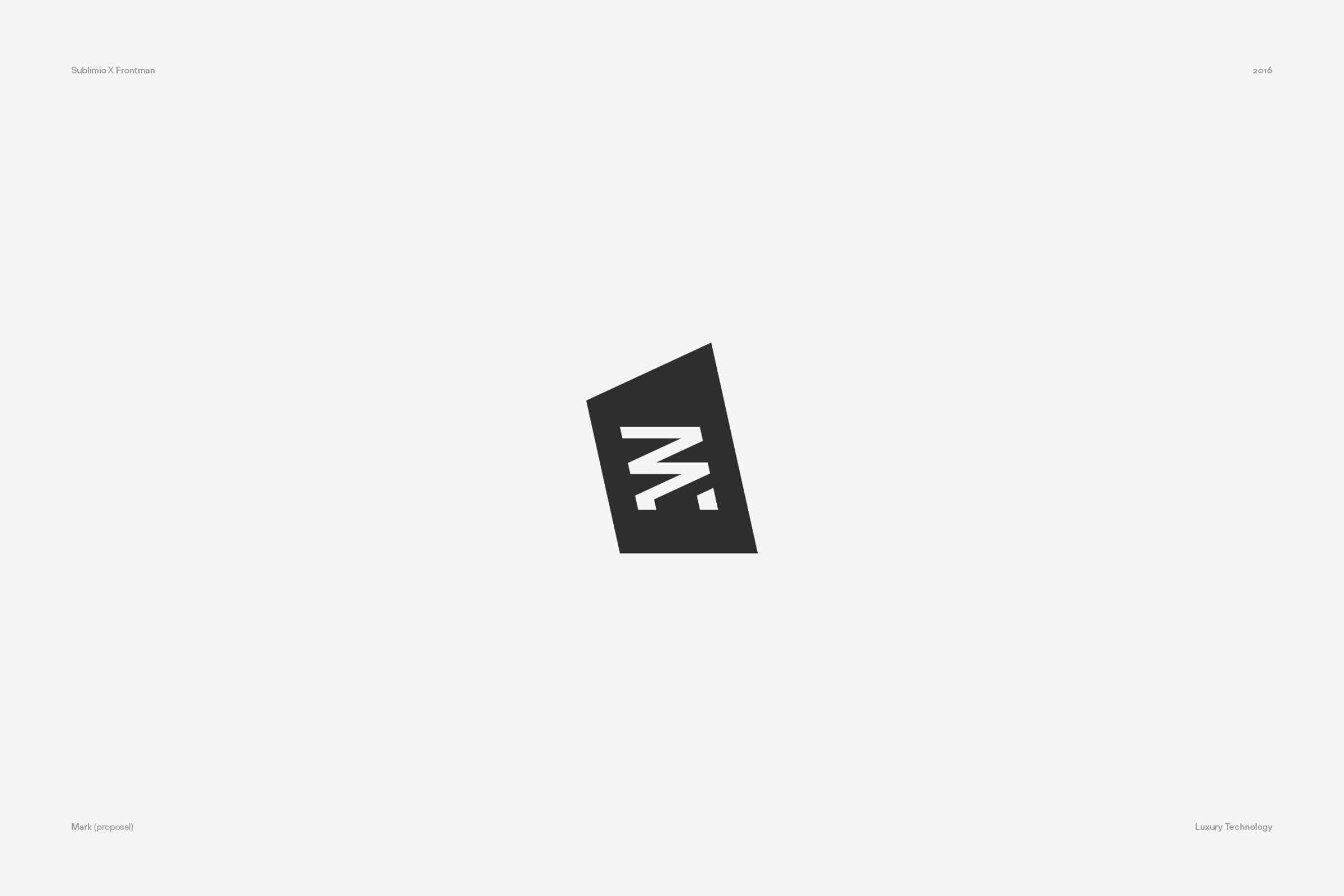
The logo design challenge here was all about balancing aesthetics. How much tech should we blend in? How much rock? As you can tell by looking at the proposals, we tried different recipes.
Thinking about it, the rejected proposals – while bold enough – were missing one thing: they were not challenging modernity and minimalism strongly enough. The selected option – using a serif font and a symbol reminiscent of a crest – felt so opposed to the current tech vibes that it really connected to the brand strategy.
Stylish Rent: getting exclusivity right
A logo design must serve the brand’s business objectives, so the final pick might be influenced by some very practical decision the client has to make.
Take the example of Stylish Rent: this new brand was looking to compete in the segment of high-end car rental, while leveraging a long expertise in retail rental. Given its name, we had our focus set on the concept of exclusivity and style.
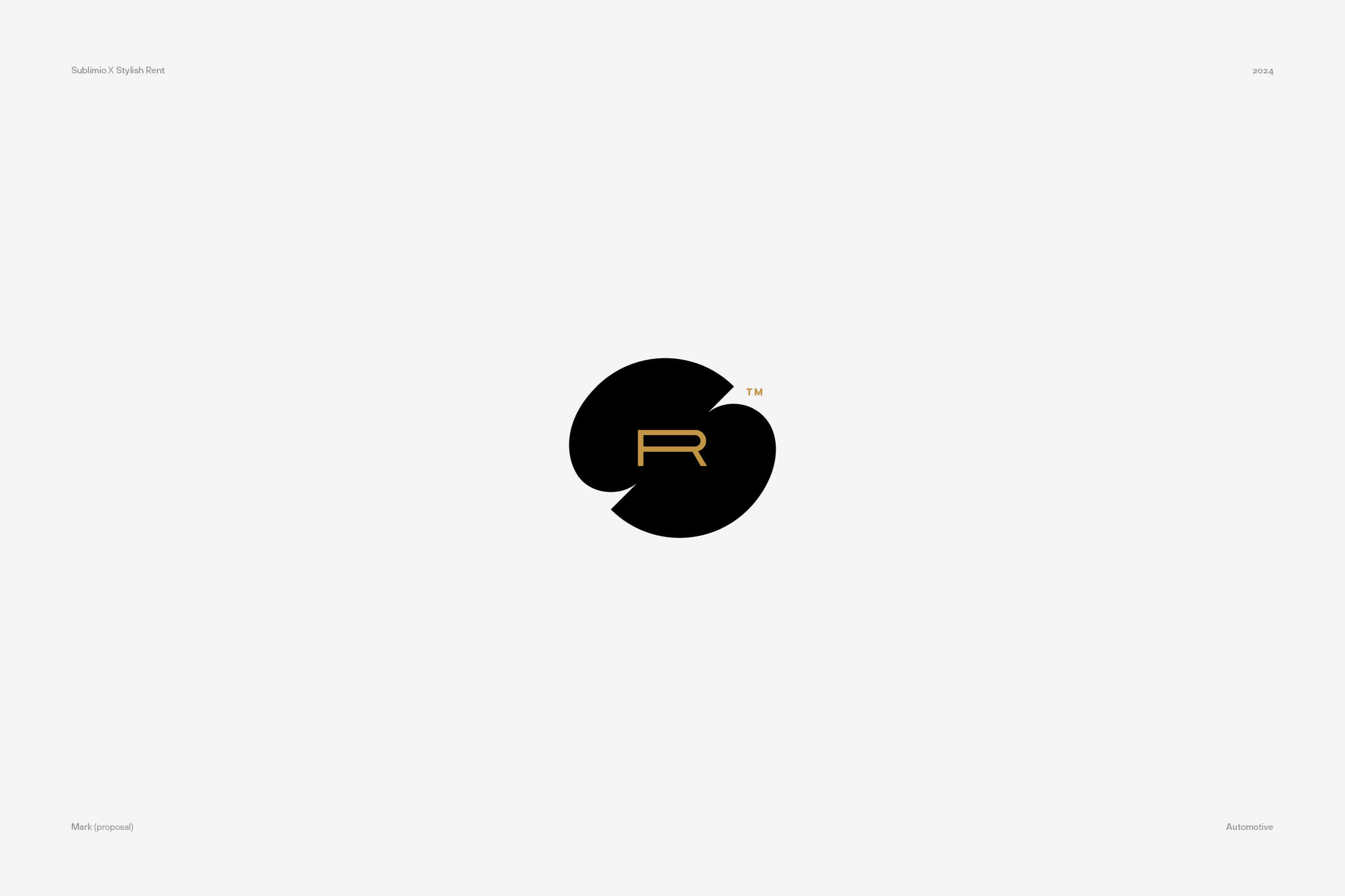
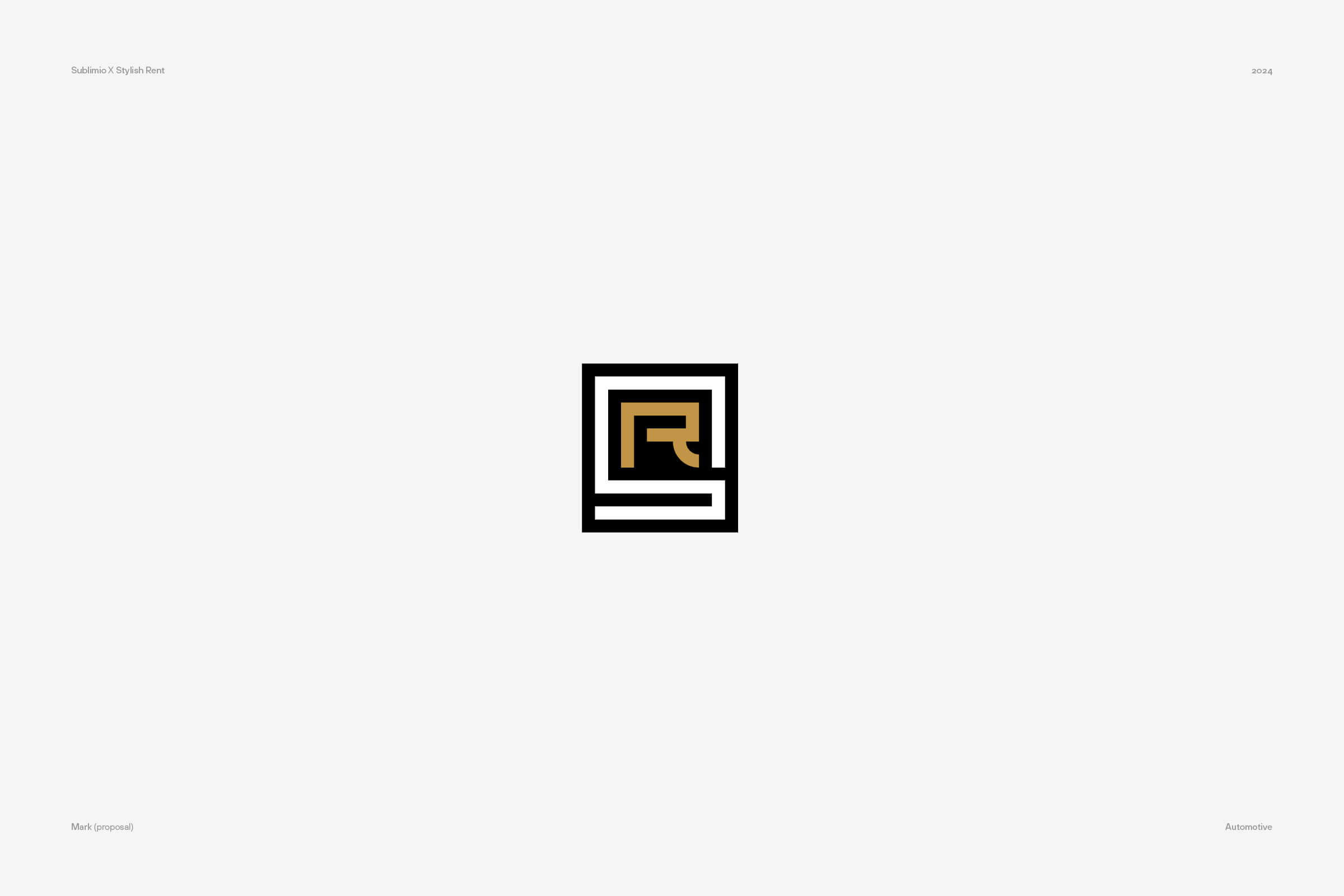
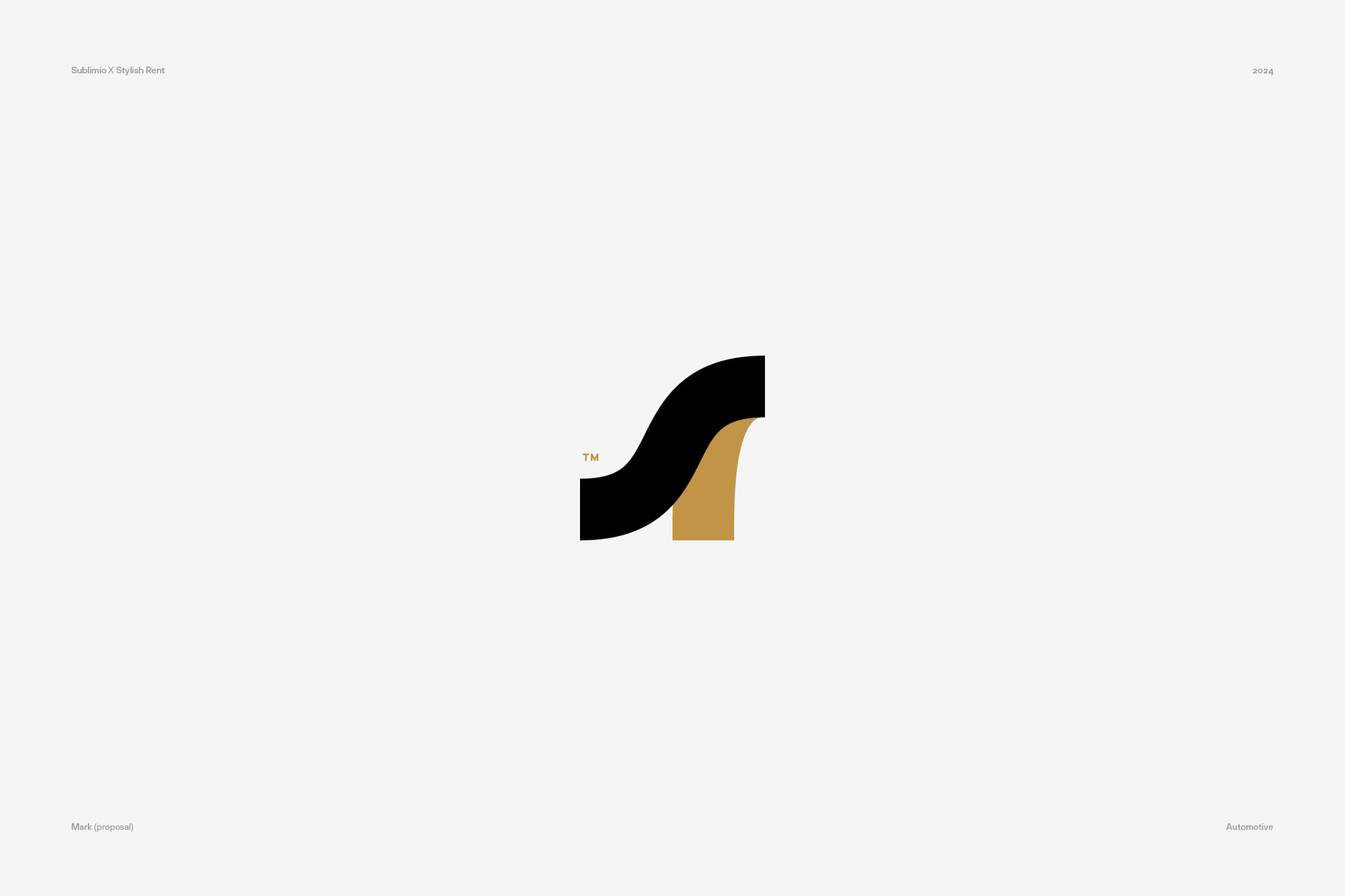
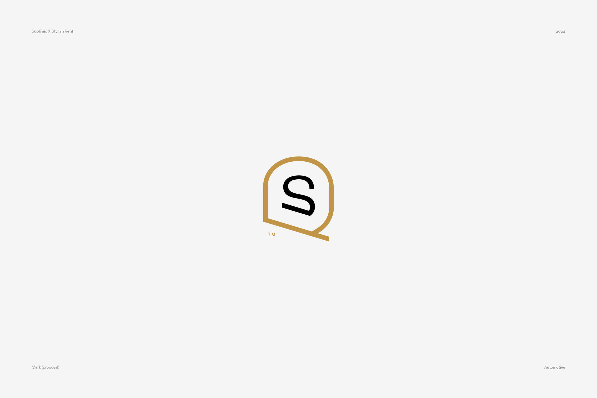
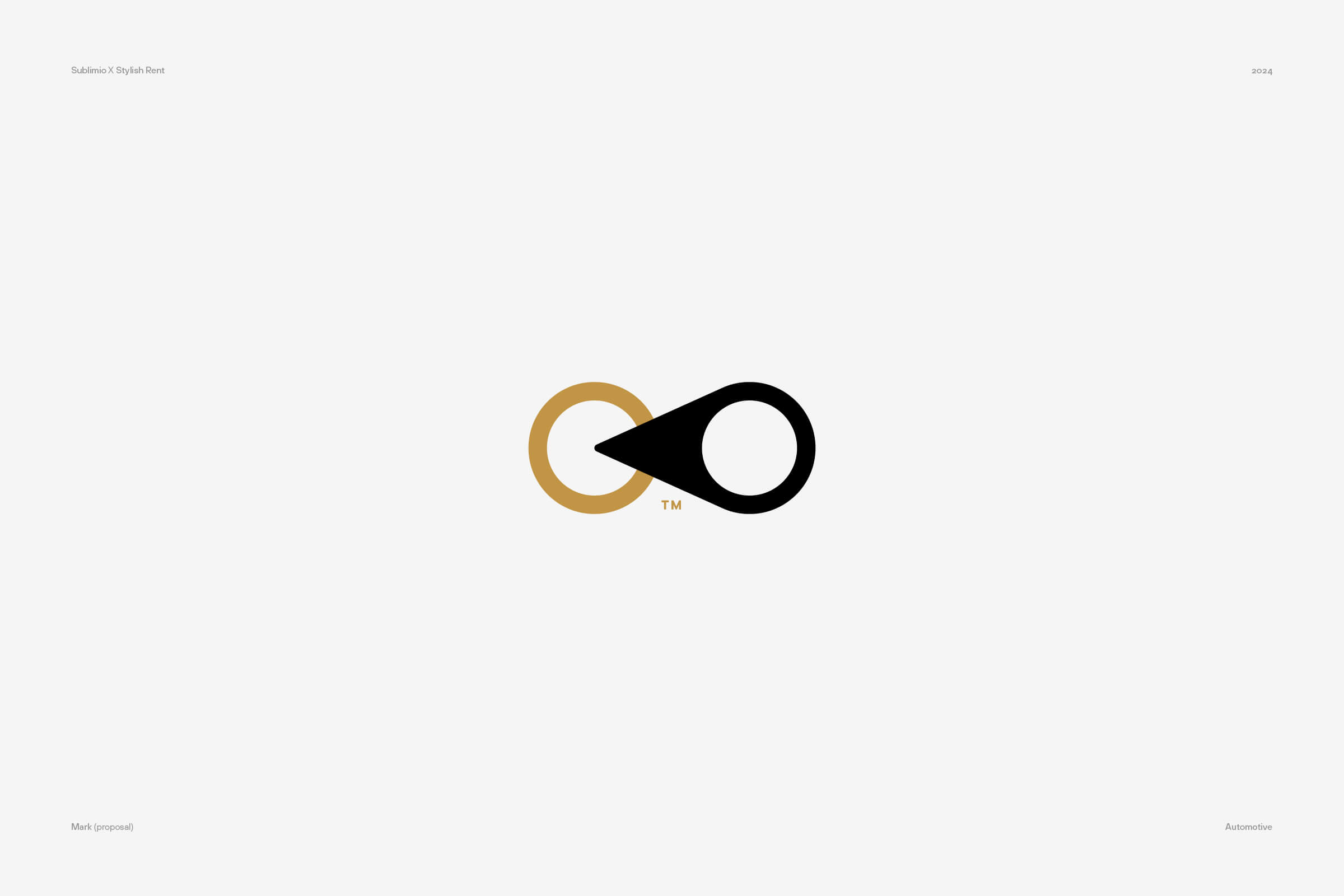
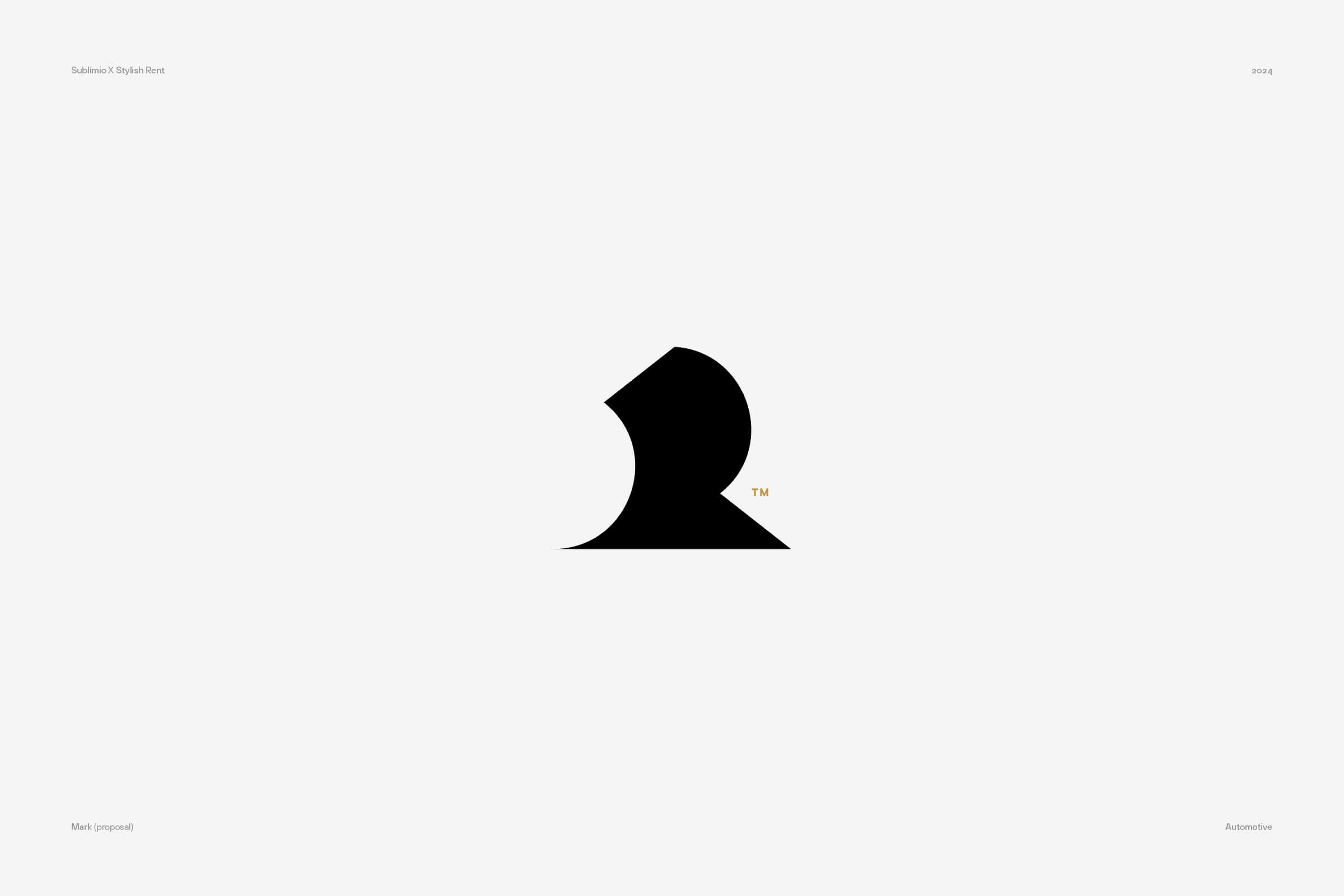
As you can see in the rejected proposals, we pursued this through an evocative minimalism, using the initials of the brand to create something more akin to an emblem than a logo. We interpreted the high-end positioning quite literally, presenting a very subtle and refined brand.
No logo was picked. Sometimes, this happens. No logo meets the client’s expectations or – to be more precise – reflecting on the logos helps the client reflect more deeply about the brand.
When seeing this approach before him, the client understood that his vision of a high–end brand was somewhat different. Having many B2B customers, and a credible history in retail, they didn’t feel ready to become this kind of brand. They still wanted to convey ideas of modernity, functionality, approachability.
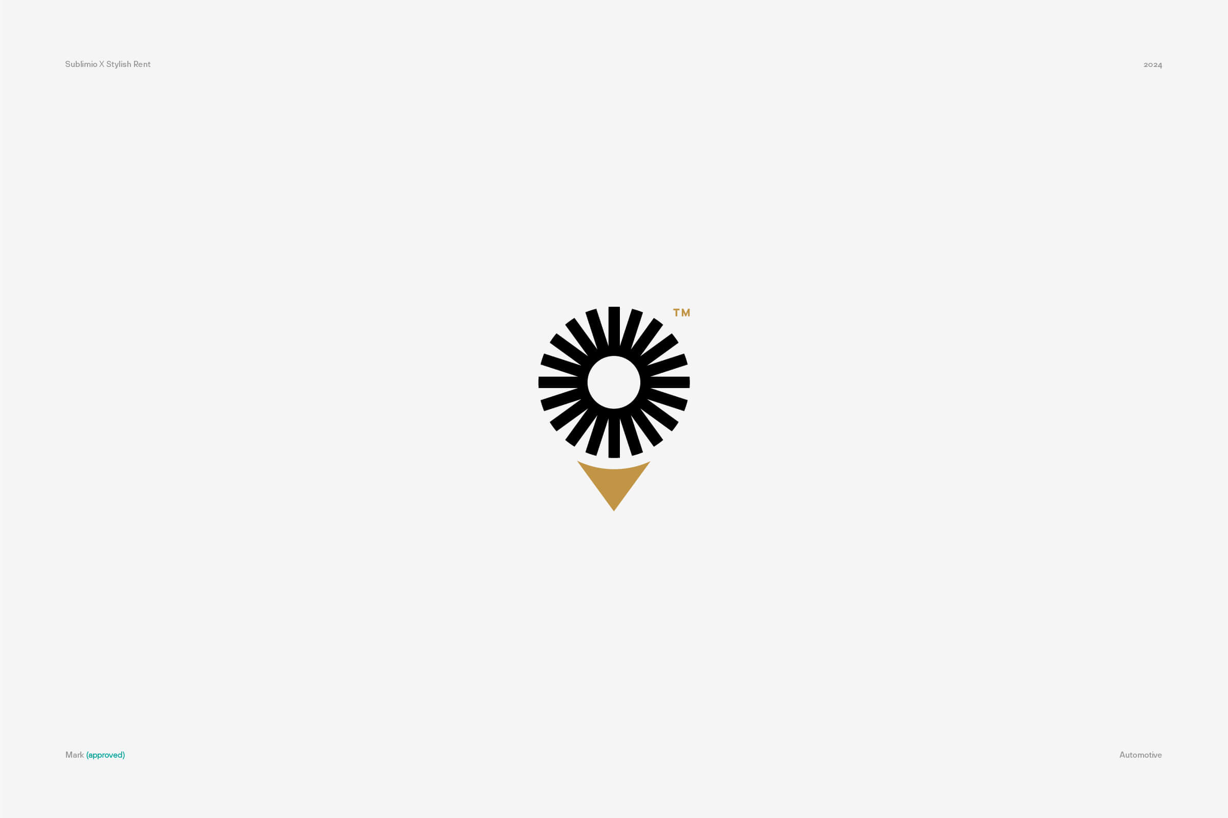
So we worked again, this time re-calibrating our idea of a high-end service, from sheer luxury to operational excellence. This is how the current logo of Stylish Rent was born, with a symbol meant to signal how the client becomes the center of everything.
Giorgio Visconti: finding the right spark
Rebranding is a different task entirely from launching a new brand: when the brand doesn’t exist, your only option is to gather your courage and jump. When you already have a brand, though, it’s easier to have second thoughts.
Take the case of Giorgio Visconti, an Italian jewelry brand with a very long and successful history. When this type of brand explores a rebranding, the reason is usually the need to adapt to changing times, not an urgency to fix some big problem.
The brand strategy was focusing on the concept of light, both literal and symbolic, which reflected the special ability of Giorgio Visconti’s craftsmen in handling gemstones and using light in their designs.
Light would be the central concept of the logo, too. Not an easy task: sparks and lightbeams abound in logo design, making it quite hard to create something original.
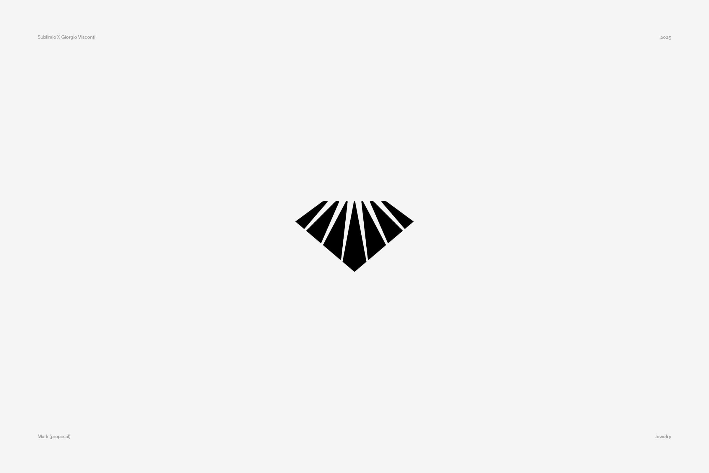
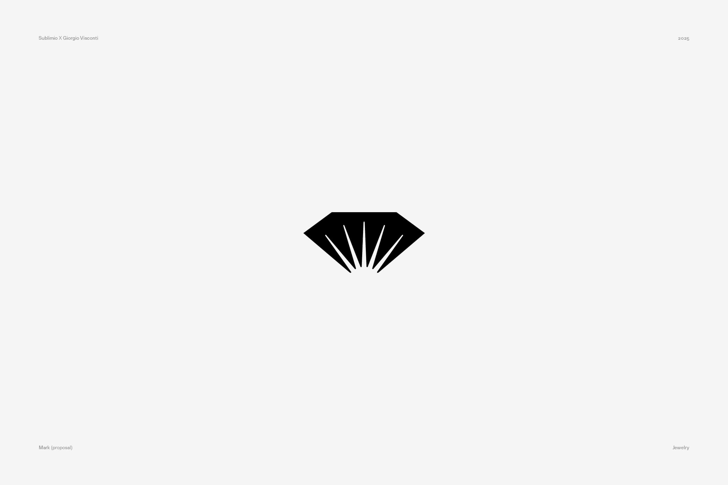
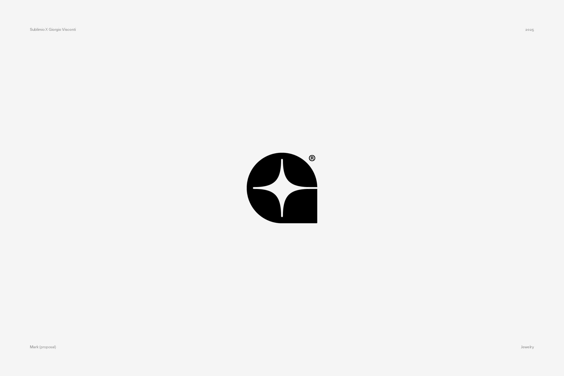
These above are three of our light–focused proposals, trying to incorporate that concept within the brand’s letters. We felt these could be strong proposals, but we still had a long way ahead. When seeing light represented, the client felt it would be not distinctive enough in the world of jewelry.
While these logos would have probably worked for the audience, their long experience in the field made it hard for them to call them their own.
So we worked again, this time on the brand’s core identity, and especially on its initial letter “V”. This would bring more uniqueness to the brand. In the process, we tried to give the brand a more contemporary twist, which would reflect the initial need to adapt it to new times.
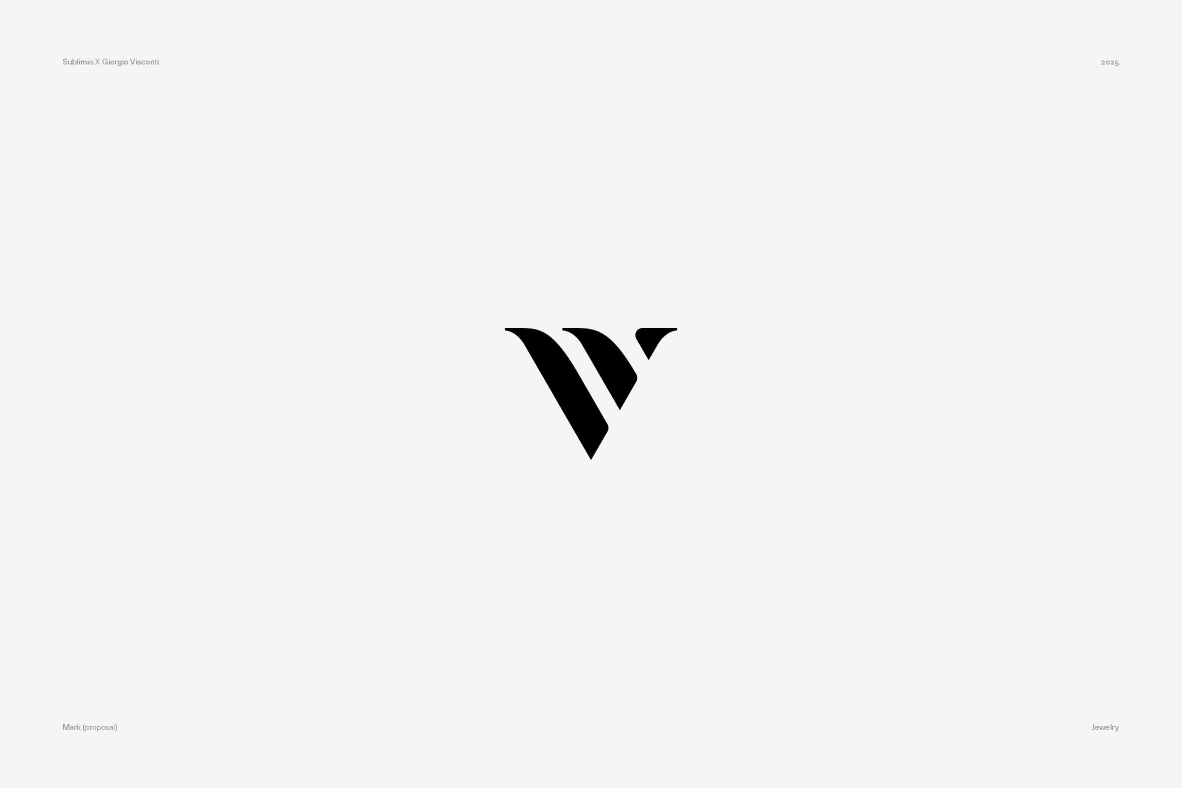
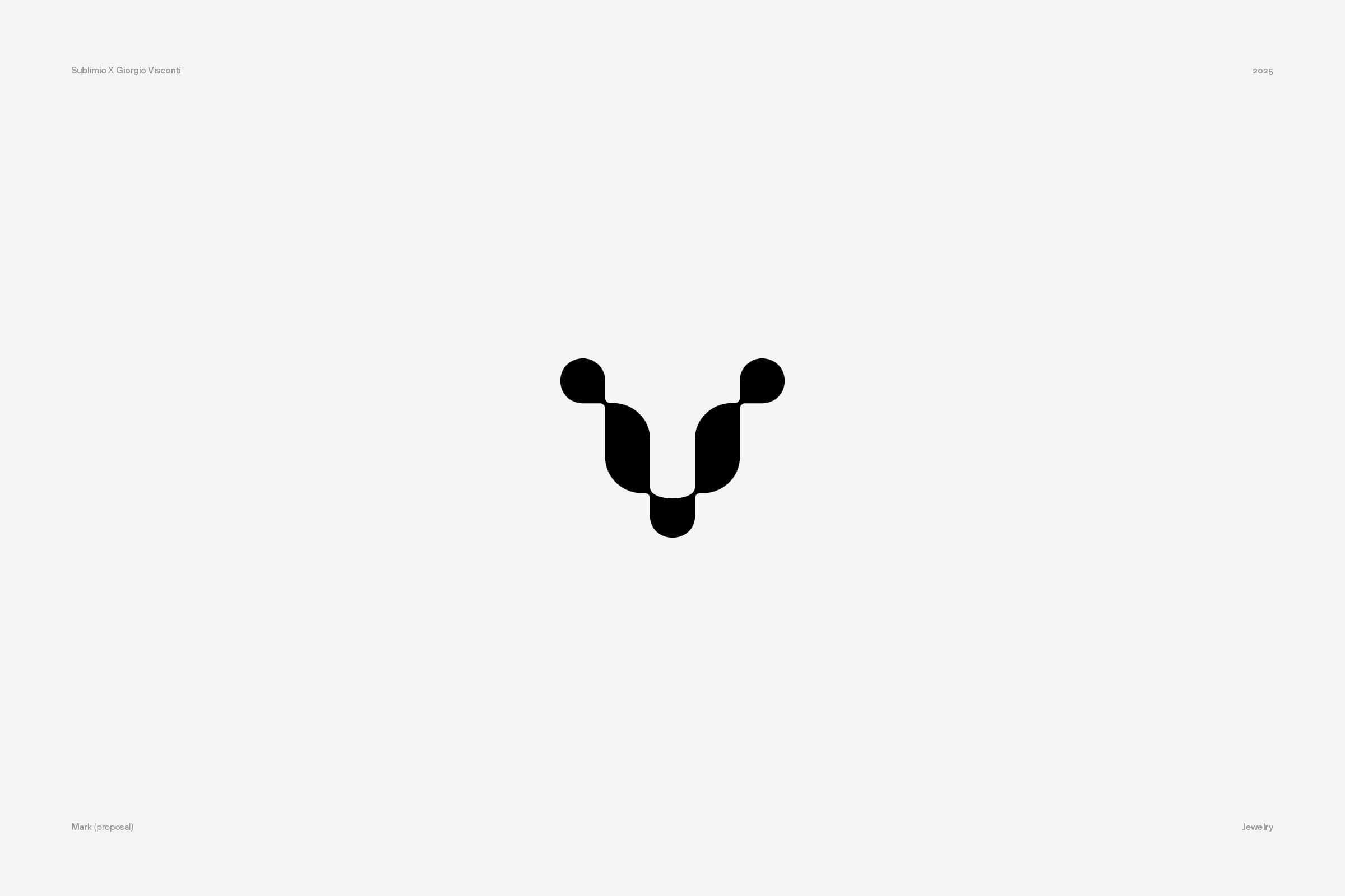
Again, these logos didn’t make the cut. When this happens in a second round of proposals, you can sense the problem is deeper. The rejection wasn’t strictly about the logo designs: the brand didn’t feel ready to let go of its old identity.
Yes, it was frustrating. But I can tell you: this happens. Even when a client has a brief, they don’t necessarily know how they feel about a rebranding and seeing your logo changed can be quite an emotional moment. While we love good briefs, we understand, and we think a branding agency should be able to support its clients in these moments of reckoning.
So we scaled back our contribution to a more conservative logo restyling, and worked with the client in making it look more contemporary while keeping it recognizable.
It’s not just about accepting rejection. It’s about understanding it
So I partly lied in the opening of this article: accepting rejection within a design process is important, but it’s not enough.
If you simply accept, you might end up working forever or trying to push in a direction that is simply not viable. “Easy” rejection (A over B) shows a clear path for all. But there are trickier kinds of rejection, moments of stalling and doubt, where the client is not sure why he doesn’t “like” your logo designs.
A good designer won’t simply push to sell them anyway, but try to understand the underlying reasons. A logo bought without being truly convinced won’t last long, or will be forever seen as a mistake and you don’t want that.
A rejection, then, is the opportunity to have some serious and deep talk. Sometimes this is even harder than designing the logo itself, but that’s how you build a strong brand everyone can believe in.
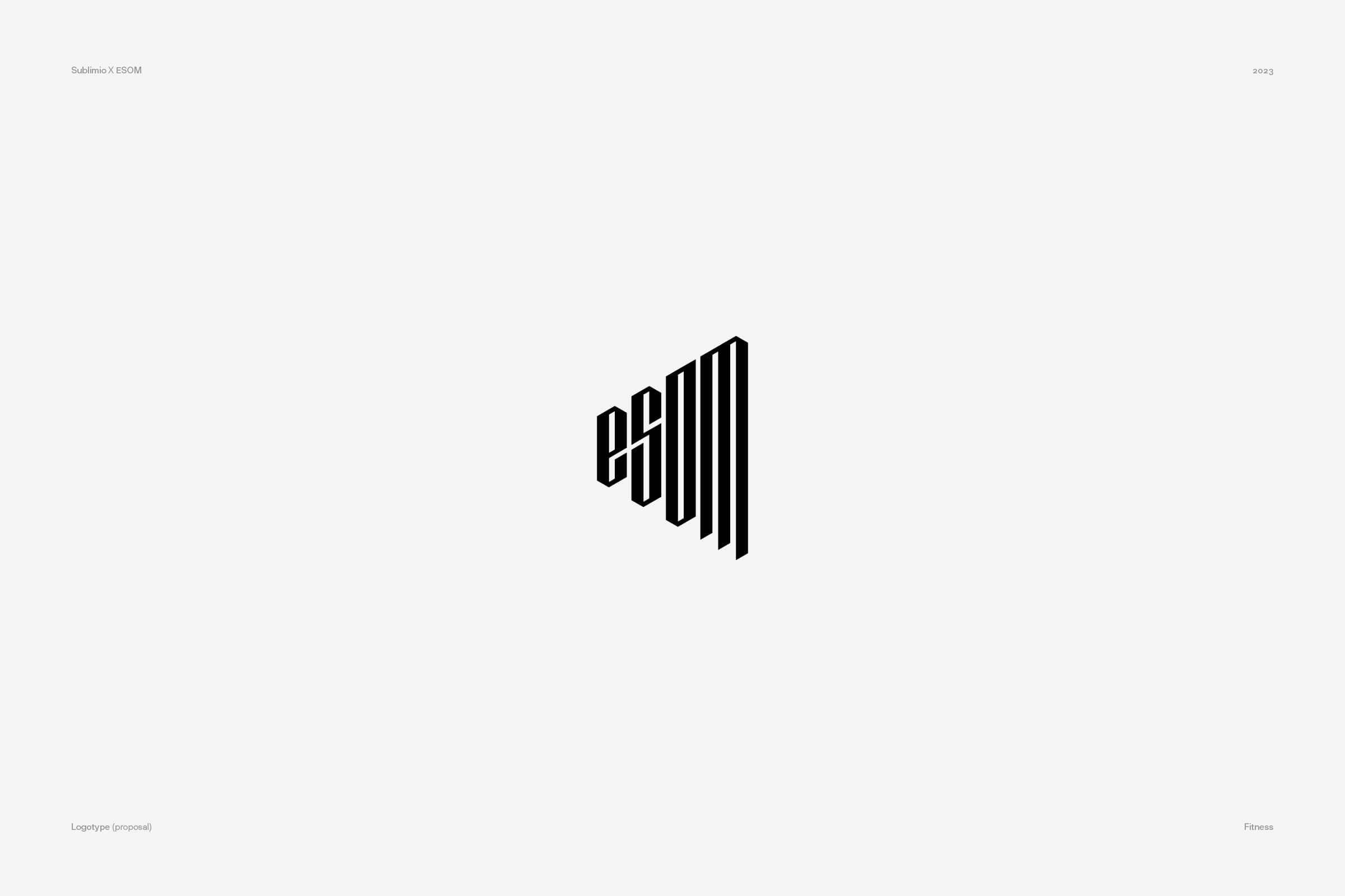
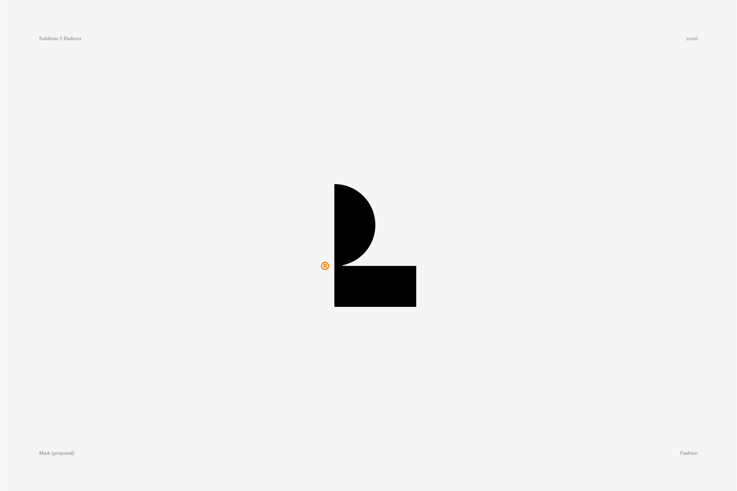
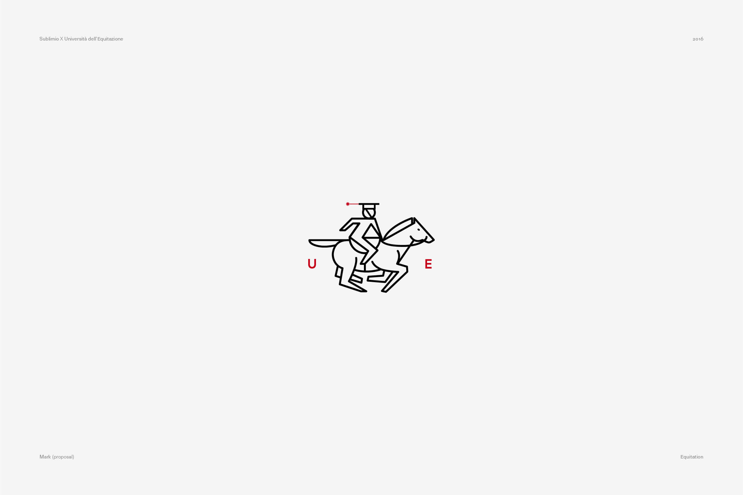
And just to be transparent: we got many more logos rejected and we deeply love some of them. Here’s a short selection.
READ MORE ON
The comma nobody sees: why attention to detail in branding still matters
Nobody notices when I change the color of a comma, and that’s exactly why I keep doing it. A case for perfectionism and attention to detail in branding.

Before you hire a branding agency, ask to see the drafts
A while ago, at Sublimio we started sharing with potential clients not just our portfolio, but our past presentation. Here’s why.
Can AI do your brand strategy?
AI can craft a pretty believable brand strategy, but will it hold? Here are some things to know before you forward it to the team.
Do you have a brand architecture? Here’s why you should
If you find the term “brand architecture” intimidating, you might want to do this. Because the right one makes all the difference for your business.
our newsletter
SUMO is one of the few newsletters I don’t archive when my inbox gets full. Each edition feels crafted with care - the links are genuinely interesting, the curation is thoughtful, and the newsletter design itself is a delight to consume.

Content curation at its finest. Doesn't overdo it on commentary, and has probably the highest signal-to-noise ratio among the design newsletters out there. Never a dull entry! Every issue feels handpicked rather than churned out.

Sublimio Monthly is always a breath of fresh air. I especially like how each issue explores one timely theme, turning Andrea and Matteo’s perspectives into a clear takeaway I can immediately apply to my work—often before the topic becomes mainstream.

You know that feeling as a kid, waiting for your favorite magazine to hit the stands? That's what SUMO is for me.

SUMO is much more than a newsletter: it's a guide. In a world of information overload, having someone who does real curation work is invaluable. What I find there is always worth my time. I read it eagerly every time, and I often share it with friends and colleagues because there's always something useful and genuinely interesting.

SUMO has a level of intentionality that sets it apart from most newsletters I read. Each edition is built around a theme that feels considered without being overworked, with Matteo and Andrea’s dual perspectives adding depth and a set of curated links that feel carefully chosen. It’s a newsletter worth reading properly.

SUMO has quickly become one of my favourite newsletters. Every issue leaves me with a fresh perspective on how I see my brand and the world around it.



© 2009—2026 Sublimio


