
 by Matteo Modica
6 MIN. READ
09.10.2026
by Matteo Modica
6 MIN. READ
by Matteo Modica
6 MIN. READ
09.10.2026
by Matteo Modica
6 MIN. READ
Everything moves faster, and almost everything can be fixed later. So why should attention to detail in branding still matter, when most people will never notice it?
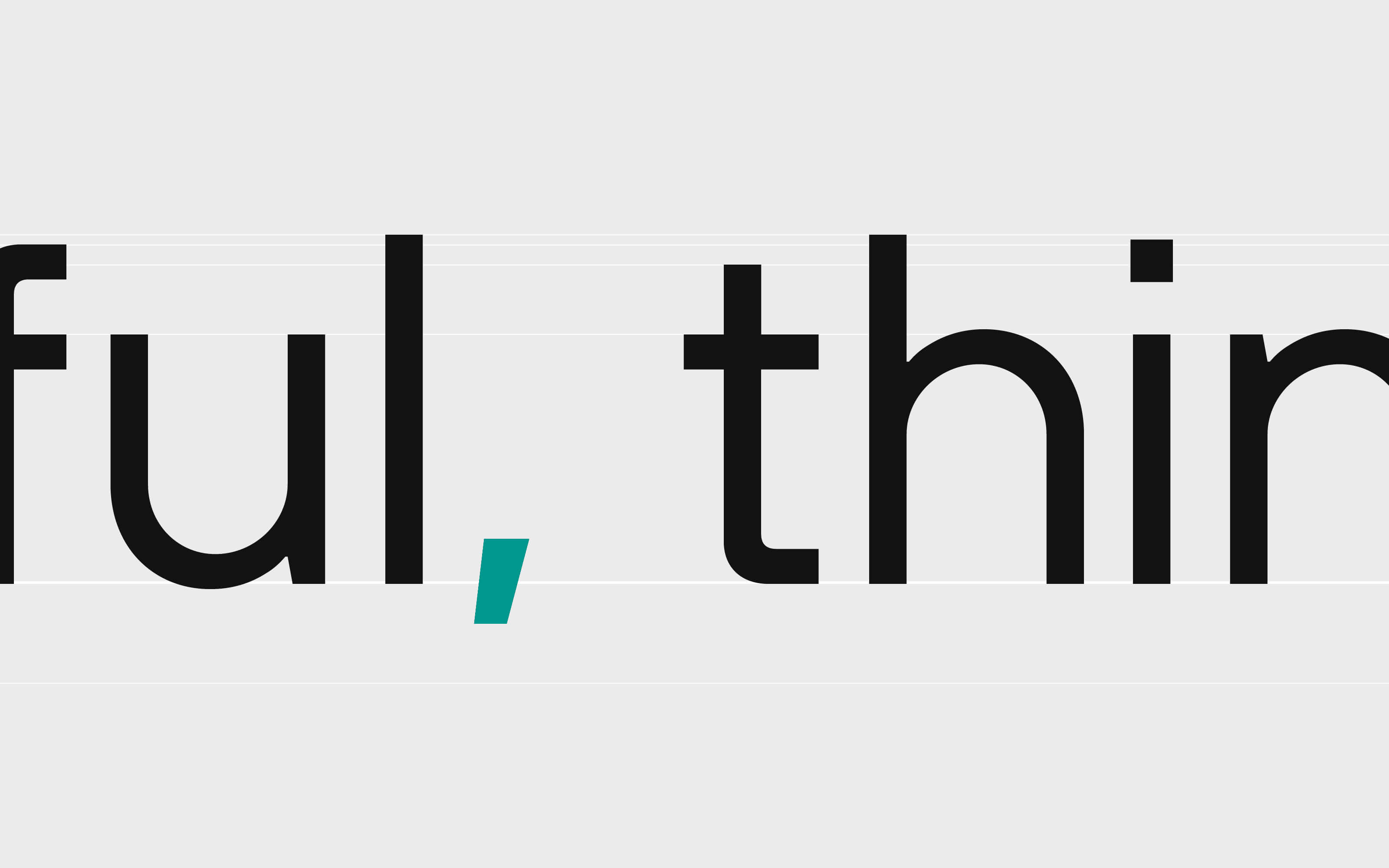
I have a small confession to make. When I lay out a text, I often change the color of the punctuation. I don’t touch the words or the leading. Just the commas, the dots and the like, which I soften by about 20 to 30 percent.
The reason is optical. Punctuation is there to support the words, not to compete with them. In bold or high contrast text, though, every sign carries the same strength as the letters, and the rhythm of the line gets a little noisy. So I lower the contrast of the punctuation by a touch, until the words lead and the signs stay in the background.
Nobody has ever thanked me for this. I’m fairly sure most readers have never noticed. And yet I’m convinced it matters. A paragraph where every sign sits at the right volume reads more calmly, even if you couldn’t say why.
Type designers have always worked this way. A round letter like the O is drawn slightly larger than a flat one like the H, otherwise it would look smaller. Optical correction is, in a way, lying to the eye so that it sees the truth.
Lately, though, I’ve been asking myself an uncomfortable question. In a time obsessed with speed, is perfectionism still a virtue? Or is it just a bad habit with a good reputation? And closer to my own field: does attention to detail in branding still make a difference, now that almost everything can be fixed after launch?
Where my perfectionism comes from
My background is in industrial design. In product design, one moment changes everything: the moment the product ships.
Until then, you can change anything. After that, the molds have been cut, thousands of pieces have been produced, and the boxes are on trucks. If a hinge squeaks, it will squeak in thousands of homes.
This teaches a very specific discipline. You don’t polish details at the end. You design them from the start, because you know there won’t be a “later”. That’s where I learned that perfectionism in design isn’t a personality trait. It’s part of the job description.
When I moved into branding, I brought this habit with me. For a while I wondered whether it still made sense. A brand today lives mostly on screens. You can change a color in the guidelines, re-export a file, or publish a new version of a website in an afternoon. Does the logic of the product still apply?

A brand is a designed object (even when it’s made of pixels)
My answer is yes, with a caveat. A brand can be adjusted after launch, and it should evolve over time. But being able to fix something later is not a good reason to plan for it.
I believe a brand should be conceived as a design object, in the technical sense of the word. It has a structure, tolerances, and a way of behaving under stress. Its logo will be printed tiny on a receipt, embroidered on a shirt, cropped into a round avatar, and squeezed into a favicon between twenty other tabs. Its typeface will be used by people who have never opened the guidelines. Each of these situations is a stress test, and the brand should pass it without surprises.
That’s where attention to detail comes in. It’s part of the design phase. When details are solved at the root, the brand stands on its own and doesn’t need a designer next to it correcting every application. When they aren’t, every new touchpoint becomes a small emergency. A long series of small emergencies is how a brand slowly starts looking patched up.
So yes, we do have margins for correction. I just prefer to spend them on evolution rather than repairs.
Attention to detail as a human signature
There’s another reason why I don’t think perfectionism is obsolete, and it has to do with the moment we’re living in.
A growing share of the creative output we see every day is generated by AI. I have nothing against it. At Sublimio we use these tools, and we’ve written about how we do it. But anyone who works with them knows that AI is brilliant at the overall impression and much less reliable on the last millimeter. The text is almost right, the alignments are almost right, the typography is almost right. Approximation is built into the process: a model aims for what is plausible, not for what is exact.
This creates a curious paradox. When a polished surface becomes cheap, the signal of a human hand moves elsewhere.
For some, humanity lives in imperfection: the visible stroke, the shaky line, the error left there on purpose. It’s a legitimate path, and many brands are taking it.
There’s also a second, quieter path: the detail pursued with stubbornness. It’s a detail no one asked for and no algorithm would have flagged, one that required someone to stop and say “not yet”. That is an act of will. And will, the decision to care beyond what is strictly necessary, is about as human as it gets.
People may not see the detail, but they perceive the care behind it. Today, that is what makes attention to detail in branding a real differentiator.
Two details you weren’t supposed to notice
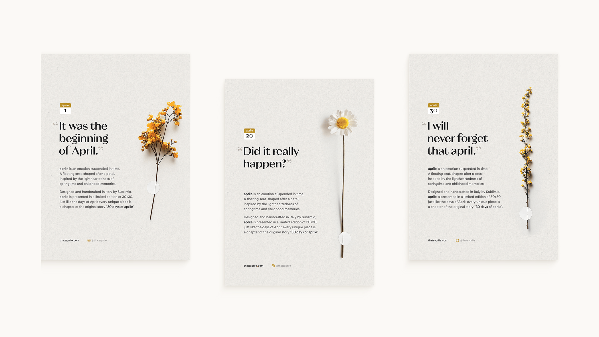
Here are two recent examples of attention to detail pushed to the point of invisibility. These details aren’t flaunted in campaigns; they’re hidden in the margins of the experience.
Apple and the little tab
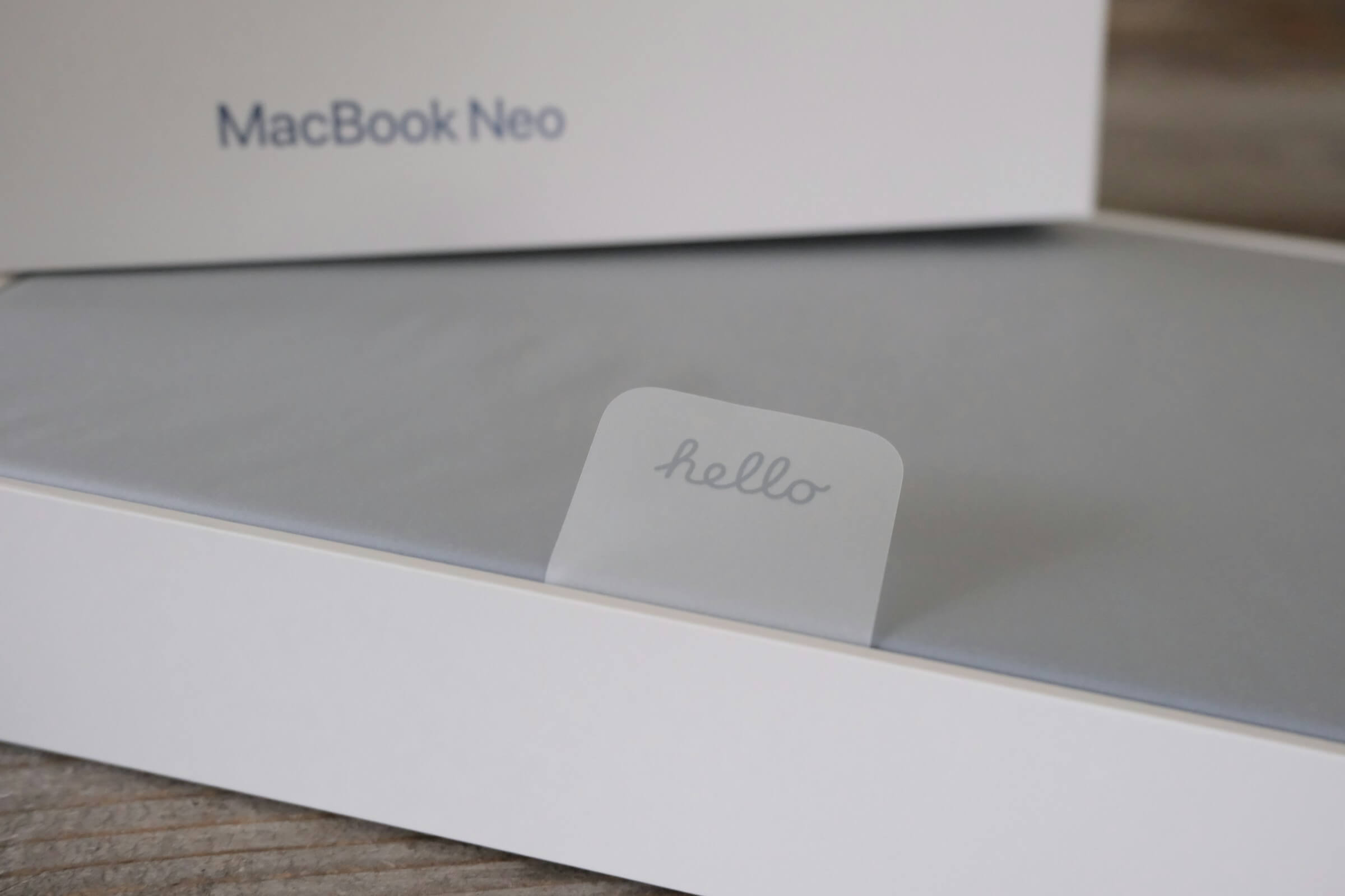
At Stripe Sessions last year, Jony Ive recalled working on how a cable was managed inside the box, fully aware that millions of people would end up handling one small tab. He also spoke about cabinet makers who finish the inside parts of a cabinet even though nobody will see them, and suggested we are measured by “what we do when no one sees”. It’s not a new story, but it has never felt more relevant.
Ferrari Luce and the sound of a switch
Yes, Jony Ive again: the Luce interior was developed with LoveFrom, the collective he founded with Marc Newson. I promise this isn’t turning into a fan letter. Some people just keep proving the same point.
In February, Ferrari revealed in San Francisco the interior of its first fully electric car. Most headlines went to the glass key and the displays. Fewer mentioned that the analog controls were tested with Ferrari drivers to fine-tune their mechanical and acoustic feedback, and that the key’s E Ink display only uses power when its color changes. Nobody buys a car for the click of a switch, but everyone hears it every single day.
Neither detail is ostentatious. They don’t shout. They’re there for whoever notices, and also for whoever never will. This is what I mean by detail as a moral principle: doing things properly even when no one is checking.
Perfectionism: virtue or bad habit?
Back to the question I started with. Perfectionism does have a dark side, and I know it well. There’s a kind that never lets go, that keeps reopening finished work and mistakes polishing for progress. That’s not the kind I’m defending.
Industrial design taught me the opposite: perfectionism with a deadline. You get the details right because, at some point, the product has to leave your hands. The care goes into the design phase precisely so that it doesn’t have to chase the project afterwards.
Seen this way, speed and perfectionism are less at odds than they seem. What slows a brand down is rarely the attention paid to details while designing it. More often it’s the lack of that attention, which comes back later as a long series of fixes.
One more thing has changed. When producing more costs almost nothing, attention becomes the scarce resource. Choosing where to spend it, even on something as small as a comma, says a lot about what a brand values. That’s why I see attention to detail in branding as a matter of priorities more than aesthetics.
So I’ll keep adjusting my punctuation. Most likely nobody will notice, and I’m fine with that. I do it because a brand, and the people on the other side of it, deserve to be finished properly, down to the smallest sign on the page.
READ MORE ON

Before you hire a branding agency, ask to see the drafts
A while ago, at Sublimio we started sharing with potential clients not just our portfolio, but our past presentation. Here’s why.

Can AI do your brand strategy?
AI can craft a pretty believable brand strategy, but will it hold? Here are some things to know before you forward it to the team.
Rejected Logo Designs We Still Love
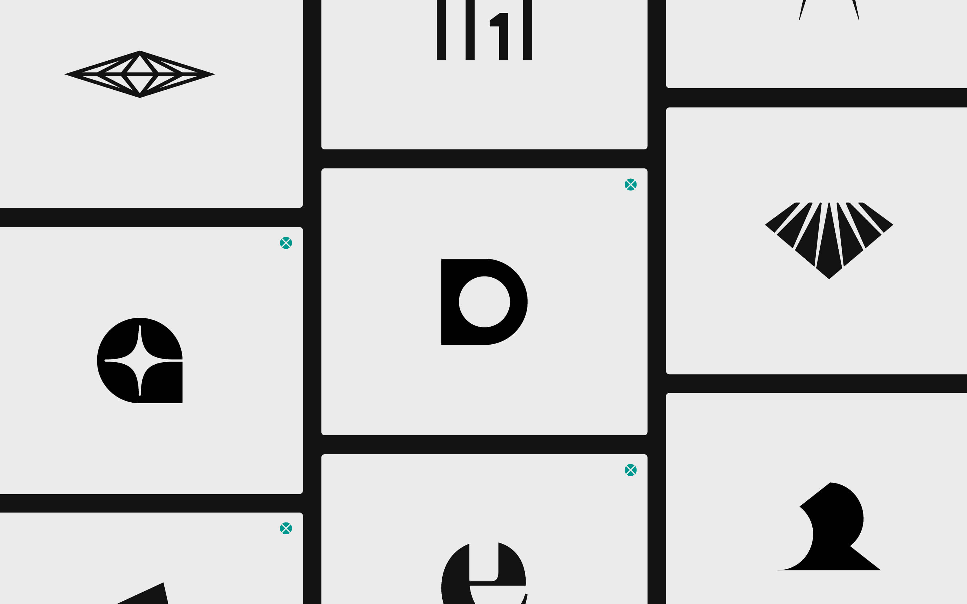
Not all logo designs get accepted. Actually, most of them get rejected, and that’s ok. Here’s why we don’t throw ours away.

Do you have a brand architecture? Here’s why you should
If you find the term “brand architecture” intimidating, you might want to do this. Because the right one makes all the difference for your business.
our newsletter
SUMO is one of the few newsletters I don’t archive when my inbox gets full. Each edition feels crafted with care - the links are genuinely interesting, the curation is thoughtful, and the newsletter design itself is a delight to consume.

Content curation at its finest. Doesn't overdo it on commentary, and has probably the highest signal-to-noise ratio among the design newsletters out there. Never a dull entry! Every issue feels handpicked rather than churned out.

Sublimio Monthly is always a breath of fresh air. I especially like how each issue explores one timely theme, turning Andrea and Matteo’s perspectives into a clear takeaway I can immediately apply to my work—often before the topic becomes mainstream.

You know that feeling as a kid, waiting for your favorite magazine to hit the stands? That's what SUMO is for me.

SUMO is much more than a newsletter: it's a guide. In a world of information overload, having someone who does real curation work is invaluable. What I find there is always worth my time. I read it eagerly every time, and I often share it with friends and colleagues because there's always something useful and genuinely interesting.

SUMO has a level of intentionality that sets it apart from most newsletters I read. Each edition is built around a theme that feels considered without being overworked, with Matteo and Andrea’s dual perspectives adding depth and a set of curated links that feel carefully chosen. It’s a newsletter worth reading properly.

SUMO has quickly become one of my favourite newsletters. Every issue leaves me with a fresh perspective on how I see my brand and the world around it.




© 2009—2026 Sublimio


