
 by Matteo Modica
4 MIN. READ
06.07.2025
by Matteo Modica
4 MIN. READ
by Matteo Modica
4 MIN. READ
06.07.2025
by Matteo Modica
4 MIN. READ

Not everyone is into fonts and stuff, but everyone gets instant cues from brand typography. So, let’s take it seriously.
—
This is the sixth article in a series describing Sublimio’s approach to branding projects. In case you haven’t read the previous one about visual identity, you can find it here.
—
When asked “what brands do you look up to?” most companies will respond “Apple”. Fair enough. And yet not everyone knows (or remembers) how Steve Jobs would obsess – among other things – about typography, something that at the time was not so central in consumer electronics.
And that might have become one of the distinctive elements of Apple: their use of type – minimal and yet intentional – can still be recognized today, both in their interfaces and their communication.
Brand typography can make or break a brand image. It’s just everywhere, and compared to other assets, you can’t avoid using it. Because the absence of brand typography is also typography.
No wonder that defining the brand typography, for us at Sublimio, is such a big part of the visual identity work.
Using brand typography to set the overall tone
Brand typography has the power to set the tone of our communication in a visceral way.
Even people who don’t care about type or don’t have an extensive visual culture will get the clues. After all, typography is everywhere and we all interact with it all day, every day. It could be the text on a printed receipt, a sign at your local florist, the label on the backpack of the person in front of you on an escalator.
Type, type, type. It’s everywhere and we are creating mental associations all the time. Each typeface or family of typefaces is inevitably linked to concepts, subcultures, historical periods or specific uses.
It’s hard to use a circus font without everyone thinking you are there to entertain. Some associations are more subtle and it helps to know a bit of type history to pick the right typeface. Some will feel more British, others more French, some will bring images of smart technology, others will still communicate technology but in a more traditional way.
The first step in defining the brand typography is then to define how we want the interactions with our audience to feel. Yes, it’s not an entirely rational choice and it doesn’t have to be. If brand typography was a rational choice, we’d all just go with the most legible font. And yet, we don’t.
Sometimes, brand typography can help us convey the messages that the brand image itself won’t be able to. Make a brand look reliable and sturdy, or playful and indulging.
How we pick a primary and secondary typeface
If you have had previous experience of brand identity, you will know that brand typography will usually come with a primary and a secondary typeface.
The role of the two in itself is no big mystery. While the primary typeface is usually the lead character – employed for titles and adv, the secondary typeface is the workhorse, used for long text (eg. websites or print publications).
How you approach the two makes a difference. The main choice is probably the delta you want to have between the two. The primary typeface is usually more expressive, while the secondary is usually more neutral. But just how much? Do both typefaces belong to the same world or are they complementing each other?
For example, you may have a classical-looking primary contrasting with a techie-minimal secondary or you could go all in on one of the two styles. This is a choice that has to do with the nuances of the brand personality.
A jester brand (imagine a fun spreadable meant for kids) could have a playful primary to attract but a serious secondary to show parents it’s safe and responsible. Or – if meant for teens – it could be all crazy, and have all type act in unison.
The same goes for a fashion brand: do you want to feel like a heritage maison or will you leave space for modernity?
Of course you have technical constraints to consider. Secondary (and even more tertiary) typefaces need to work at small sizes, be readable and flow well, and also be easy to use on web.
While this will narrow the selection, it doesn’t mean you should just go with the most plain and boring option. Even in the somewhat sober world of serifs there are endless nuances you can take advantage of.
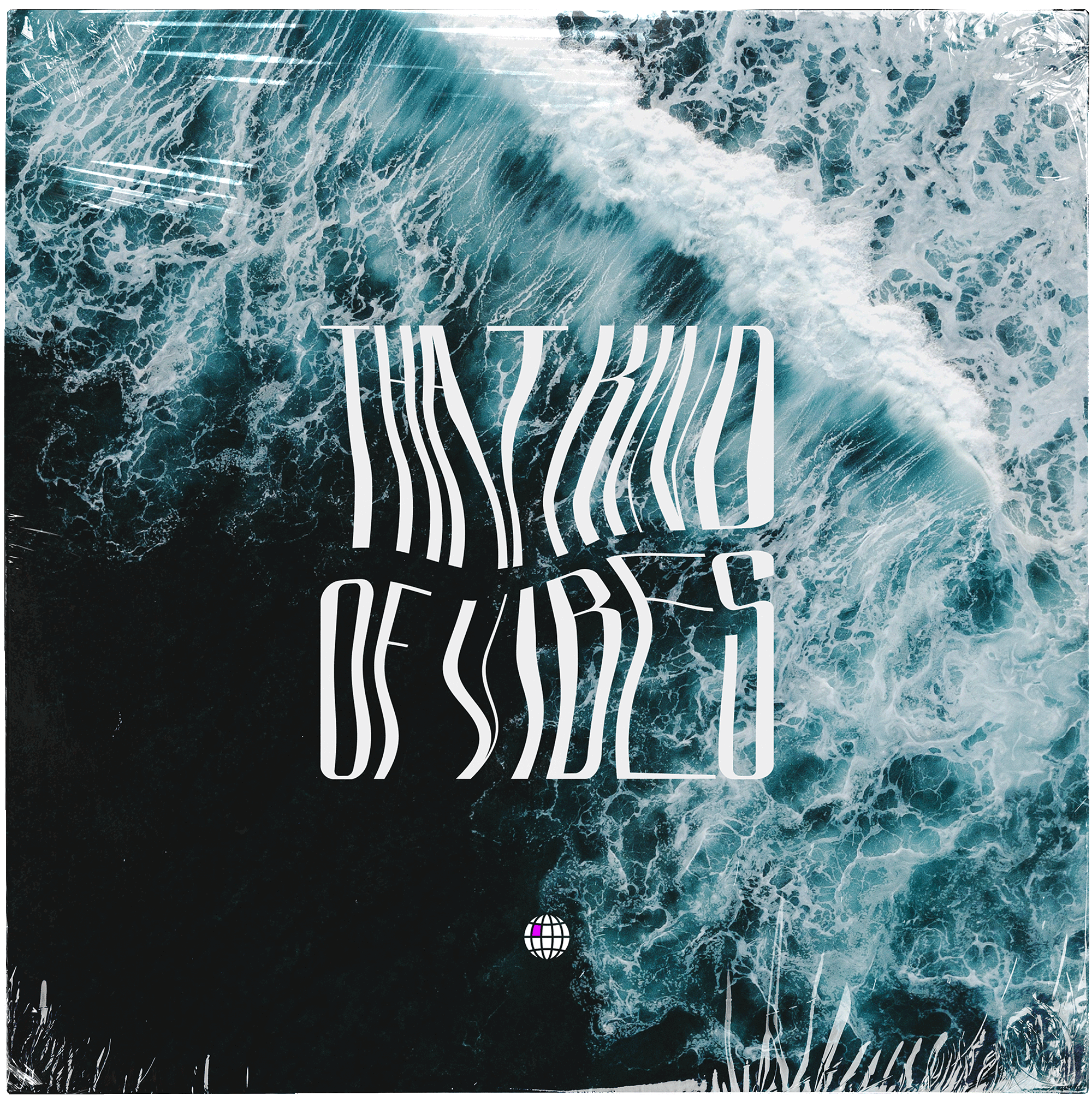
Brand typography as a graphic motif: the case of MessUp
Sometimes, brand typography becomes more than type and it evolves into a graphic system. Bold fonts (and bold brands) are especially suited for this approach.
It’s the case of our friends at MessUp, an agency for which we developed a very recognizable brand identity, built upon its logo typeface.
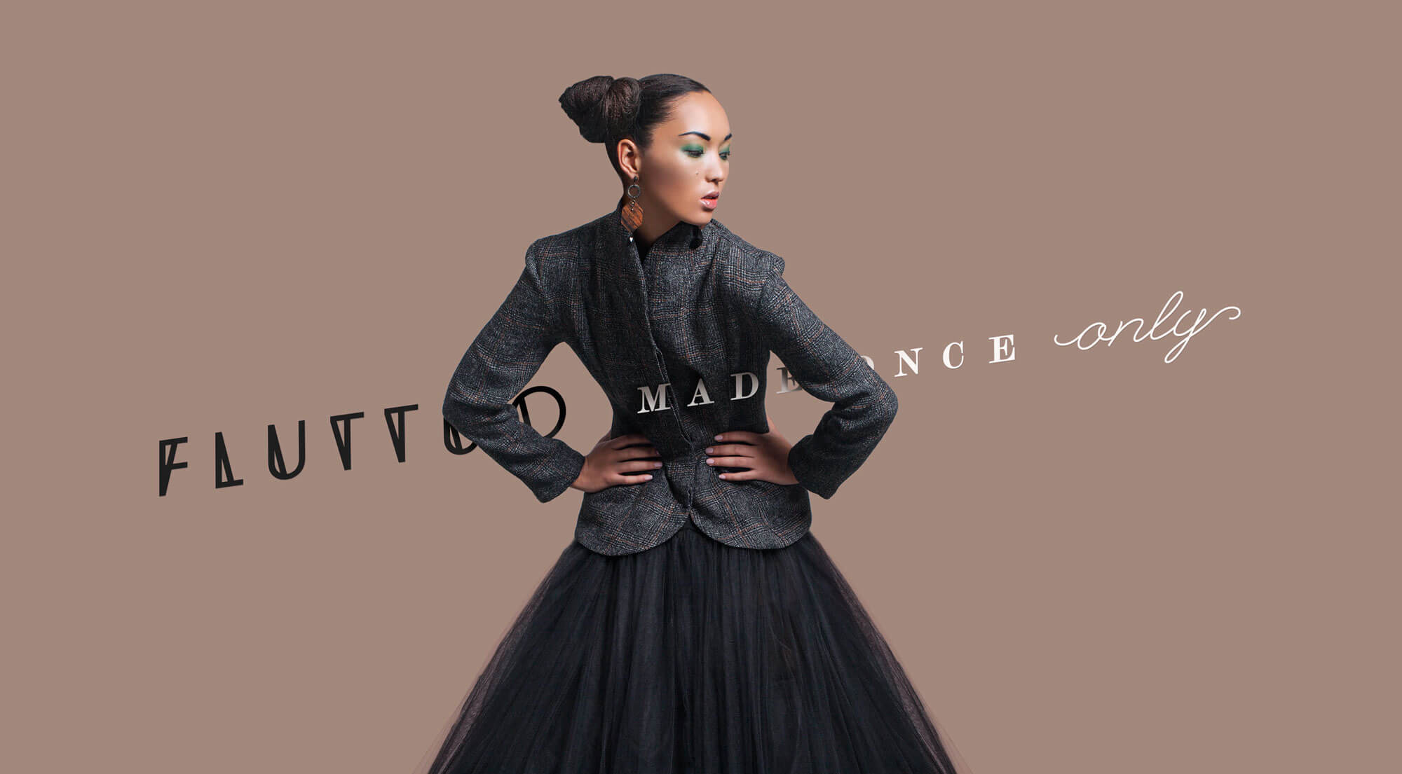
Playing with contrast: the case of Fluttuo
A good example of contrasting fonts is that of our brand typography for Fluttuo, an artisanal jewelry brand.
The interplay of serif fonts – evoking the tones of luxury – and handwritten fonts that bring an artisanal feel to the project created a nuanced brand image.
How much should you obsess about brand typography as a client?
Well, this is a tricky point. While we believe client and agency should build a brand together, brand typography also has a very technical side to it that has to do with real-world implementation.
Our advice? Give a general vibe-driven feedback, then trust your agency or designer on the choice of a specific typeface. You won’t regret it.
READ MORE ON

Verbal Identity: How We Craft the Voice of a Brand
Brand typography can be seen as a detail, but it’s the living spirit of a brand. This is how we do it at Sublimio.

Beautiful Thinking: the branding philosophy behind Sublimio
Can a brand look good and be strategic at the same time? If you ask us, there’s really no other way.
How We Choose Brand Colors for Impact
Choosing brand colors is never easy. But it helps to have a rough idea of why you are picking one over another.

Why Our Branding Agency is Called Sublimio
What’s in a name? More exactly, what’s in our name? Well, probably more than you think. Here’s where it comes from.
our newsletter


© 2009—2025 Sublimio


