A brand identity package can be a mysterious thing: while you know what it’s supposed to do, the exact content can sometimes be quite unclear. Here is what you should expect.
You are setting up a brand and your agency proposed you a brand identity package. It sure sounds good, but as with every “package”, it’s what’s inside that counts. Truth is, the content of a brand identity package can vary depending on the project, but there are some immutable elements.
A brand identity package should always include:
• logo design
• logo usage guidelines
• color palette
• typography
• graphic elements
A brand identity package can include (but not necessarily):
• photographic style guidelines
• a set of illustrations
• tone of voice guide
• print assets (business cards, letterhead)
• social media templates and profile images
• digital assets (email signature, DEM template)

Brand Identity Package Essentials
These elements are fundamental to the brand identity package: without them, you are not really getting an identity at all.
A logo is, of course, the cornerstone of your brand identity package. Whether you are getting a new one or refreshing your old one, the work that is done on the logo will influence everything that comes after.
Logo usage guidelines are an operational document that explains what to do and what not to do with your logo. Unlike the brand bible, it does not include elements like values, tone of voice or style suggestions.
The color palette usually comes with the logo but can also be an extension of the logo colors. A proper brand identity package will contain a detailed palette with color codes for web, print and possibly other media.
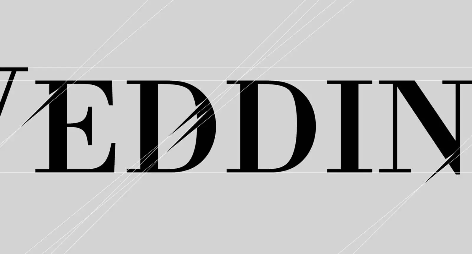
Typography is a fundamental element of your brand identity and it requires a great deal of attention. The brand identity package will define what typefaces your brand will use on print and digital: these are not necessarily the same that appear in the logo and should be carefully selected to cover a wide range of uses.
Graphic elements is a pretty wide term that can include every visual device you can think of, to be used on communication materials in order to make the brand recognizable. It could be a certain kind of frame, a splat of paint or whatever you can imagine. Having graphic elements in the brand identity package is very important because it allows you to bring your brand to life well beyond the logo.

Brand Identity Package Extensions
Depending on the kind of brand and budget, the brand identity package can include additional items, either meant to add depth to the brand or to make your day-to-day work easier.
Photographic style guidelines will define the mood of the photos you shoot, select or buy for the brand’s communication assets. They are very important to ensure a common mood across all touchpoints.
The brand identity package could also include a set of illustrations, either original or purchased, to be used in the development of future assets.
A tone of voice guide will tell you (and show you) how to write copy in the voice of the brand. This can be a light or rich document depending on the project.
Print assets such as business cards and letterhead used to be included in all brand identity packages. Nowadays, not all brands ask for them as some are purely digital. Other assets such as brochures, packaging, bags can also be included.
Digital assets such as email signatures and DEM templates make sure your brand will be able to communicate digitally while respecting its identity. As with their print counterparts, the list could well be extended.
Social media assets are quite commonly part of a brand identity package, as setting up social channels is one of the first things a new brand does. This includes profile images, templates for the creation of new posts and sometimes also the copy for social bios.
READ MORE ON
How to Brief Your Branding Agency
Branding can take you anywhere, but do you know where you are headed? Here are some tips on how to brief your branding agency right.
Can AI visuals keep your brand authentic? Here’s how we do it.
As artificial intelligence tools get more powerful, you are probably tempted to create AI visuals for your brand. But should you do it?
Brand Packaging as an Act of Love
Brand packaging is not just a matter of aesthetics: it’s a mix of brand vision, user experience and pure fascination.
How We Make Website Design That is Not Boring
Website design often comes last after everything has been already decided. And yet, it’s still a central part of brand experience.
our newsletter


