
 by Matteo Modica
4 MIN. READ
13.02.2026
by Matteo Modica
4 MIN. READ
by Matteo Modica
4 MIN. READ
13.02.2026
by Matteo Modica
4 MIN. READ

Where do you start when designing your brand packaging? Well, your brand, of course. But even more important, the customer.
—
This is the tenth article in a series describing Sublimio’s approach to branding projects. In case you haven’t read the previous one about website design, you can find it here.
—
We are taught from a young age not to judge a book by its cover, implying that the container must be superficial and maybe even deceiving.
At Sublimio, we beg to differ. We think that – if the cover is well designed – you should absolutely judge the book by it.
It’s a matter of intention. While it’s true that packaging does not equal quality, a well designed brand packaging shows the customer that you care. And maybe gets them to care about your product, too.
Designing brand packaging in the customer’s shoes
It’s easy to make the mistake to consider packaging as yet another brand asset to be simply developed from the guidelines. Unlike other brand assets, though, your packaging is part of your product and it’s meant to be experienced in many different ways.
It will be seen in advertising, spotted on a shelf, carried in a bag, opened at home or kept on the table.
So many different situations and one same point of view: that of the customer.
At Sublimio,we consider brand packaging as an exercise in empathy, more than a simple design project. While it descends from the strategy and identity we have developed for the brand, packaging brings all these values to the physical world, so it needs to adopt its language.
More than any other asset, it needs to take into account distance, obstruction, distraction. In other words, all those real world occurrences that complicate the perception of the asset.
Just think of the endless dilemma about the packaging of pasta, so strongly felt by Italians, who never seem to find the cooking time number on the pack.
In that case you need to consider that the situation of cooking, maybe in a rush, is messier and more chaotic than you would expect. Information must find its way.
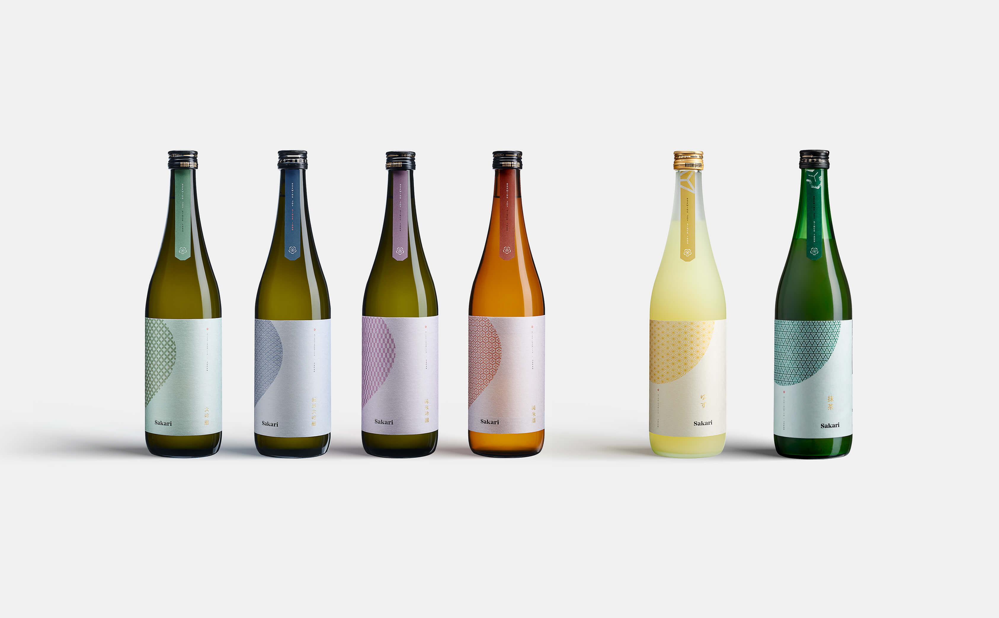
Sakari: standing out, blending in
When designing the labels for Sakari Sake – a Japanese brand planning to go global – we had to keep in mind our audience much more than the brand: sake bottles in Japan are usually adorned with ideograms, easily decipherable for the Japanese audience but not as meaningful for a non-Japanese crowd.
Furthermore, Sakari was planning to hit the global market not just with sake but with a full family of it: junmai, daiginjo, junmai ginjo, junmai daiginjo, yuzu sake.
Yes, unless you are a sake connaisseur these words might not mean much to you. They refer to the degree of rice polishing and each kind of sake actually has a very different and distinctive flavor.
In order to give value to each of them, we had to make the labels easily recognizable as different, even from a distance.
So we worked with traditional Japanese colors and patterns that would feel culturally authentic to a Western audience but at the same time easily legible. Even from afar, you can easily tell which kind of Sakari sake you are looking at.
The unique shape that “contains” the pattern, placed in high contrast against a white(ish) background, makes it also easy to recognize it’s Sakari.
These colors are not natively part of the brand identity, but they have extended it de facto.

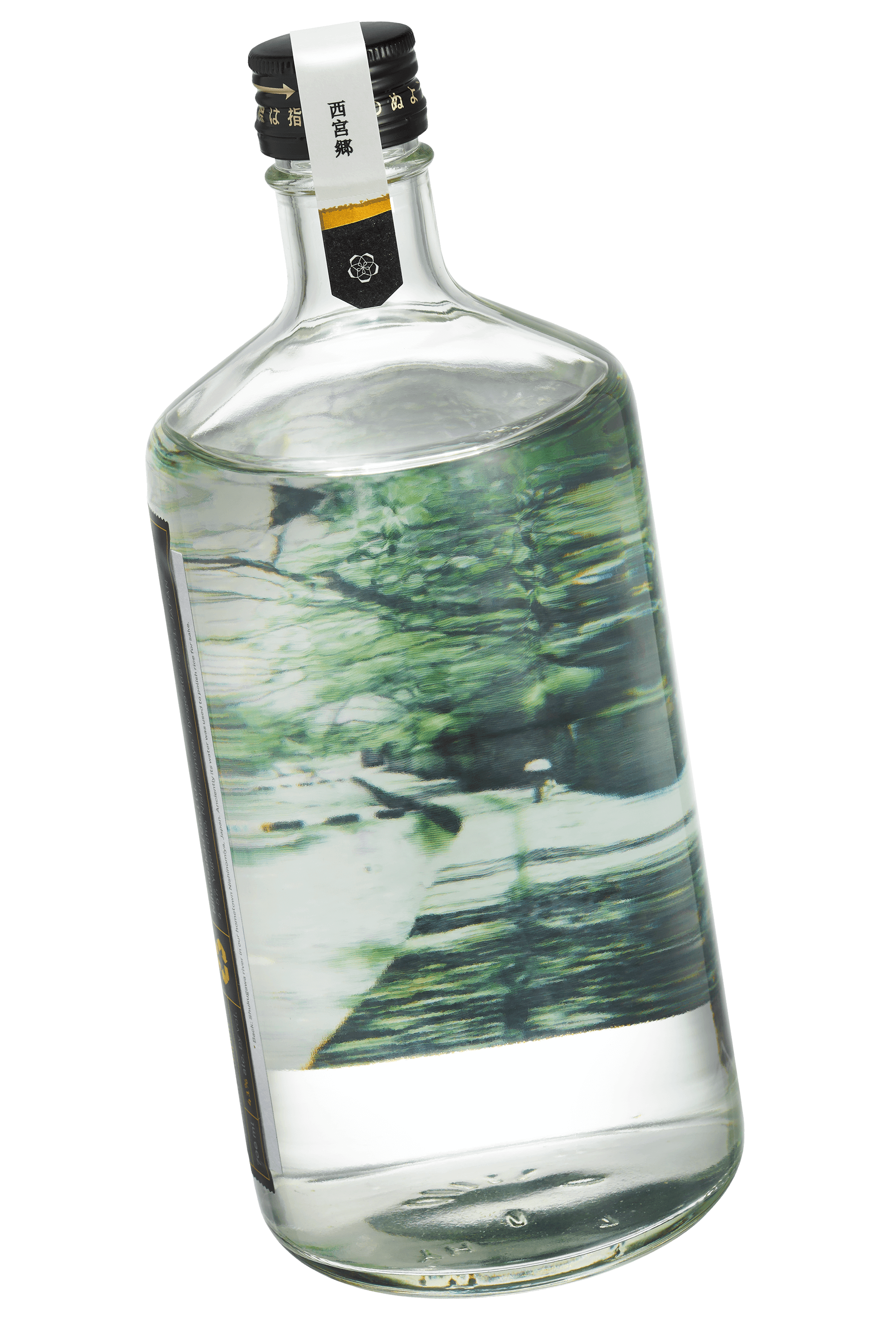
When the brand launched its own gin we had to take a different approach.
Gin caters to a different group of people and to a different kind of drinking situation. It’s less about “fighting for visibility on the shelf” and more about making an impact in the ritual moment of opening and mixing.
Which is why we opted for a minimal, delicate and premium packaging that becomes an interactive experience: the back of the label shows a view of the Shukugawa River in Nishonimiya, from which the gin also takes its name.
Gin acts as a lens, allowing us to see the landscape thanks to its purity and transparency.
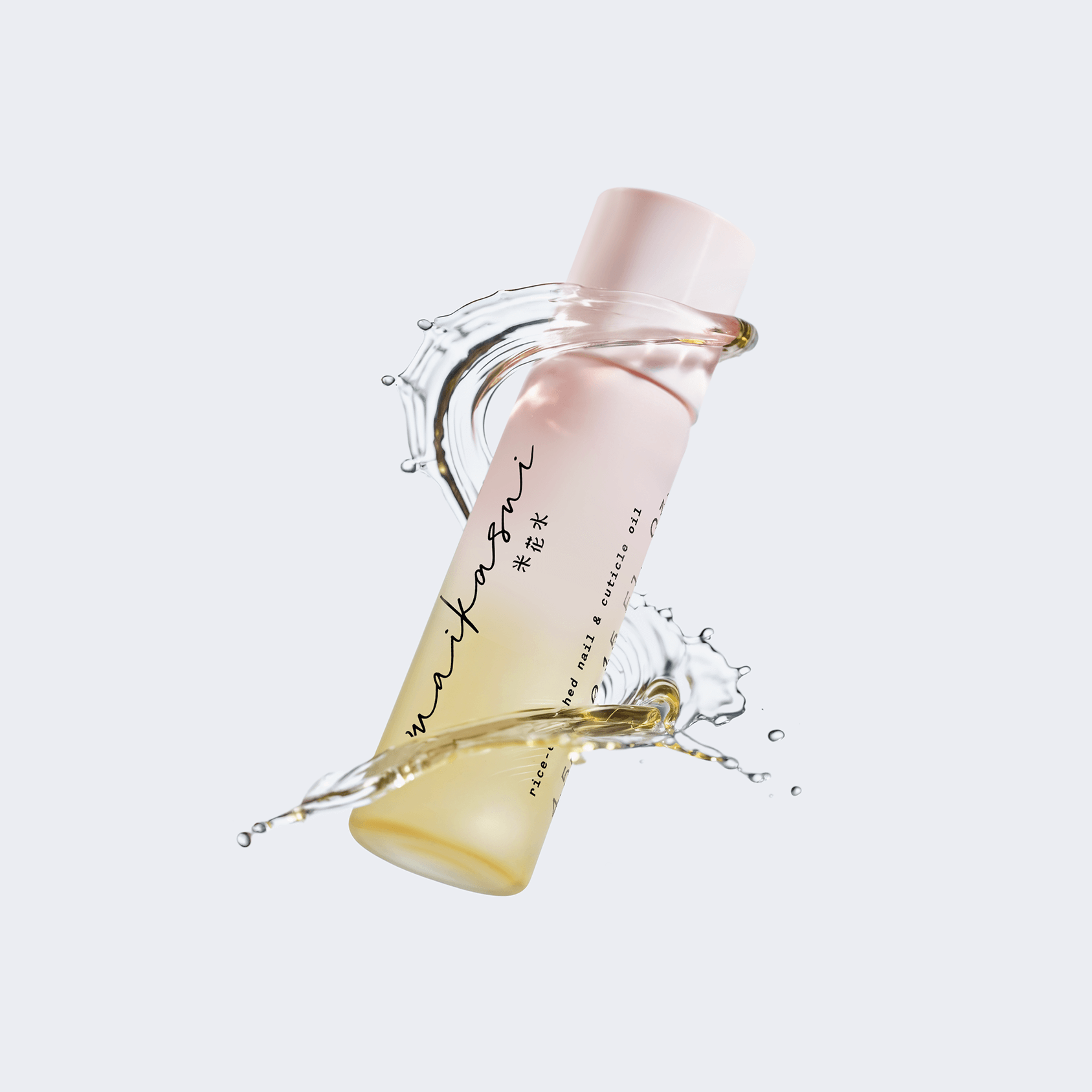
maikasui: imbuing the brand packaging with the brand’s soul
Sometimes, packaging can speak volumes about your values, too.
It’s the case of maikasui, a Japanese handcare brand that was created with the vision of a perfect balance between human and nature.
Of course, this approach is well reflected in the product itself, but it’s not something that you would know at first glance.
This is where packaging came in. Beyond aesthetic choices, most of our decisions regarded materials as those that truly impact our environment. We picked some of the most sustainable: glass and paper, for the hand cream jar and its box.
And not just any paper: kome–kami is a kind of paper made from rice that can not be used anymore (leftover from sake production), making it a perfect example of circular design.
Cherry on top: the paper is embossed but not printed. The use of ink is kept at its functional minimum to further reduce impact. The result is a gentle, delicate pack that has a (very good) story to tell.
READ MORE ON
Rejected Logo Designs We Still Love
Not all logo designs get accepted. Actually, most of them get rejected, and that’s ok. Here’s why we don’t throw ours away.

Do you have a brand architecture? Here’s why you should
If you find the term “brand architecture” intimidating, you might want to do this. Because the right one makes all the difference for your business.

Brand equity: why branding is an investment (and how to tell your CFO)
A brand is not a number, but it can bring numbers: when your brand equity is healthy, results follow.

How to Brief Your Branding Agency
Branding can take you anywhere, but do you know where you are headed? Here are some tips on how to brief your branding agency right.
our newsletter
SUMO is one of the few newsletters I don’t archive when my inbox gets full. Each edition feels crafted with care - the links are genuinely interesting, the curation is thoughtful, and the newsletter design itself is a delight to consume.

Content curation at its finest. Doesn't overdo it on commentary, and has probably the highest signal-to-noise ratio among the design newsletters out there. Never a dull entry! Every issue feels handpicked rather than churned out.

Sublimio Monthly is always a breath of fresh air. I especially like how each issue explores one timely theme, turning Andrea and Matteo’s perspectives into a clear takeaway I can immediately apply to my work—often before the topic becomes mainstream.

You know that feeling as a kid, waiting for your favorite magazine to hit the stands? That's what SUMO is for me.

SUMO is much more than a newsletter: it's a guide. In a world of information overload, having someone who does real curation work is invaluable. What I find there is always worth my time. I read it eagerly every time, and I often share it with friends and colleagues because there's always something useful and genuinely interesting.

SUMO has a level of intentionality that sets it apart from most newsletters I read. Each edition is built around a theme that feels considered without being overworked, with Matteo and Andrea’s dual perspectives adding depth and a set of curated links that feel carefully chosen. It’s a newsletter worth reading properly.

SUMO has quickly become one of my favourite newsletters. Every issue leaves me with a fresh perspective on how I see my brand and the world around it.


© 2009—2026 Sublimio


