
 by Matteo Modica
4 MIN. READ
08.10.2025
by Matteo Modica
4 MIN. READ
by Matteo Modica
4 MIN. READ
08.10.2025
by Matteo Modica
4 MIN. READ
Brand colors are a powerful and valuable device. So when should you choose your palette, and how do you do it? Here’s how we do it at Sublimio.
—
This is the seventh article in a series describing Sublimio’s approach to branding projects. In case you haven’t read the previous one about typography, you can find it here.
—
We have covered some aspects of brand colors in our previous articles, but color in branding is such a vast topic we thought we’d share a few more ideas.
Color is a key element of a recognizable brand. If picked wisely, it’s often enough to make it stand out. Just think about Tiffany’s Blue. If rushed, it will drown in a sea of sameness.
When to start thinking about brand colors
From a design standpoint, the relationship we have with brand colors is nuanced. We always begin in black and white. If a mark can hold its own stripped of ornament – balanced, legible, unmistakable – it earns the right to be dressed.
Introducing color is not a garnish; it’s the start of a new phase where the symbol finds new life. Color doesn’t replace the mark’s strength: it amplifies its rhythm, sharpens hierarchy, and sets the stage it moves through.
From there, we design how color and form interact: how the mark reverses on dark, knocks out on light, and sits against photography or texture.
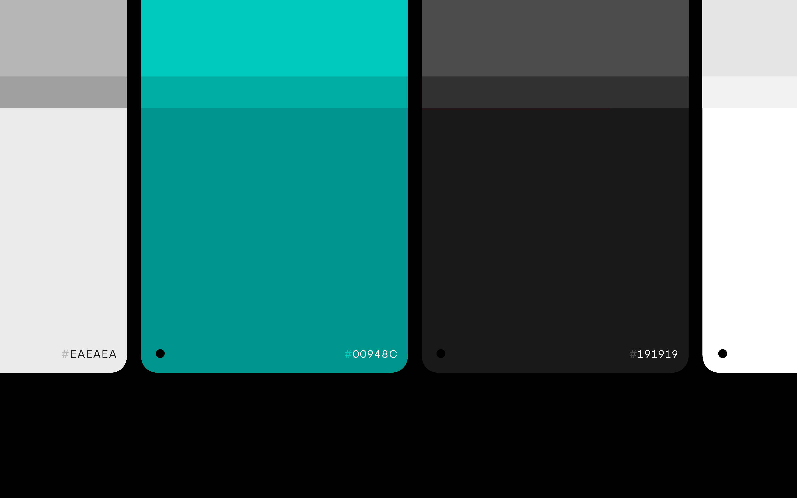
We design a palette with roles and range: primaries that anchor recognition, supporting tones that scale the system, neutrals that give it air, and controlled tints/shades for flexibility.
We define ratios so the palette feels intentional rather than noisy, and we stress-test across contexts: tiny favicons and giant billboards, matte paper and glossy screens, dark mode and daylight glare.
Thinking hard about the meaning of colors
But how do you pick brand colors, really?
Well of course it’s not a matter of taste, it’s a matter of communication. Colors send clear signals to your audience, which should derive directly from your brand positioning. Sometimes, colors can do what a logo can’t, as they act on an even more visceral level.
But what does a color mean? Please don’t stop at some randomly googled color psychology chart (not that you would). They are not wrong, but they are just part of the story.
Is purple royal? Sure. Is white pure? We won’t argue about that.
But beyond the basic meaning of colors – which is, of course, historically determined – you need to take into account the real–life experience of your target, the brands they interact with, the characters, places, objects, conventions.
Take the color red.
Is it truly straightforward? Is it just linked to passion? Well, it depends. It can be the color of sportscars, true. But it’s also widely used for sales from retail brands. If you are in fintech, red is a color you don’t want to see. So sure, it will get your blood pumping, but it can do so in different ways.
How about purple?
It is luxurious, yes. Maybe you will link it to premium chocolate. But it’s also the key color in the gaming world. Or – if you are into pop culture – it’s the color of villains.
Orange can be yummy, or cheap, or signal an alert depending on the product and context you use it in.
So no, colors are not straightforward. They work within a system that helps guide their interpretation. Their universal meaning must be evaluated alongside their contextual meaning.

Developing a color family: the case of Sakari
We talk about brand colors, because you don’t need just one, but a palette. You know that. But what do you need a palette for?
Well, you use more than one color in design, of course. But sometimes it’s more than that. If you happen to have – or plan to have – a product family, picking your palette will be a much deeper exercise.
It’s not just about finding three colors that match, but a whole color space that you will be able to expand with time.
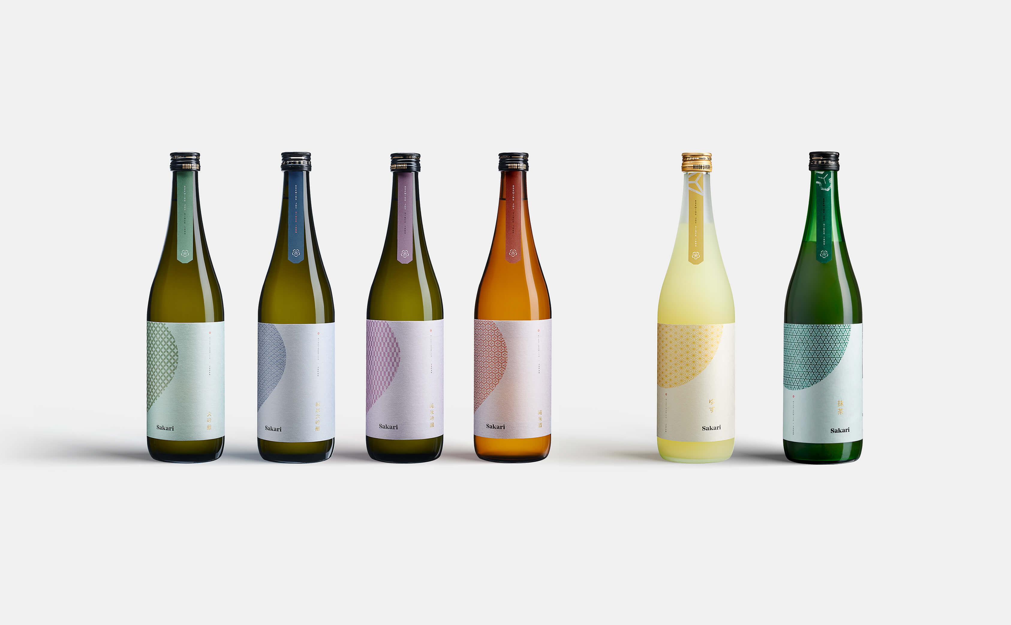
Take the example of Sakari, a Japanese sake brand for which we created the entire visual identity and packaging system. As a Japanese brand talking to a global audience, we needed to make the bottles recognizable and self–explanatory, which is not always the case in the sake market.
We wanted consumers to become familiar with the different types of sake offered by Sakari (junmai, junmai daiginjo, junmai ginjo, yuzu sake), so we used color codes on the labels. Each sake has its own color, but all colors live in the same space and they are inspired by two main factors:
- meaning in Japanese culture: the junmai daiginjo – the most premium sake in the family – for example, uses a traditional dark purple which Japanese culture associates to aristocracy;
- earthy color space: for an all-natural product, colors needed to reflect this quality, so the precise hue needed to be warm and soft. No hard, bright colors that would feel artificial.
Having precise rules allowed us to expand the product family with a certain ease as new products – like matcha sake – were introduced.
Protecting your brand colors
This is a refrain when talking about good branding, but it’s worth repeating: the work an agency does on brand colors only goes so far. Once the brand palette has been handed to you, the brand’s owner, you become their guardian.
Since brand colors are so valuable and strategic, using them properly is not just up to the agencies you will work with in the future. These colors must become sacred to the company.
Making sure they are properly represented and reproduced, as well as not appropriated by others, is a way to protect the brand.
READ MORE ON

Brand equity: why branding is an investment (and how to tell your CFO)
A brand is not a number, but it can bring numbers: when your brand equity is healthy, results follow.

How to Brief Your Branding Agency
Branding can take you anywhere, but do you know where you are headed? Here are some tips on how to brief your branding agency right.

Can AI visuals keep your brand authentic? Here’s how we do it.
As artificial intelligence tools get more powerful, you are probably tempted to create AI visuals for your brand. But should you do it?

Brand Packaging as an Act of Love
Brand packaging is not just a matter of aesthetics: it’s a mix of brand vision, user experience and pure fascination.
our newsletter


© 2009—2026 Sublimio


