
 by Matteo Modica
4 MIN. READ
13.07.2024
by Matteo Modica
4 MIN. READ
by Matteo Modica
4 MIN. READ
13.07.2024
by Matteo Modica
4 MIN. READ

The use of color in brand premiumization is an art. Get the right hue and you might feel worth much more. But what is a premium color?
As discussed in our previous article on brand premiumization, this process allows a brand to elevate its market position and perceived value, and to command higher prices as a consequence.
Among the various elements involved, color plays a crucial role in brand premiumization as it directly influences consumer perception and emotional response. The right color can evoke feelings of luxury, exclusivity, and quality, making it an essential tool for brands aiming to position themselves in the premium segment.
For instance, luxury brands often utilize rich, deep hues like black, gold, and navy blue to convey sophistication and exclusivity, while premium consumer goods might use crisp, clean colors like white and silver to suggest purity and high quality.
By carefully selecting and consistently applying colors that align with the brand’s desired image, businesses can enhance their perceived value and justify higher pricing.
Premium colors and their evolution
Colors carry powerful psychological associations that marketers can leverage to convey a sense of premiumness. Historically, certain colors have been linked to luxury and high status.
For example, purple has long been associated with royalty and wealth due to its rarity and expense in ancient times.
Today, black and gold are commonly used in luxury branding to evoke elegance and opulence. However, the perception of color and its association with premiumness can change over time and across cultures. In recent years, some brands have shifted towards minimalist and understated color palettes to signal modern luxury.
For instance, the use of muted tones and monochromatic schemes has become increasingly popular among high-end brands, as it suggests a contemporary, sophisticated aesthetic.
Additionally, the growing awareness of sustainability has led some premium brands to adopt earthy, natural colors to align with eco-friendly values, thus redefining what constitutes ‘premium’ in the eyes of modern consumers.
For example, the color green has evolved from being simply associated with nature to also representing eco-friendly and sustainable luxury.
Similarly, technological advancements and changing consumer preferences have influenced the adoption of colors like sleek metallics and soft pastels in luxury branding, reflecting a blend of innovation and elegance.
Real-Life Examples of the Use of Color in Brand Premiumization
When looking at successful cases of brand premiumization, a different color palette is usually one of the more evident parts of the revamped identity.
Take Barilla, for example. The historical Italian pasta brand, a staple of every pantry in the country, has recently decided to take on the artisanal premium-looking challengers in the market with its “Al Bronzo” line (bronze-drawn).
For this extension, it couldn’t use its traditional palette of bright red and blue, but needed something more sophisticated. Hence a deeper red and a deeper blue, used in an inverse combination with respect to the original brand (red became the primary color, blue secondary). While still recognizably Barilla, the “Al Bronzo” line clearly conveys the idea of a premium product.
You can also see how large the role of color in brand premiumization by looking at Carlsberg Export, a premium line from the renowned Danish brewery.
Rather than sticking to the brand’s green and white palette, CarlsbergExport is identified by a rich golden, malty hue, a color that manages to feel at the same time very premium and very descriptive of the quality of the product, which is advertised as having a deeper malty taste.

Pros and Cons of Changing Colors and Best Practices
While changing a brand’s color palette can be a powerful strategy for premiumization, it also carries risks and challenges. One major advantage is the potential to refresh the brand’s image and attract a new customer base.
A well-chosen color scheme can differentiate the brand from competitors and resonate with target audiences, thereby driving brand loyalty and higher sales.
However, changing colors also entails risks, such as alienating existing customers who have strong associations with the original colors. It requires careful consideration of the brand’s history and consumer perceptions.
To mitigate these risks, brands should conduct extensive market research and consider gradual transitions rather than abrupt changes. Testing new colors in a limited market or through special editions can provide valuable insights before a full rollout.
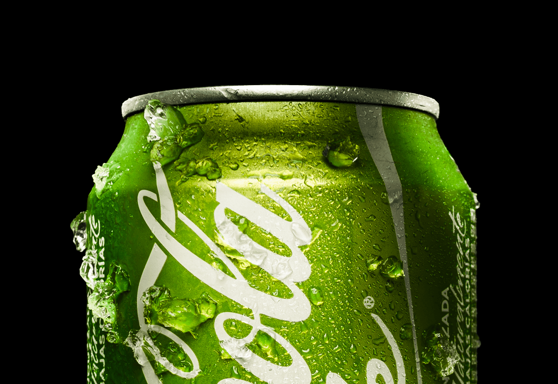
For instance, Coca-Cola carefully tested new premium packaging designs for its Coke Life product in selected markets before a broader launch, ensuring that the changes resonated with consumers and aligned with the brand’s overall image. This careful, phased approach allowed Coca-Cola to manage the risks associated with changing an established brand’s color scheme.
It’s also crucial, when launching a new product line, to ensure that new colors will fit with the existing ones in harmony.
Shelf presence should feel carefully coordinated, like a brand is hitting more notes, rather than playing disparate notes on disparate instruments.
READ MORE ON

Brand equity: why branding is an investment (and how to tell your CFO)
A brand is not a number, but it can bring numbers: when your brand equity is healthy, results follow.

How to Brief Your Branding Agency
Branding can take you anywhere, but do you know where you are headed? Here are some tips on how to brief your branding agency right.

Can AI visuals keep your brand authentic? Here’s how we do it.
As artificial intelligence tools get more powerful, you are probably tempted to create AI visuals for your brand. But should you do it?

Brand Packaging as an Act of Love
Brand packaging is not just a matter of aesthetics: it’s a mix of brand vision, user experience and pure fascination.
our newsletter


© 2009—2026 Sublimio


