
 by Andrea Ciulu
5 MIN. READ
14.12.2025
by Andrea Ciulu
5 MIN. READ
by Andrea Ciulu
5 MIN. READ
14.12.2025
by Andrea Ciulu
5 MIN. READ

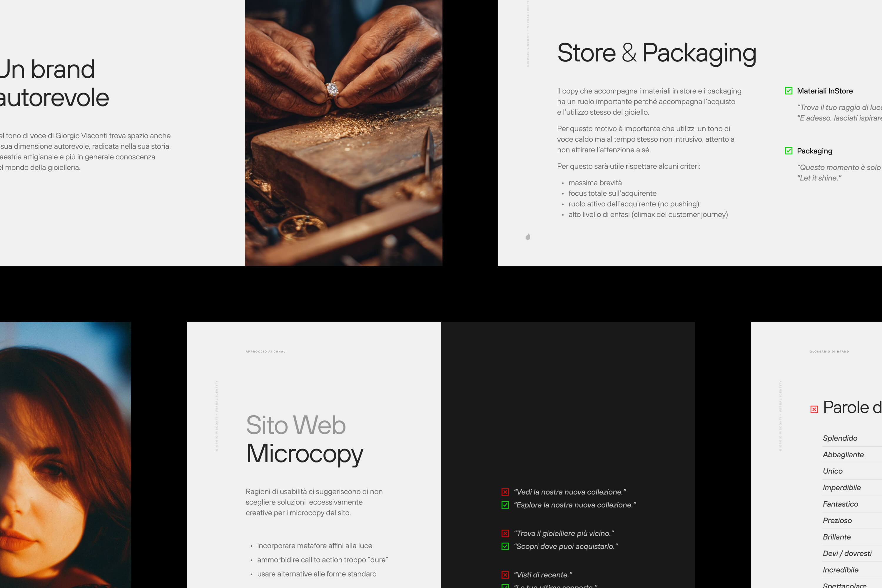
Don’t stop at tone of voice: crafting a verbal identity goes much deeper than that. For us, it’s a foundational element of the brand.
—
This is the eighth article in a series describing Sublimio’s approach to branding projects. In case you haven’t read the previous one about brand colors, you can find it here.
—
Crafting a verbal identity is a key moment in giving the brand tangible shape, as many of its strategic pillars will converge and be expressed into language.
As a consequence, verbal identity is not a separate layer; it is the brand’s fundamental reality, expressed in daily actions.
The core assumption is this: if the verbal identity isn’t treated as the bedrock, ensuring clarity, balance, and legibility before style is applied, the brand message will inevitably fail in real-world scenarios.
We test our verbal projects not just with clever phrasing, but with plain language. This foundational clarity is paramount because a brand is truly defined in countless, everyday micro-interactions, from a notification pop-up to an email subject line.
If the message falters when stripped of stylistic embellishment, it simply cannot succeed in the high-speed, real-time moments where the brand is truly perceived.
A distinct voice is therefore not a decorative garnish or a fix for a weak message. It is the essential, purposeful tool that ensures the brand is consistently understood and felt in every single interaction a person has with it.

Defining personality: beyond the “Brand Archetype” Chart
Brand archetypes are a powerful starting point.
In fact, many brands rely on them as an initial framework. However, like any framework – whether it’s the “color psychology chart” in design, this is only part of the story.
You cannot simply decide your brand is a “Jester” or a “Sage” and call it a day.
The real work begins by looking beyond basic definitions to consider the real-life experience of your target and the specific context of the interaction.
Take the tone “Authoritative.” Is it reassuring? Sure. If you are a surgeon, we want you to sound authoritative. But if you are a SaaS platform trying to simplify a complex workflow, “authoritative” can quickly read as “bureaucratic” or “condescending.”
Similarly, “Witty” is often requested by brands wanting to sound human. But if you work in fintech or insurance, wit is a dangerous game. A joke on a landing page might be engaging, but a witty error message when a transaction fails isn’t just annoying: it breaks trust.
Tones are not straightforward; they work within a system that guides their interpretation.
Building a Vocal Range, Not Just a Tone
We talk about “Verbal Identity” rather than just “Tone of Voice” because a brand needs more than one way to speak. You don’t need a single note; you need a palette.
Think about it: you don’t speak to your grandmother the same way you speak to your colleagues, yet you remain the same person. A brand must have that same flexibility.
When developing a strong, resilient Verbal Identity, you should always consider:
- Primary Tones
The keywords that anchor recognition (e.g., “Empathetic,” “Direct”).
- Supporting Tones
The nuances that scale the system depending on context (e.g., “Warm” for support emails, “Crisp” for UI buttons).
- The “Volume” Dial
Defining ratios so the voice feels intentional rather than noisy.
This ensures that whether the brand is on a giant billboard or a tiny mobile push notification, the personality remains consistent without becoming tone-deaf to the medium.
A good example of this is the banking service Monzo.
They explicitly codified their tonal spectrum into three distinct tiers that mirror your requirements. Their primary anchor is “Straightforward Kindness,” which serves as the “always-on” voice for banking transactions where clarity is non-negotiable.
However, they introduce a supporting nuance called “Everyday Magic” for moments where they can add value without adding noise (like categorizing spending).
Finally, they use “Warm Wit” as their volume dial, strictly reserving high-volume humor for non-stressful touchpoints (like changelogs or success screens) while turning the dial completely down for error messages or fraud alerts.
This structure allows them to sound like a human bank rather than a “funny” bank, preventing the common mistake of being witty when a user is panicked.
If you are interested, you can check their guidelines.

Applying nuance: the case of Sakari
Nuance is what makes verbal identity feel real and not just a layer of paint.
In our work with sake brand Sakari we had to navigate a complex scenario, with a traditional brand speaking to a global audience, having to balance tradition and accessibility.
It was not just about alternating between these two extremes (that would feel unnatural) but about “moving the slider” between the two, allowing some playfulness into our copy when possible while never betraying the brand’s respectable profile.
This hybrid profile of a “playful but traditional brand” makes the brand feel unique both compared to overly-playful pop brands and to rigorous and stiff traditional ones.
Check out the age verification screen on Sakari’s website to know what we mean.
Making verbal identity accessible to everyone
A verbal identity guide should be an operational document, not an inspirational one.
We always design it as a manual to be used by people in different roles, even if they are not familiar with branding: after all, they are becoming the brand’s voice whenever they write and communicate.
Boundaries must be clear, contexts of use must be grounded in real life and easy to recognize. Principles must be stark, unambiguous, decisive.
This often requires some early interviews with the brand’s people to understand what their reality looks like.
There’s no point in feeding them ideas for billboards if all they do is social ads and customer care. Or if their audience is mostly made of disgruntled long-term customers rather than enthusiastic Gen-Z hyperadopters.
In other words: it’s about how you say it, but also about where, when and to whom you do.
READ MORE ON

Do you have a brand architecture? Here’s why you should
If you find the term “brand architecture” intimidating, you might want to do this. Because the right one makes all the difference for your business.

Brand equity: why branding is an investment (and how to tell your CFO)
A brand is not a number, but it can bring numbers: when your brand equity is healthy, results follow.

How to Brief Your Branding Agency
Branding can take you anywhere, but do you know where you are headed? Here are some tips on how to brief your branding agency right.

Can AI visuals keep your brand authentic? Here’s how we do it.
As artificial intelligence tools get more powerful, you are probably tempted to create AI visuals for your brand. But should you do it?
our newsletter


© 2009—2026 Sublimio


