


Sakari
We helped a 130-year-old Japanese sake brewery go global in style. A cross-cultural collaboration for a project that demanded a broader point of view, and standards worthy of an Emperor.

Brewing sake is a millenary tradition in Japan, and yet most of the world doesn’t have a clear understanding of this drink. Many think it’s a very alcoholic drink – which it is not. Others only tried it warm at the local sushi bar.
Nihonsakari, a 130-years-old brewery from Nishinomiya that has long been the selected supplier for the Japanese Imperial Household, knew that in order to go global it had to help its new audience see sake as they had never seen it before: as a convivial drink to be enjoyed during any meal or a relaxed time with friends, and not as a spirit limited to special occasions, as it is often perceived outside of Japan.
This is how the Sakari brand was born. Designed to differentiate itself from the traditional and somewhat mysterious image of sake, Sakari is a contemporary sake brand based on the idea of ”brewing joy”.

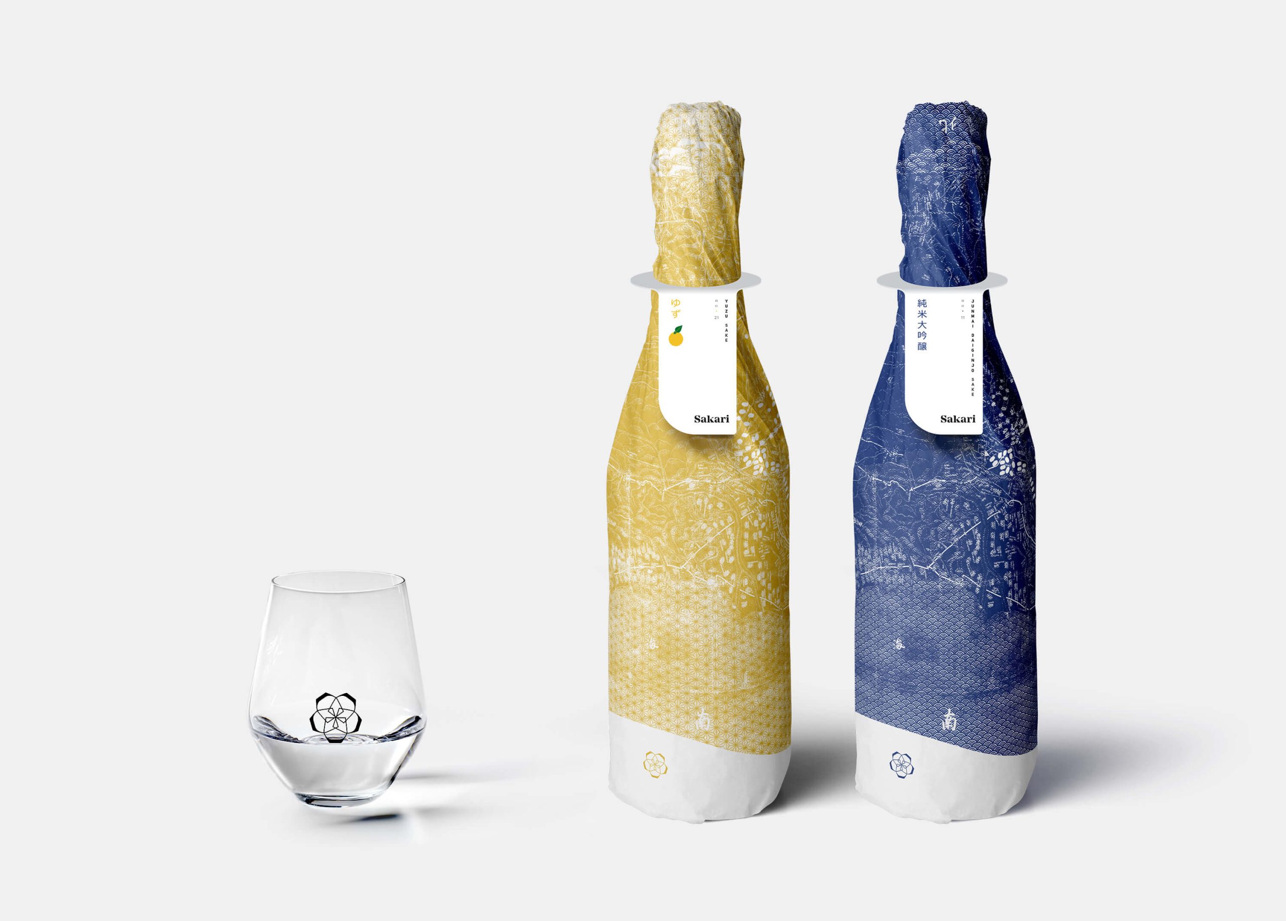
Sakari’s logo is a hint at its history: the five sake glasses that create a sakura flower are a reference to the five founders of the brewery.

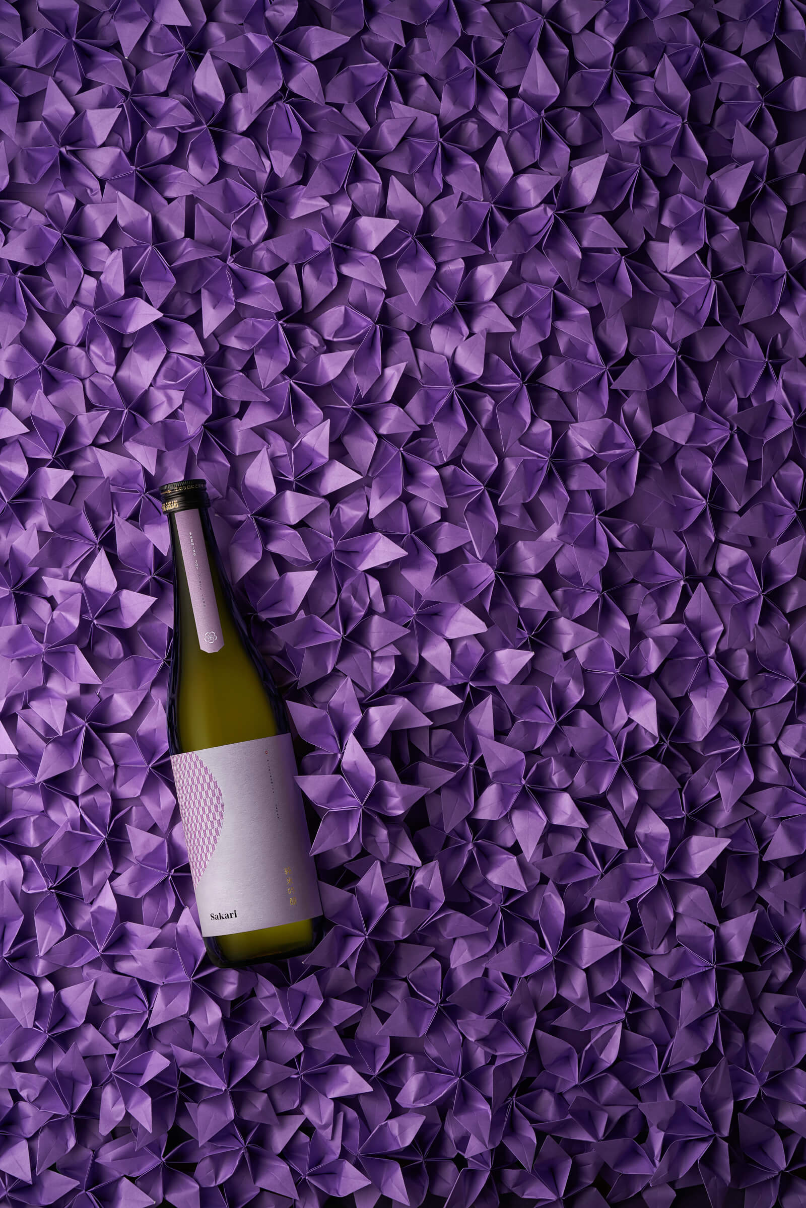
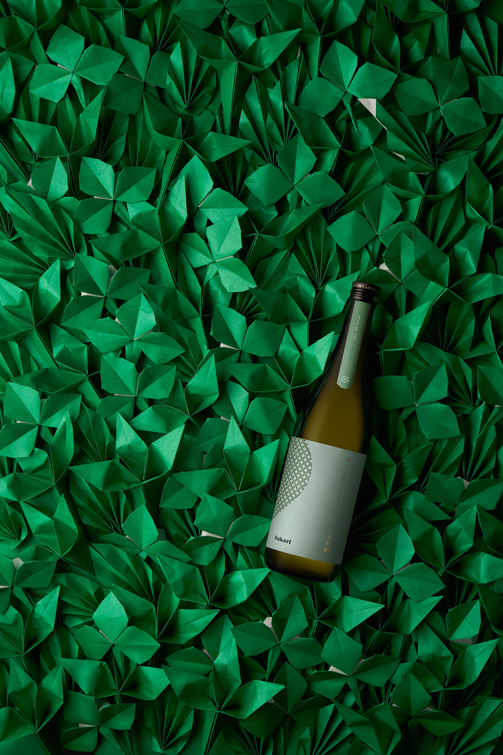
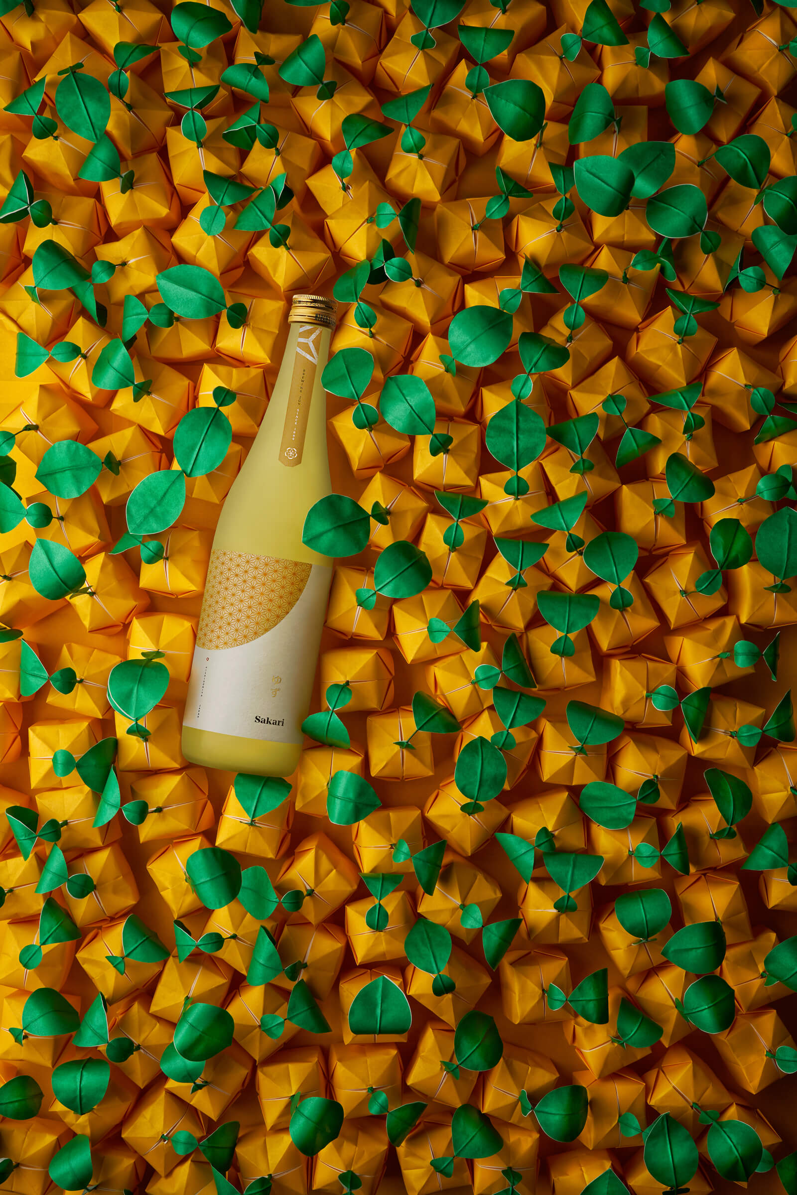
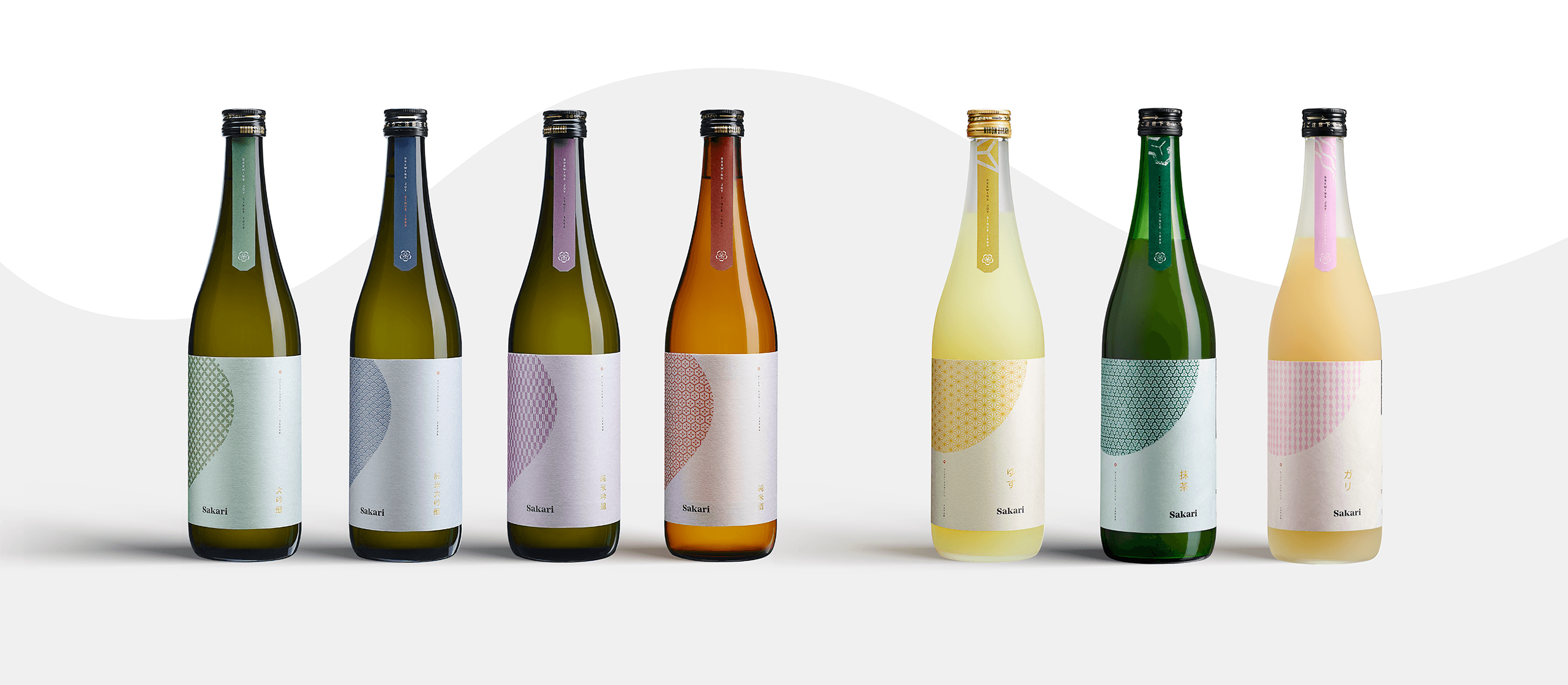
Labels take cues from Japanese traditions: every color and pattern has a very specific meaning.
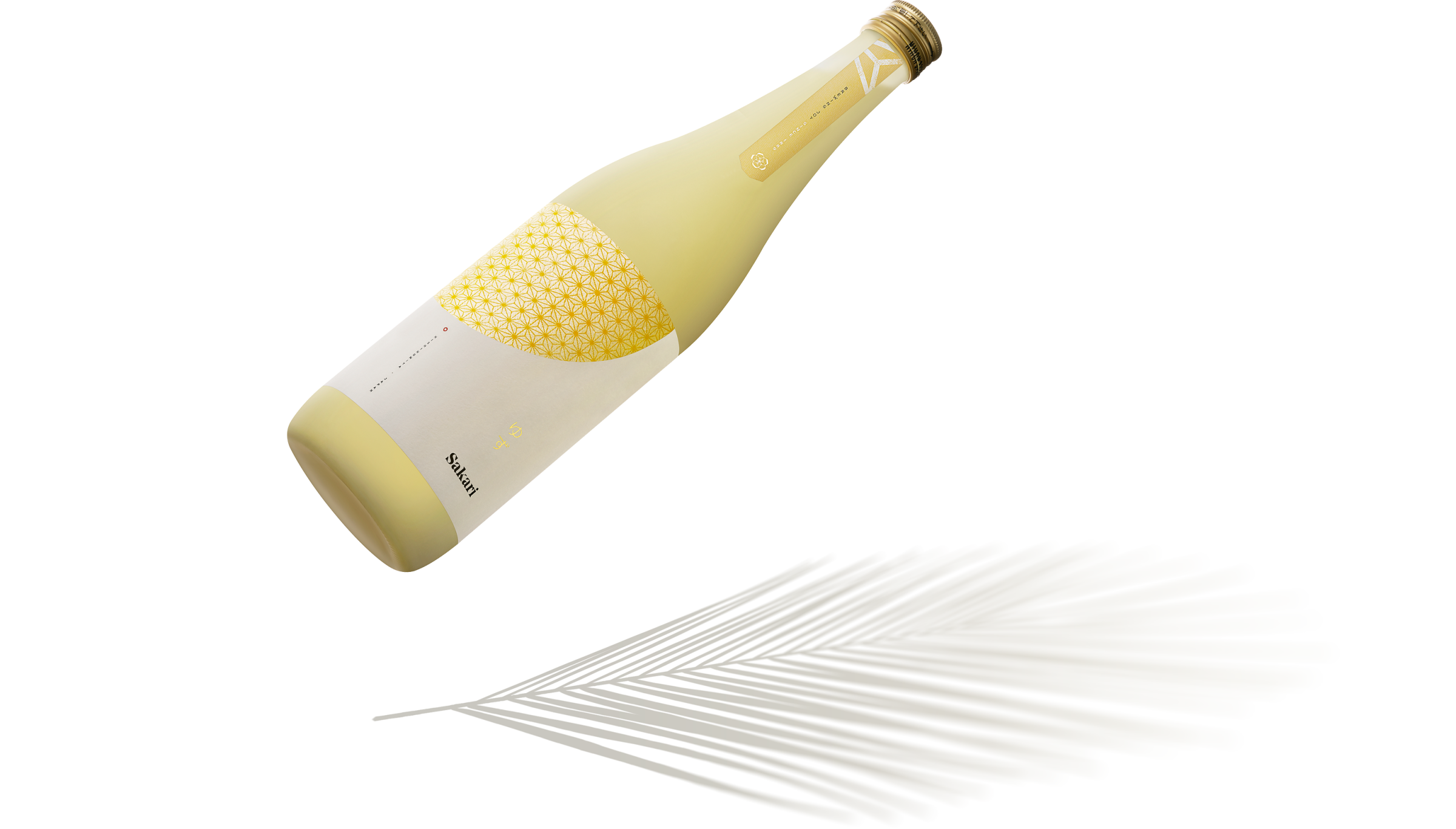
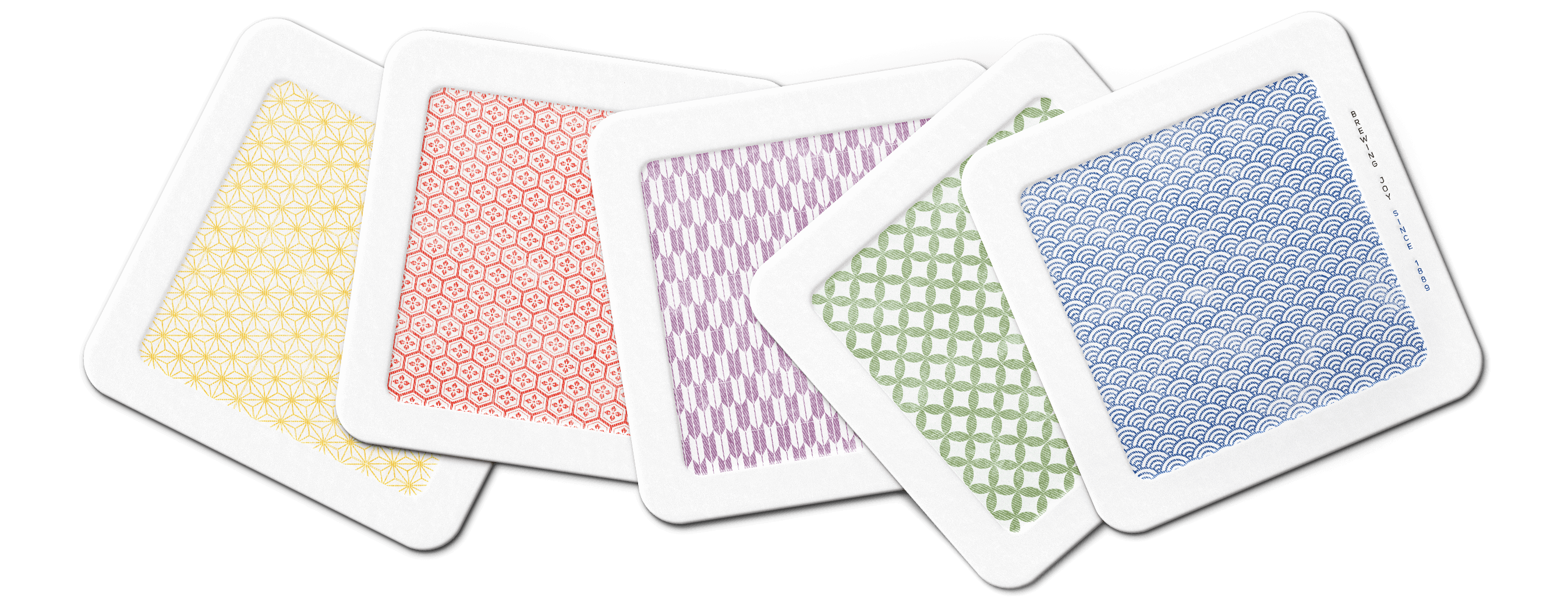

After analyzing the cultural trends and perceptions surrounding sake and Japan, we developed a brand strategy meant to bring sake closer to our audience.
Sakari embodies a specific image of Japan: warm and cozy, in balance between tradition and a more contemporary taste. Sakari is a relatable brand, willing to educate its audience without pomp or solemnity.
The visual identity has clear Japanese roots, but they are reinvented to be easily readable and recognizable by a non-Japanese audience.
Making a brand go global is about more than just amplifying its reach. What was relevant for the home market might not be as important for going abroad.
We had to help Sakari translate its deeply-rooted values for a non-Japanese audience, navigating over simplifications, stereotypes and misunderstandings. Coming from different cultures, the dialogue between Sublimio and Sakari was one of continuous mutual learning.
Sakari Sake website was designed from this perspective: a journey in understanding the true nature of sake from a non-Japanese point of view.
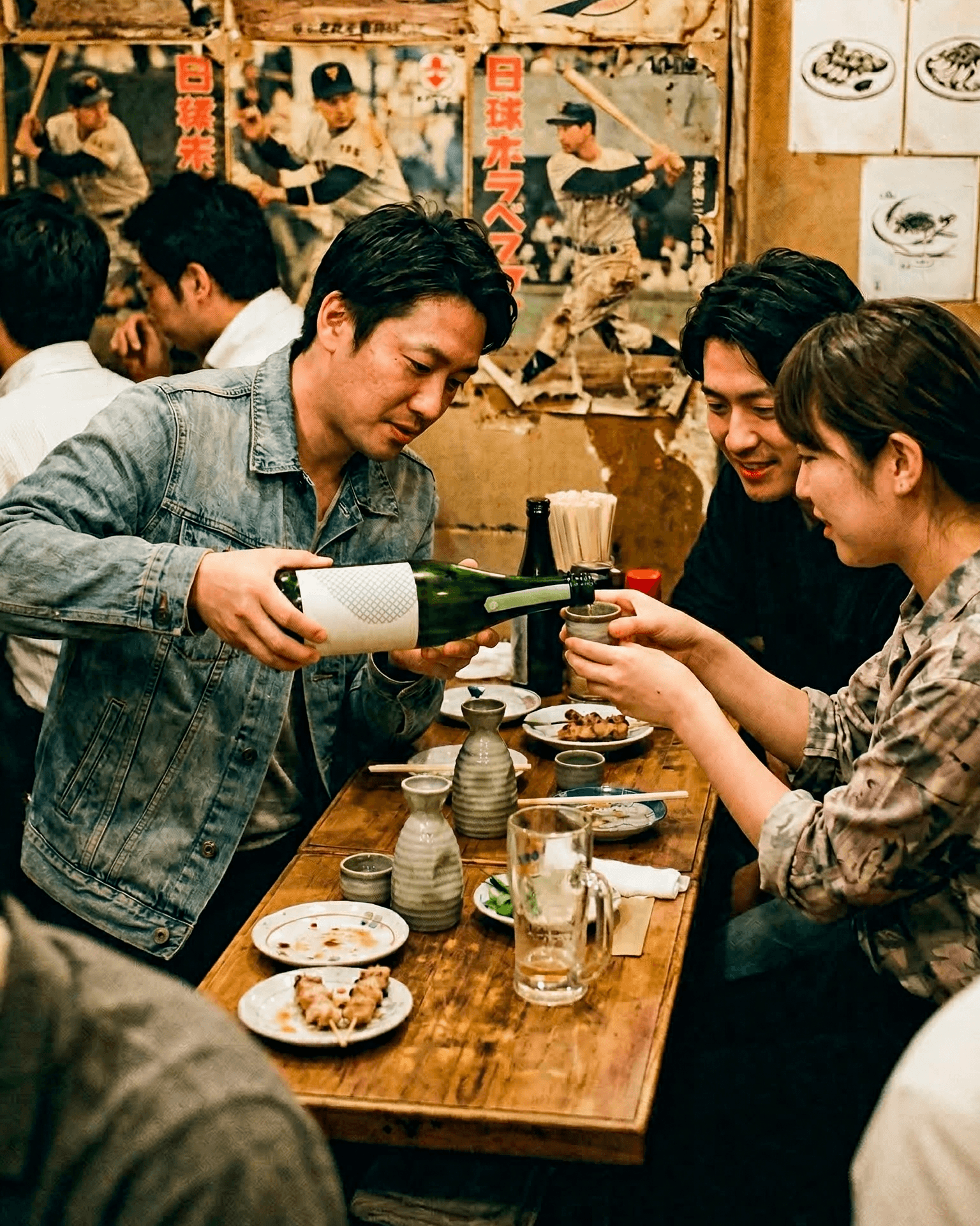
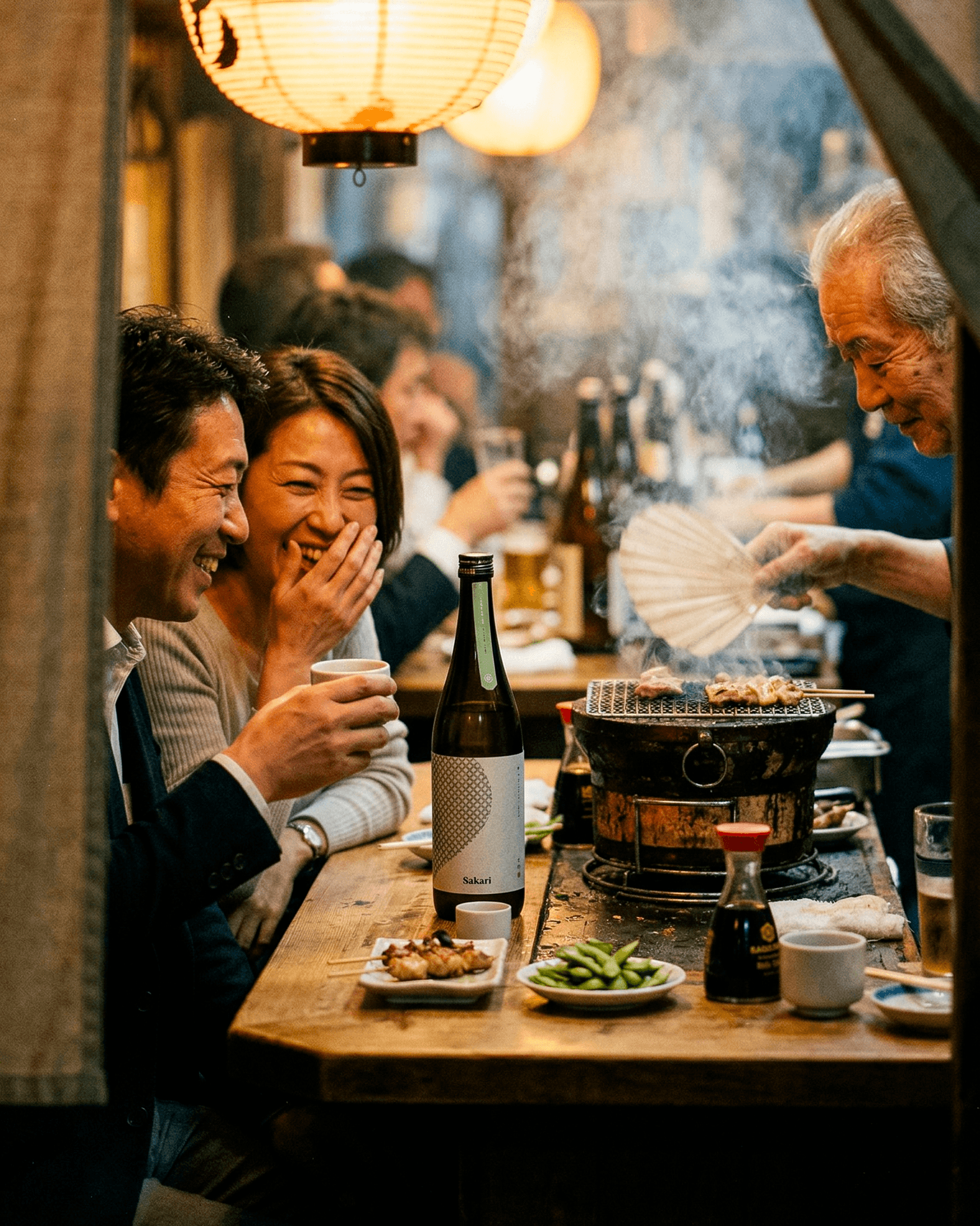
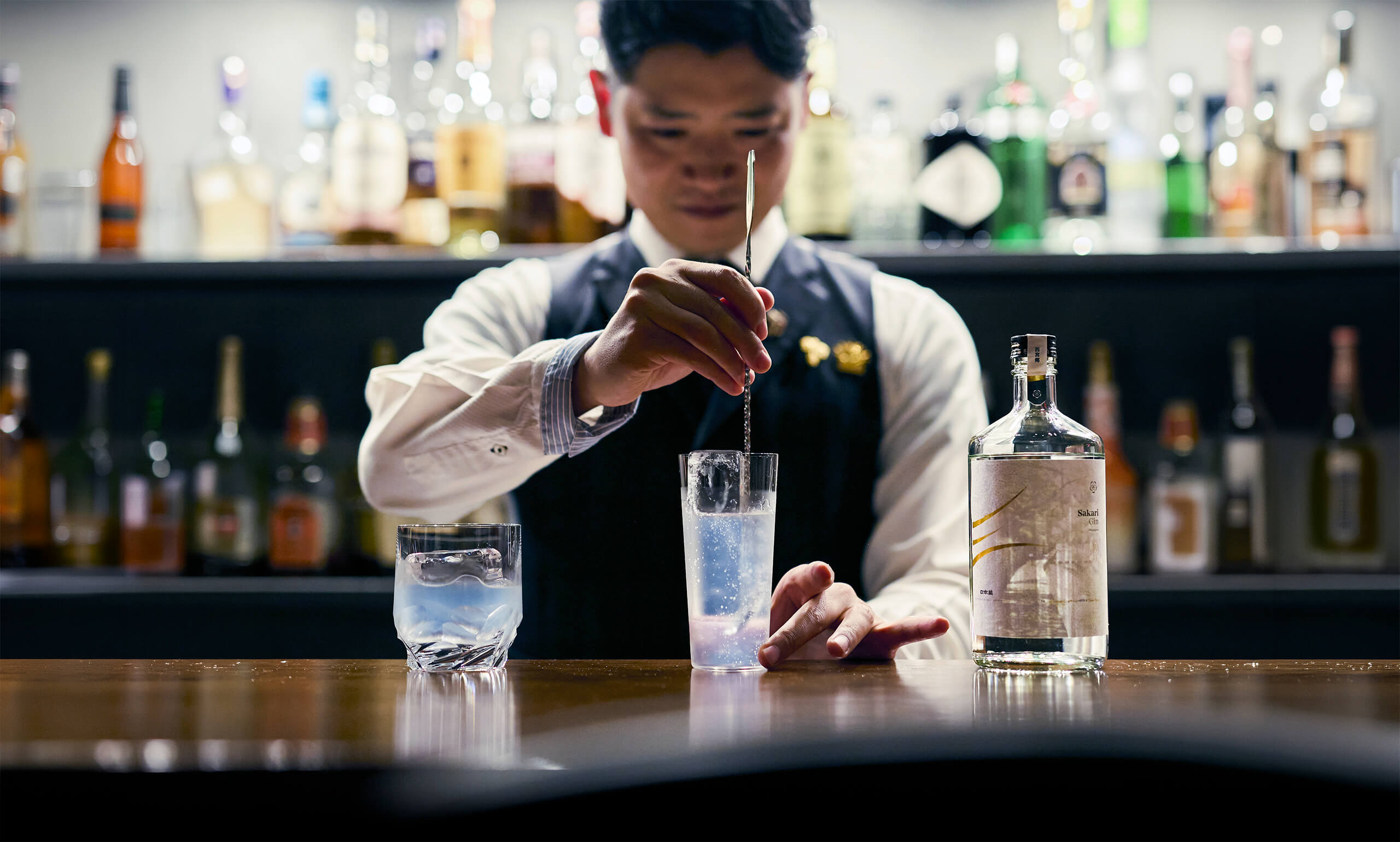
Sakari’s line expanded beyond sake with its own gin. A brand extension that had to retain the original soul.
After launching its sake, we helped Sakari launch its own gin. A product that brings a touch of originality by adding flavors that are typical of sake, notably sake kasu and sugi (cedarwood).
We had to make sure this distinctive trait would be part of the identity. This led us to the tagline “The Japanese Craft Gin With a Sake Soul”.
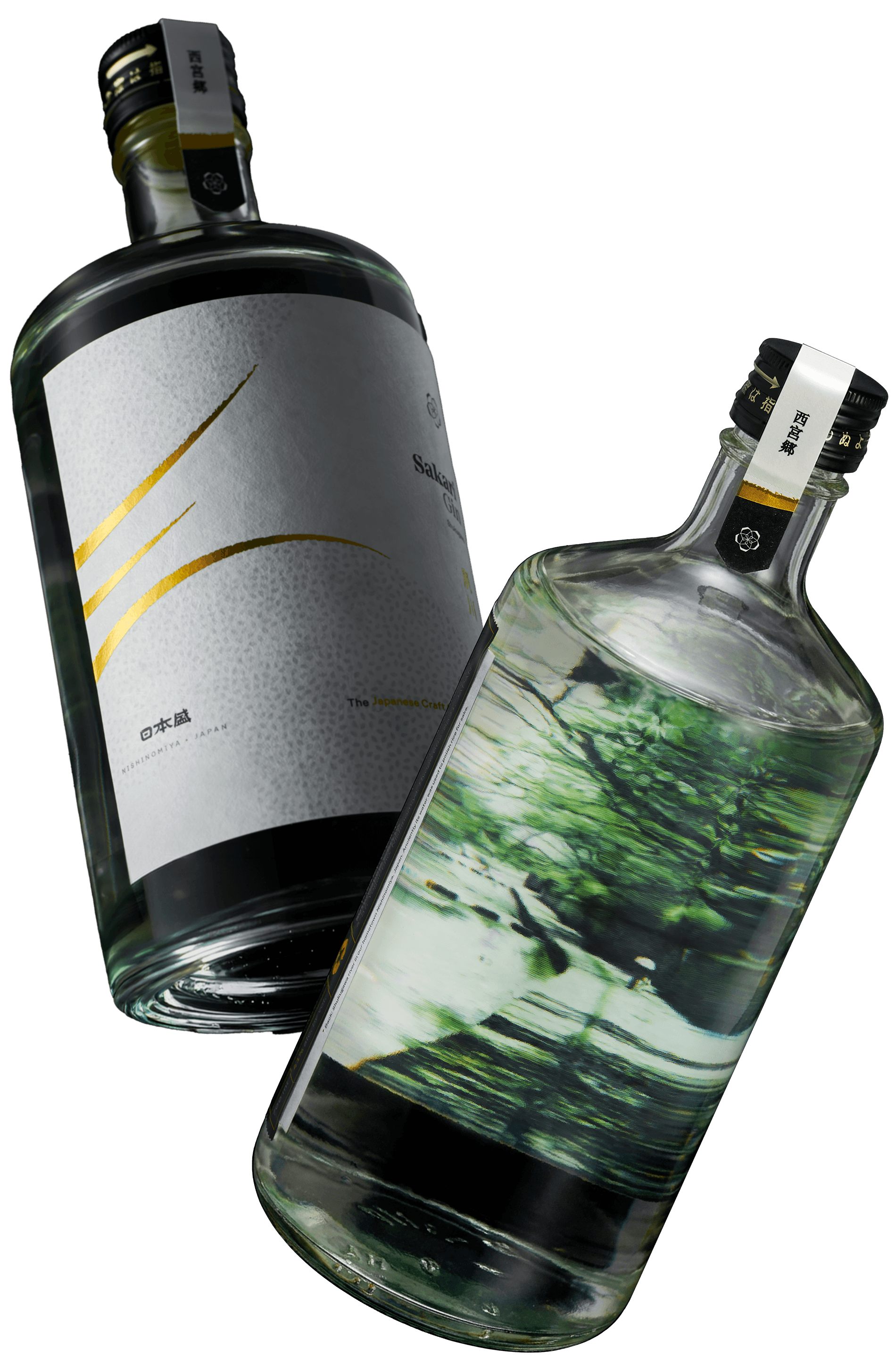
The world of gin is very nuanced and the audience is experienced and selective. You need to do your homework.

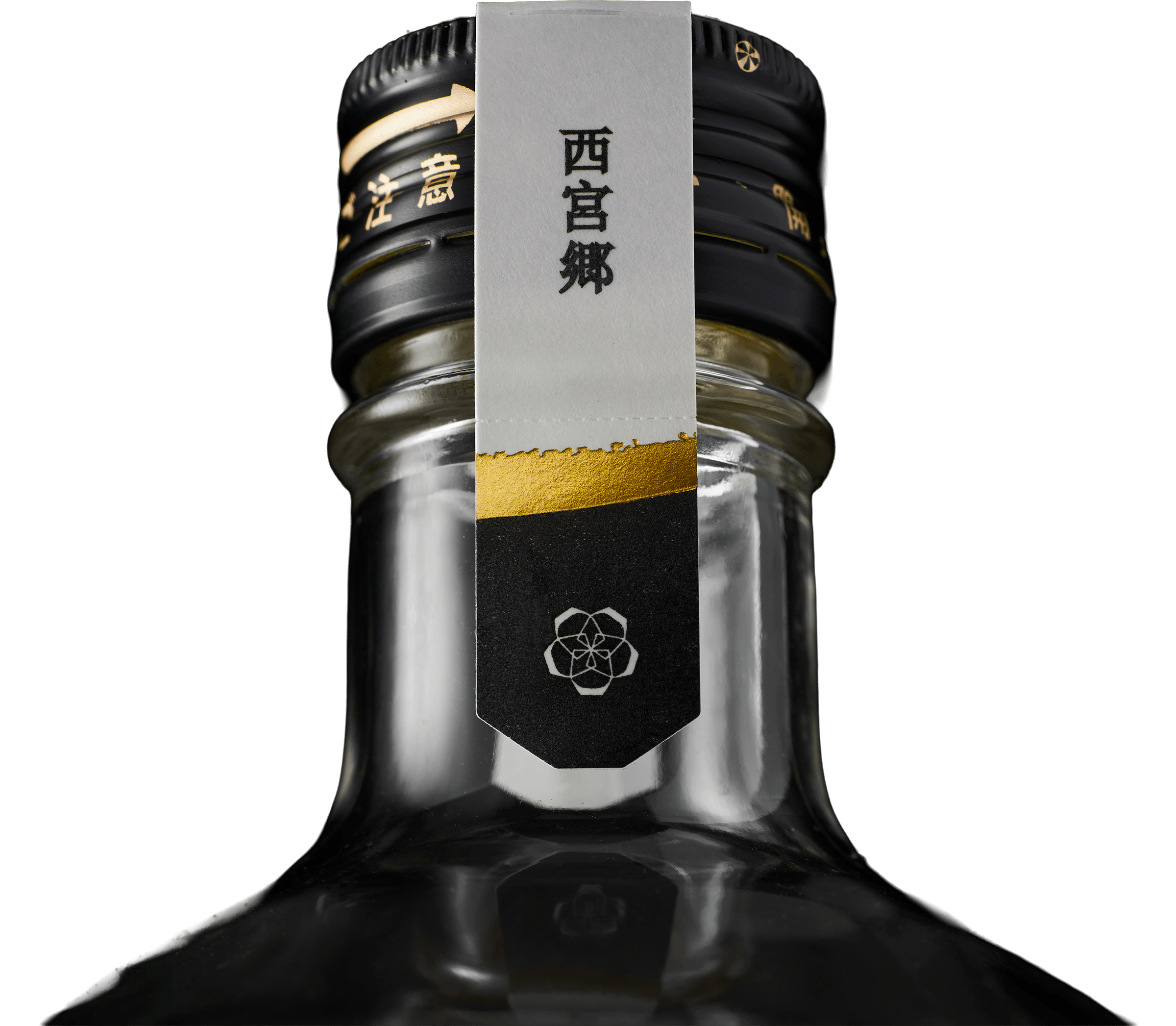
While Sakari Gin can be considered a “spin off” of its parent sake brand, we aimed at giving it a distinct look and personality, as its audience is naturally quite different.
This meant adapting the tone of voice, visual imagery and brand identity to reflect a different mood, inspired by the nights of Japanese metropolises, closer to the use case of the product (drinks in cocktail bars).
Sakari Gin’s website takes cues from its sake counterpart, but with an added focus on botanicals.
Time to work on your project, now.
GET IN TOUCH

© 2009—2026 Sublimio


