


MessUp
We brought to life the brand for a creative agency that wanted to stand out of the crowd. By addressing the flaws of the industry, we created a natural-born challenger, proud of its imperfections.
Creating the brand for a creative agency is no easy task: apparently, plenty of perfectly good players are on the market. And “perfect” is the keyword here.
As we started analyzing what was missing from the industry, we were surprised to find it was… imperfection.
But you could also say humanity.
The rise of optimization, AI, best practices, and performance marketing, has led to communication becoming a pretty sterile and commoditized practice, with the human element being progressively pushed to the side.
The aim for perfection has made most communication look alike, not unlike pop songs or car designs.
So we created a brand that would stand up for imperfection as a mark of humanity, and thus a prerequisite for breakthrough creativity.
The MessUp brand was born, with an identity and a tone of voice that would challenge all conventions of what “good design” is, while staying deeply professional.
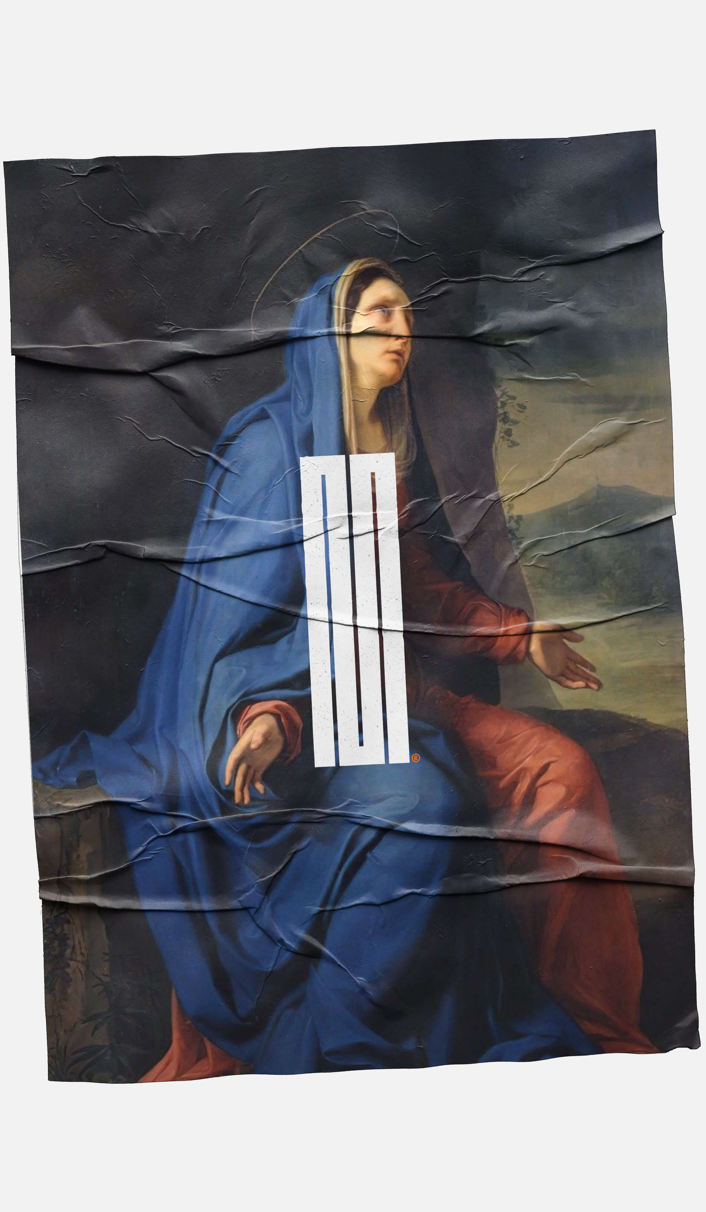
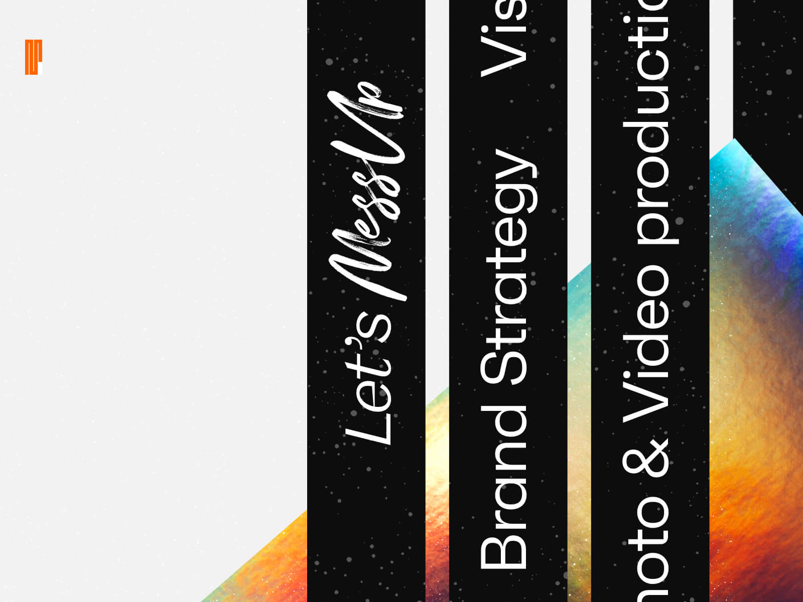
The logo was designed to become an endless pattern.
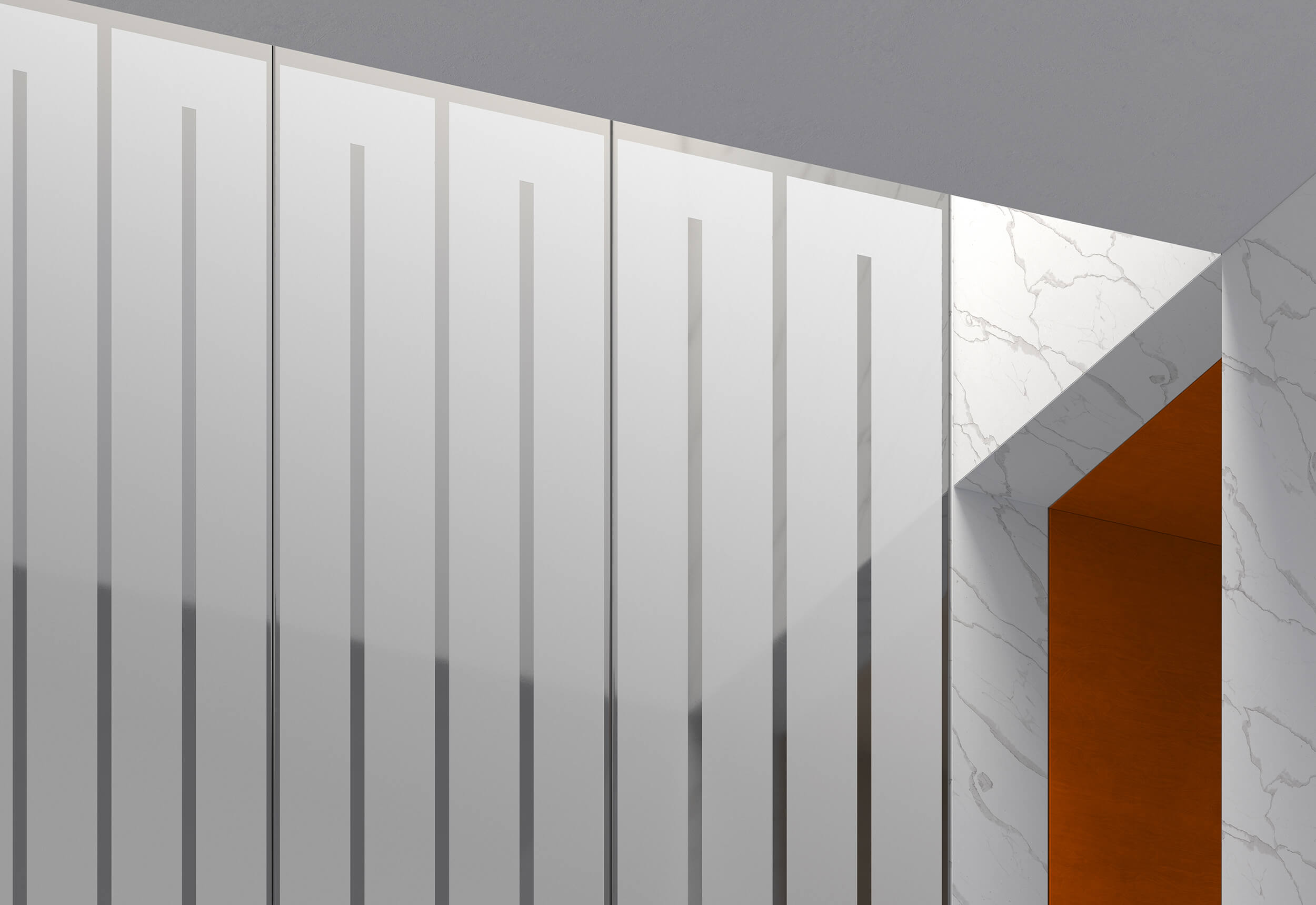
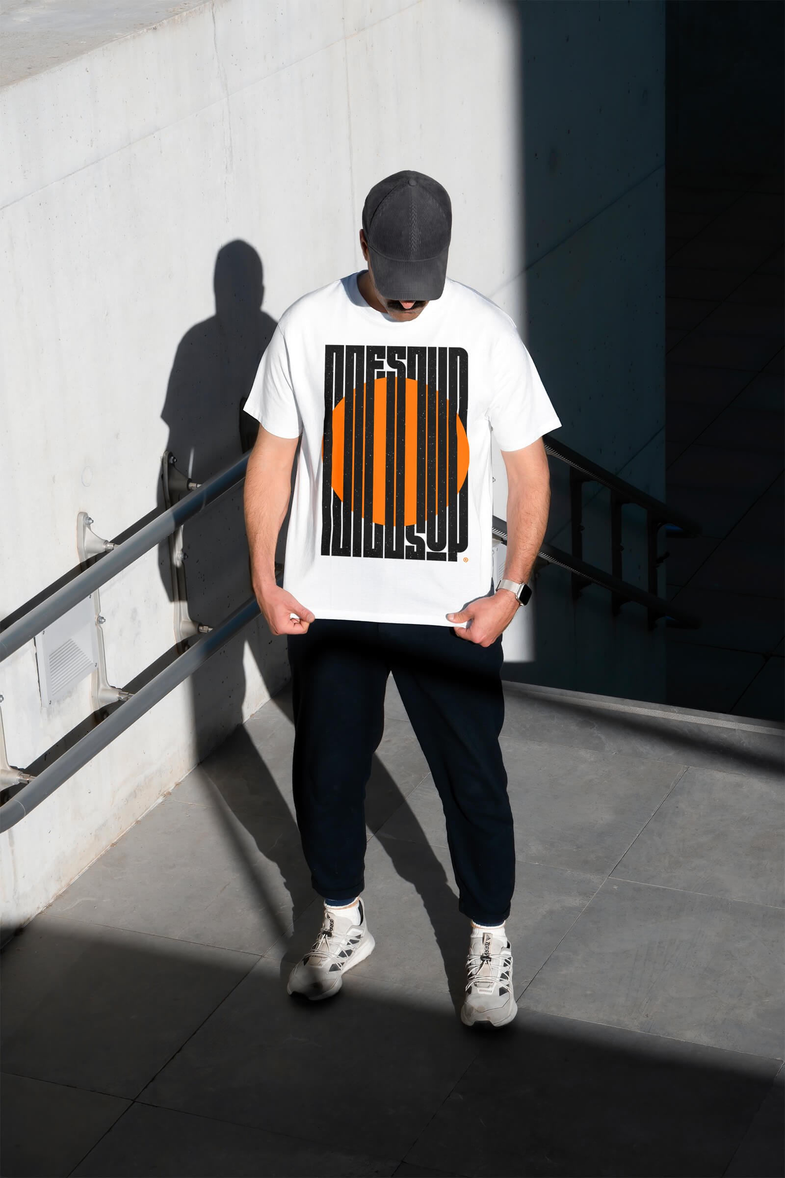

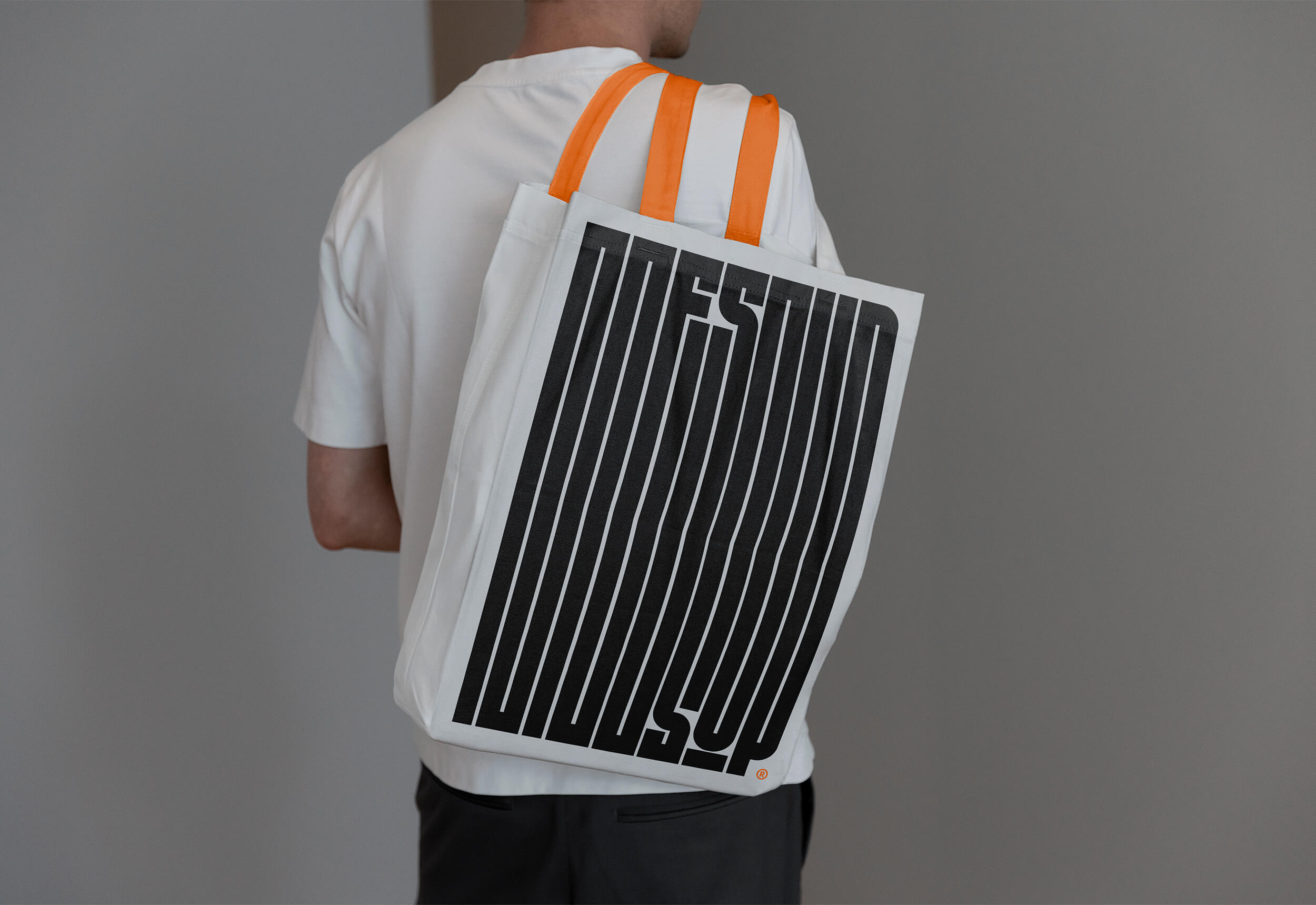
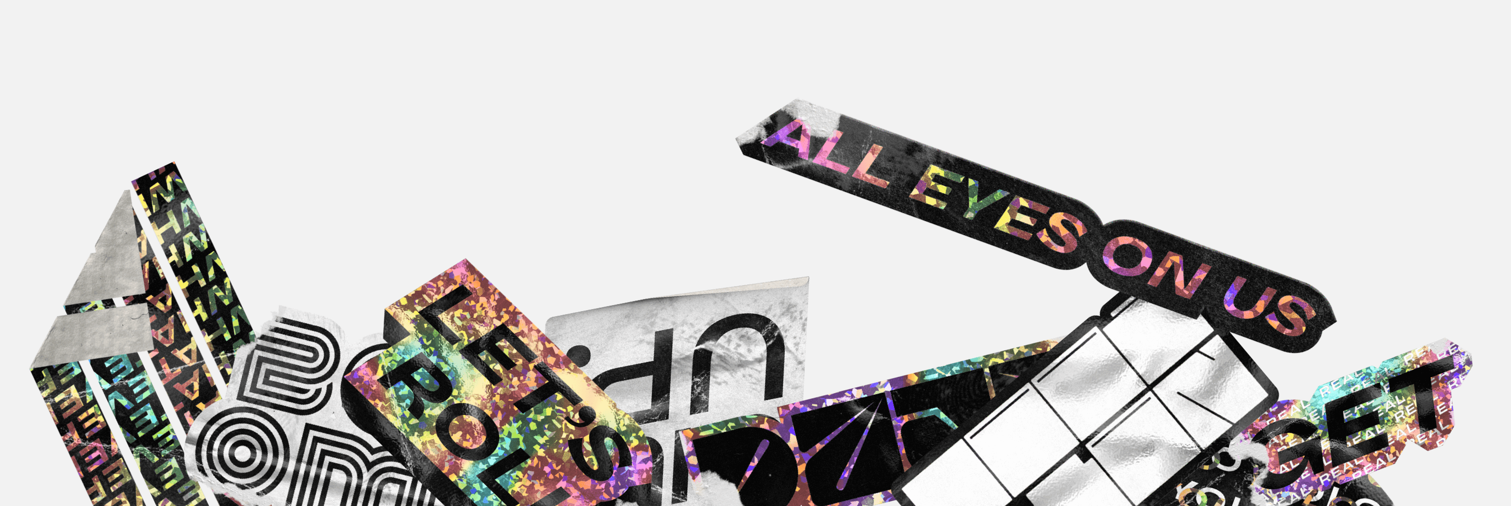
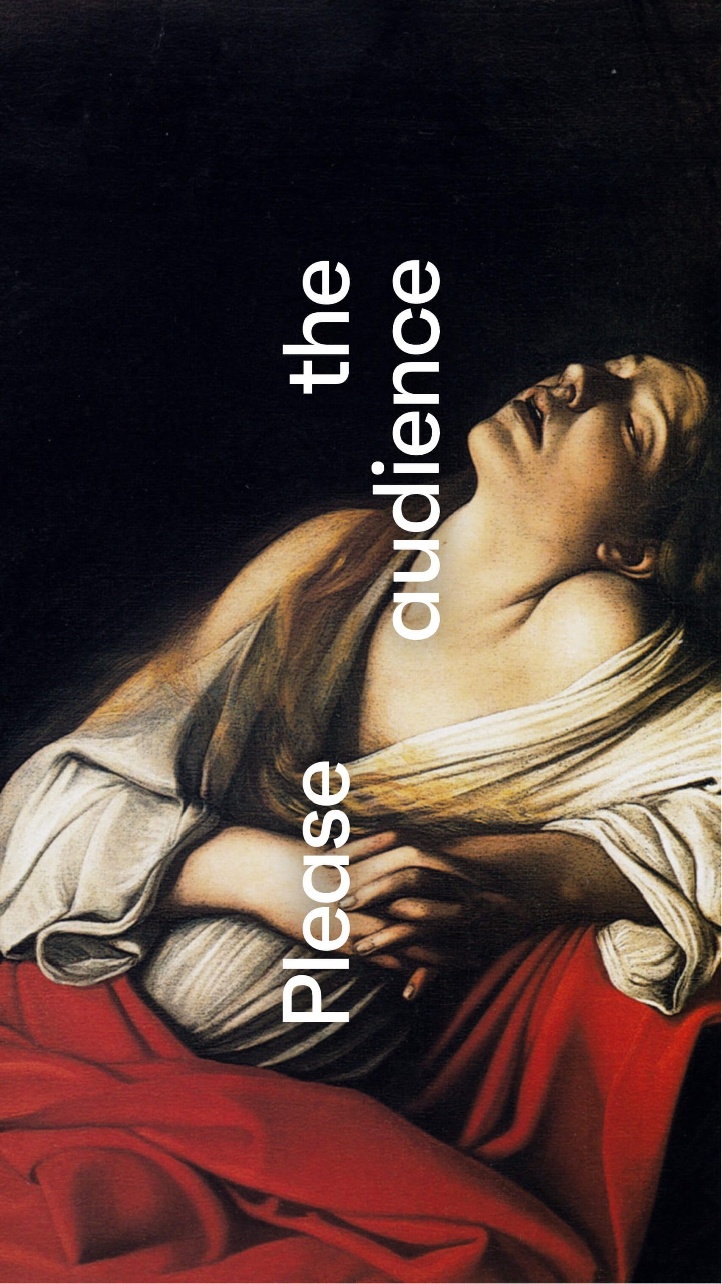
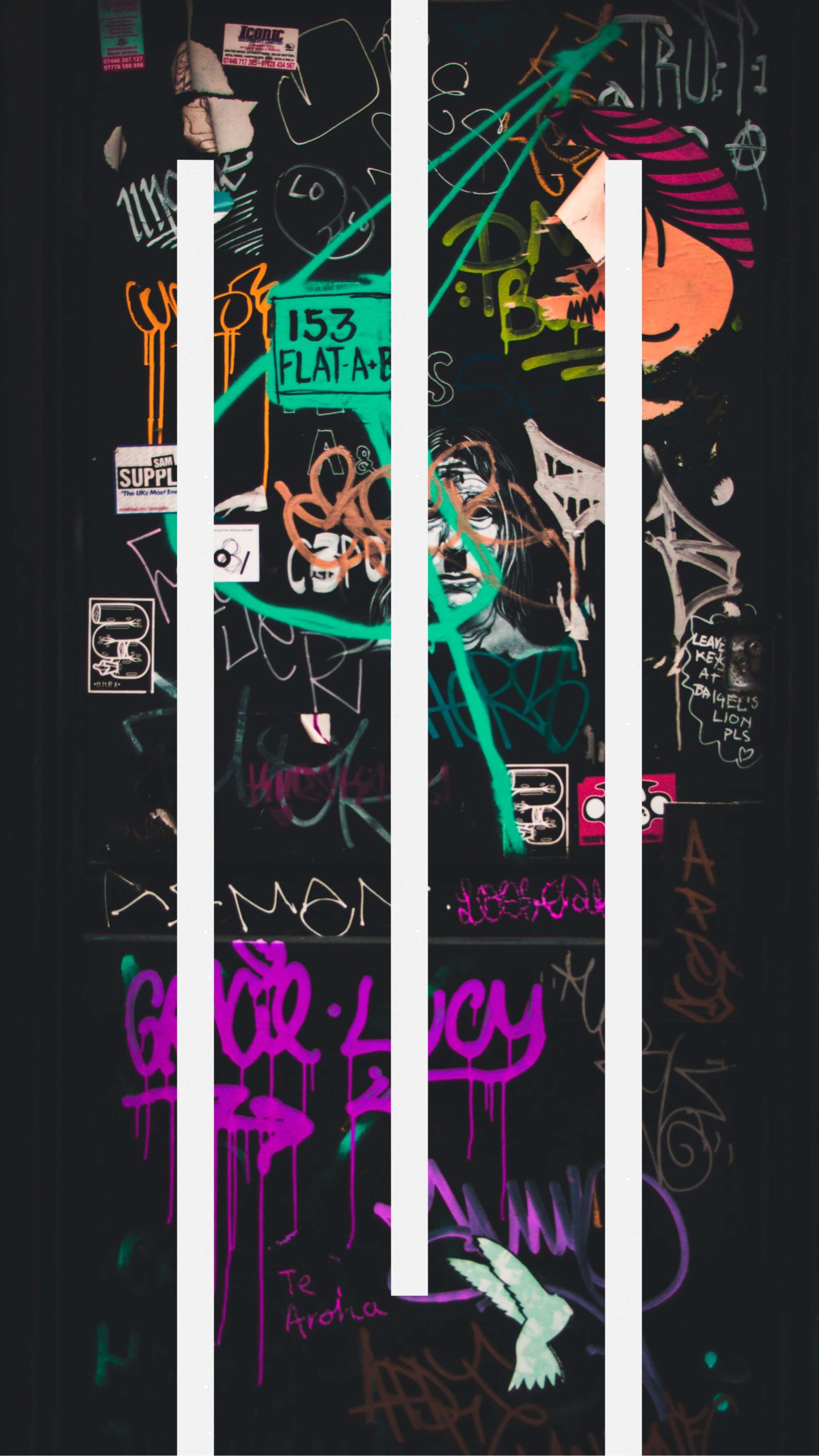
Inspired by a mix of street culture and 80s aesthetics, the visual identity of MessUp is hard to ignore.
Bold, brash and noisy, it brings the brand’s character to life.
The main idea here is to challenge minimalism: away with neutered palettes, small sober fonts, and perfect layouts.
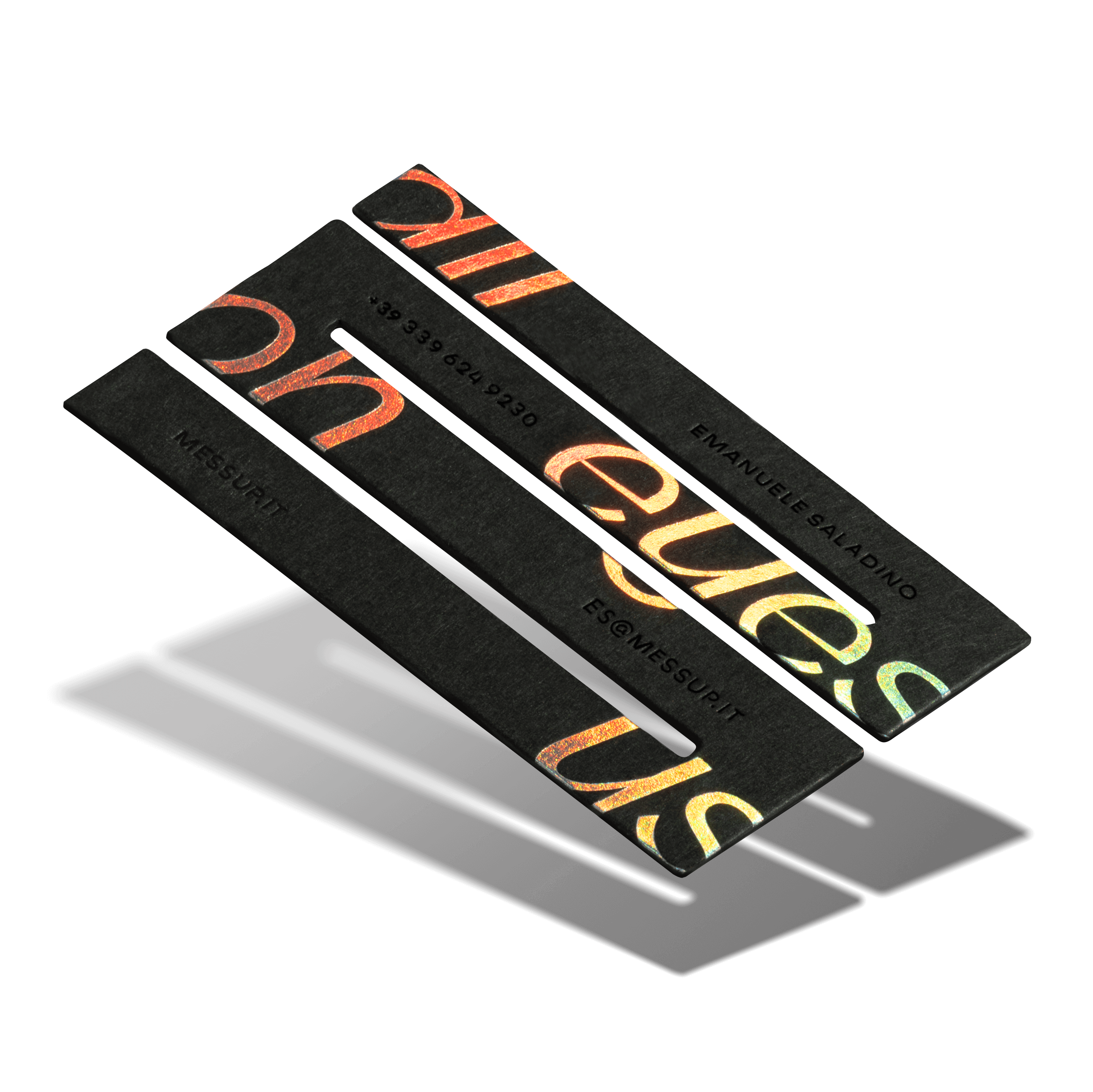
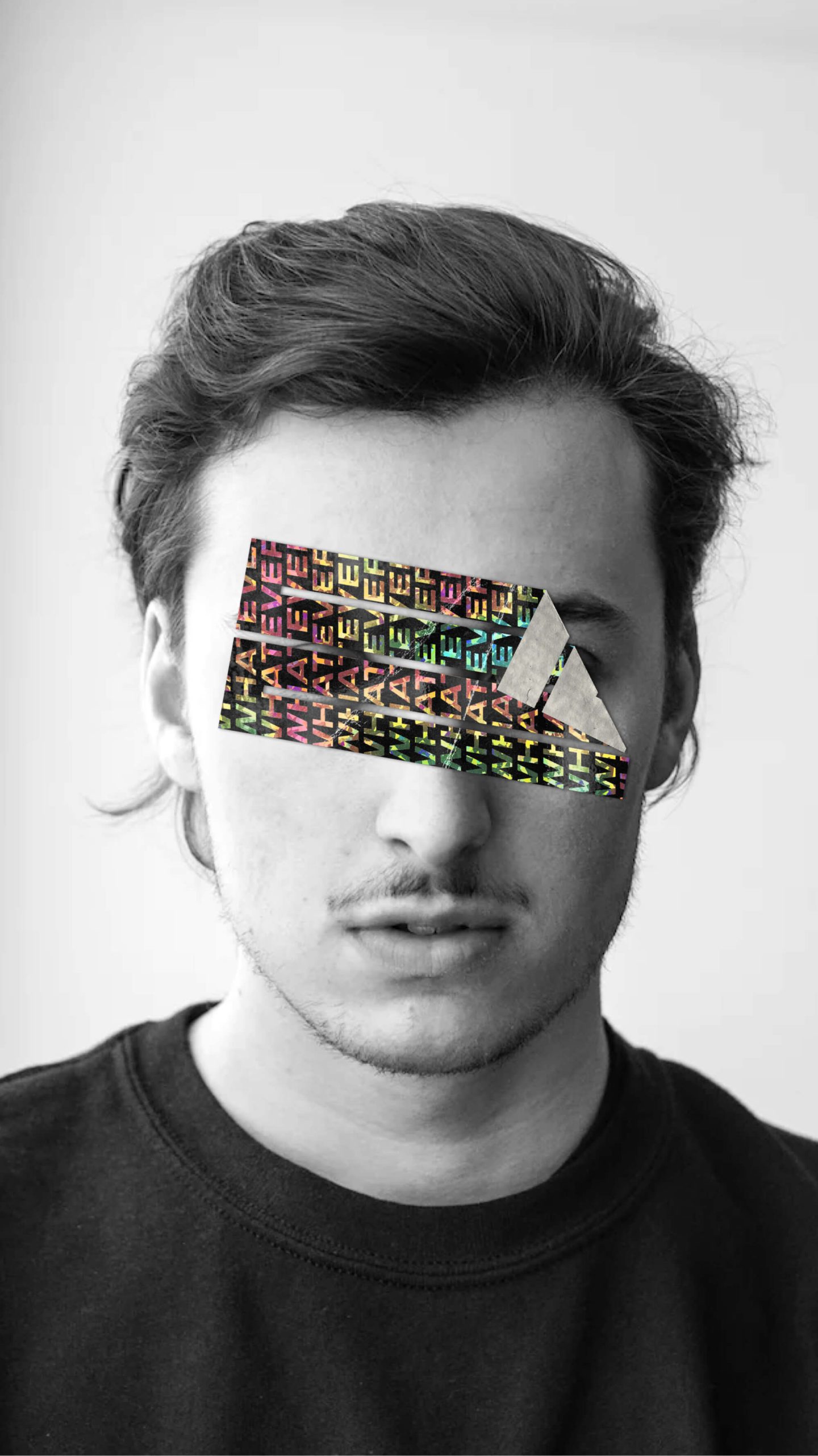
Special stickers were designed to be an integral part of the identity.
Our approach to design is apparently messy, while very rigorous underneath, but most of all consistently unexpected: even the navigation system of the website is a direct defiance of best practices.
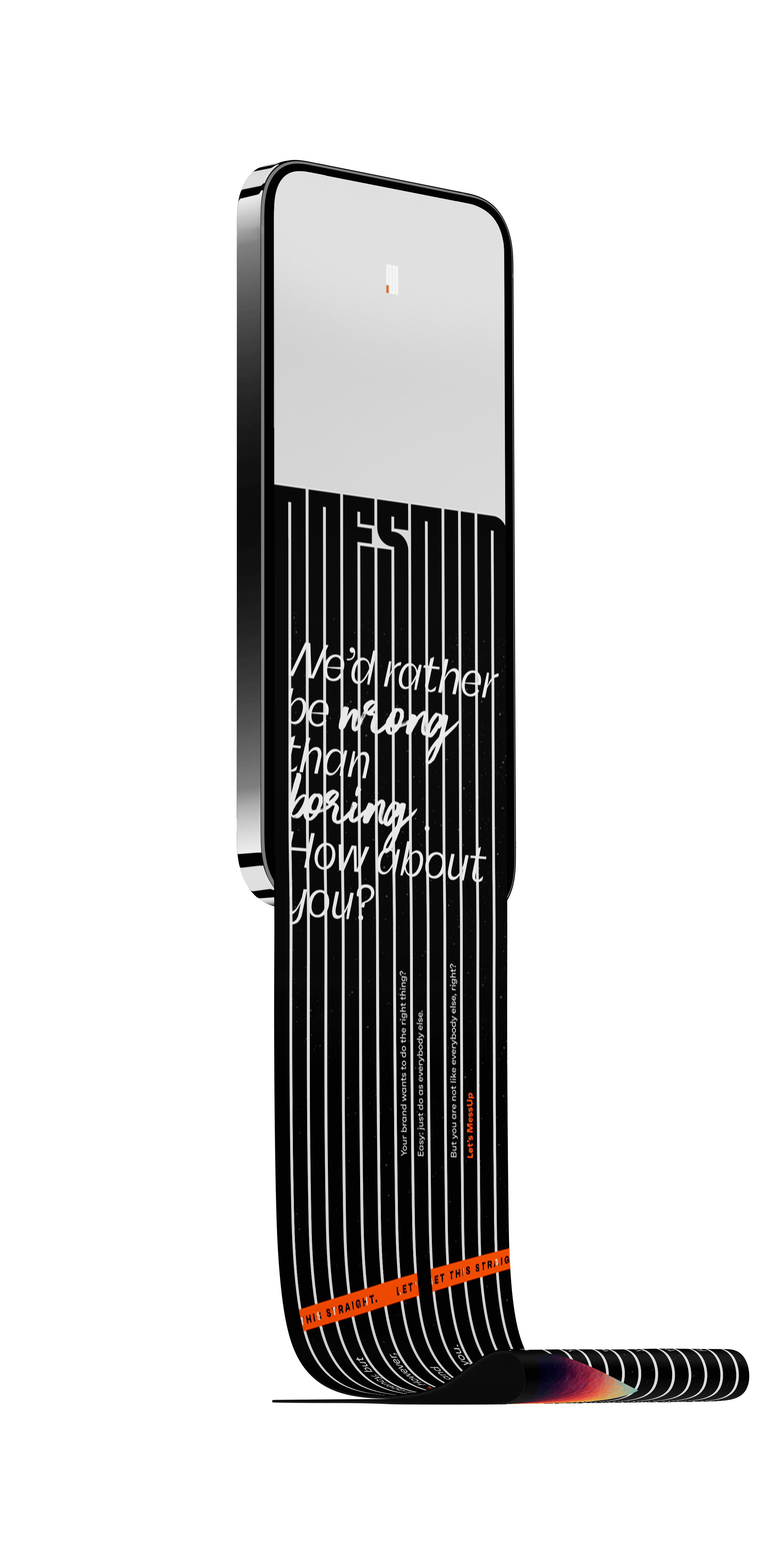
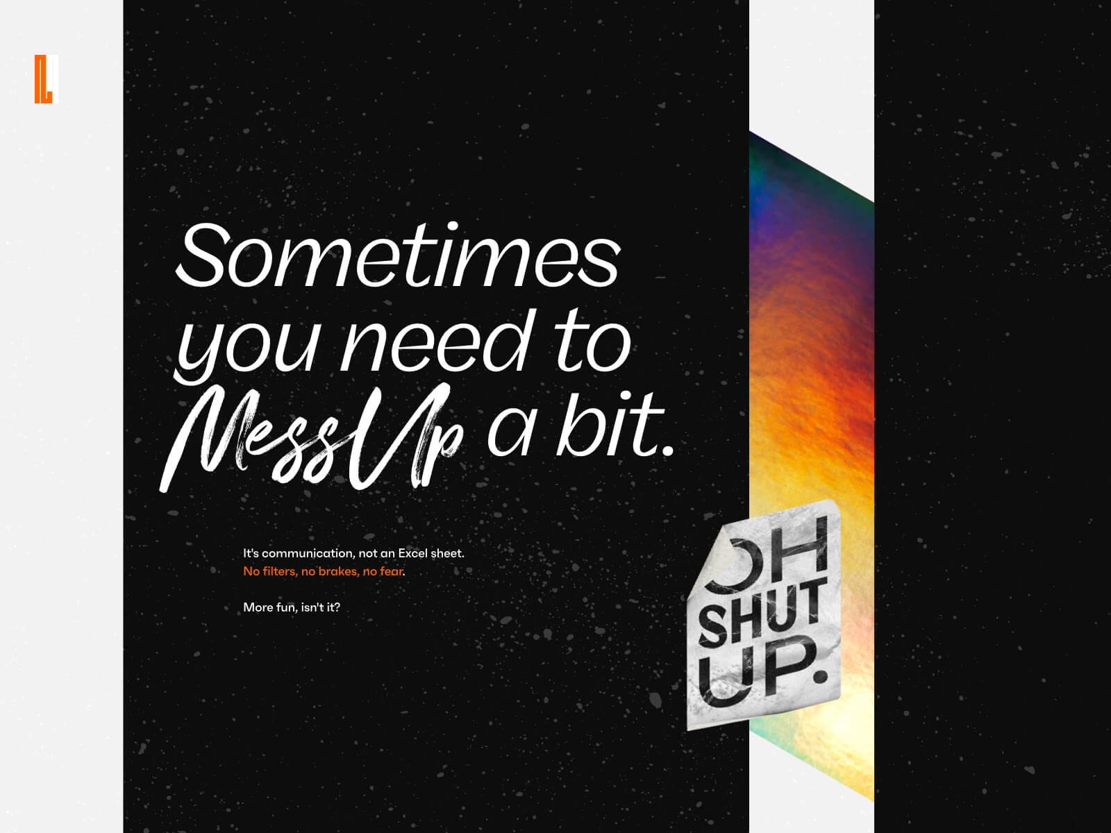
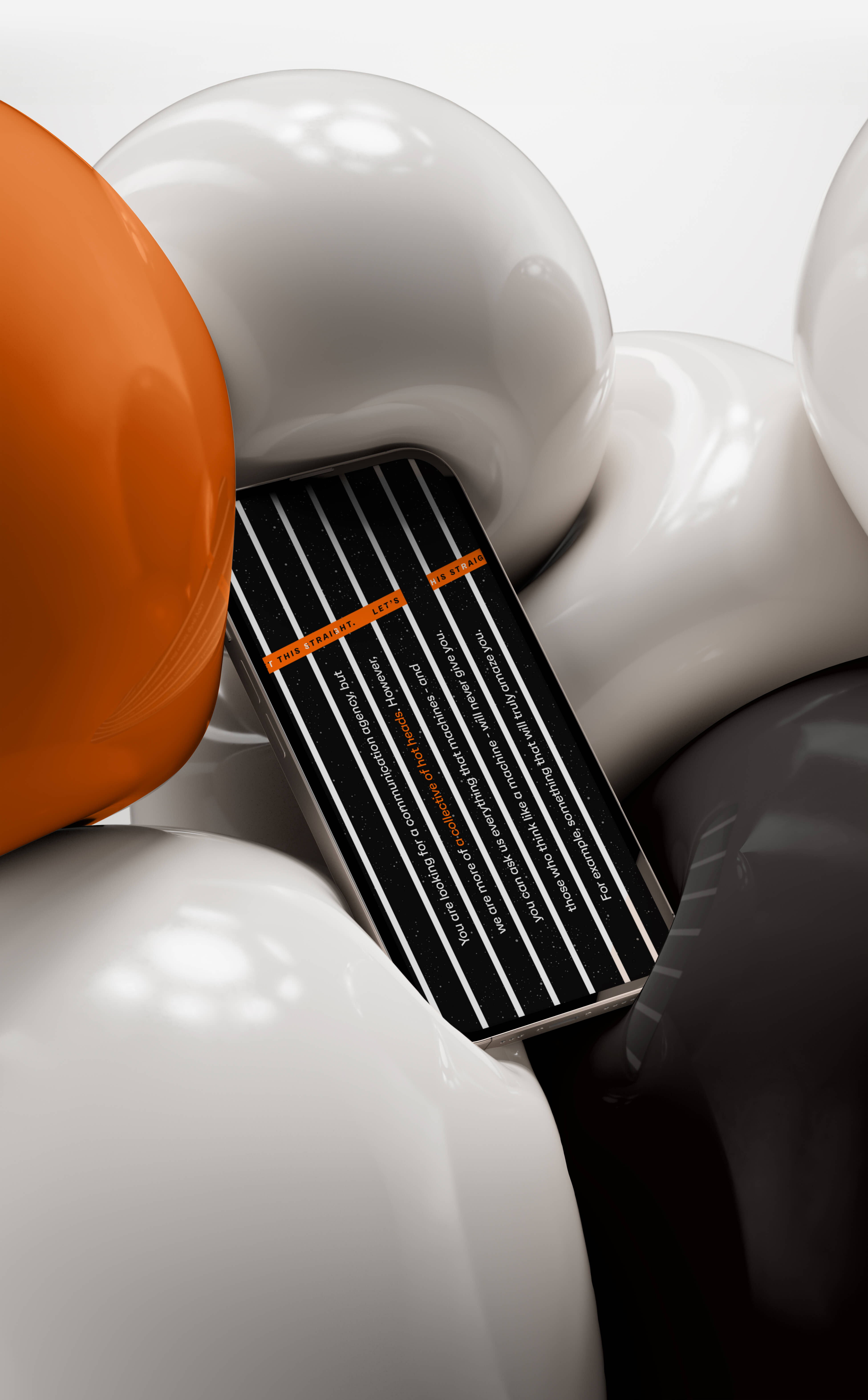
Messup’s website hits hard.
SEE FOR YOURSELFMessUp also stands out for its tone of voice: loud, proud and straightforward.
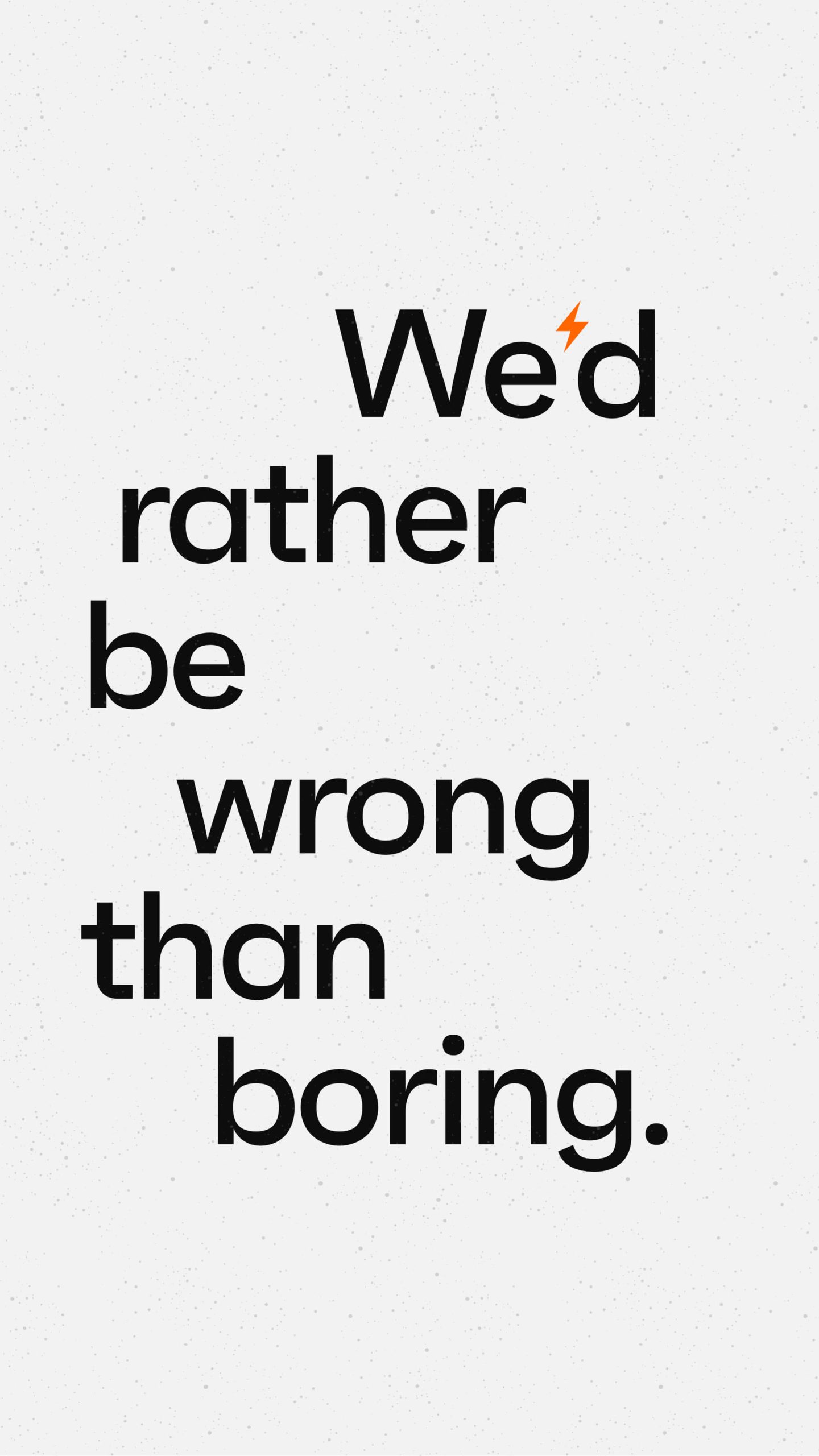
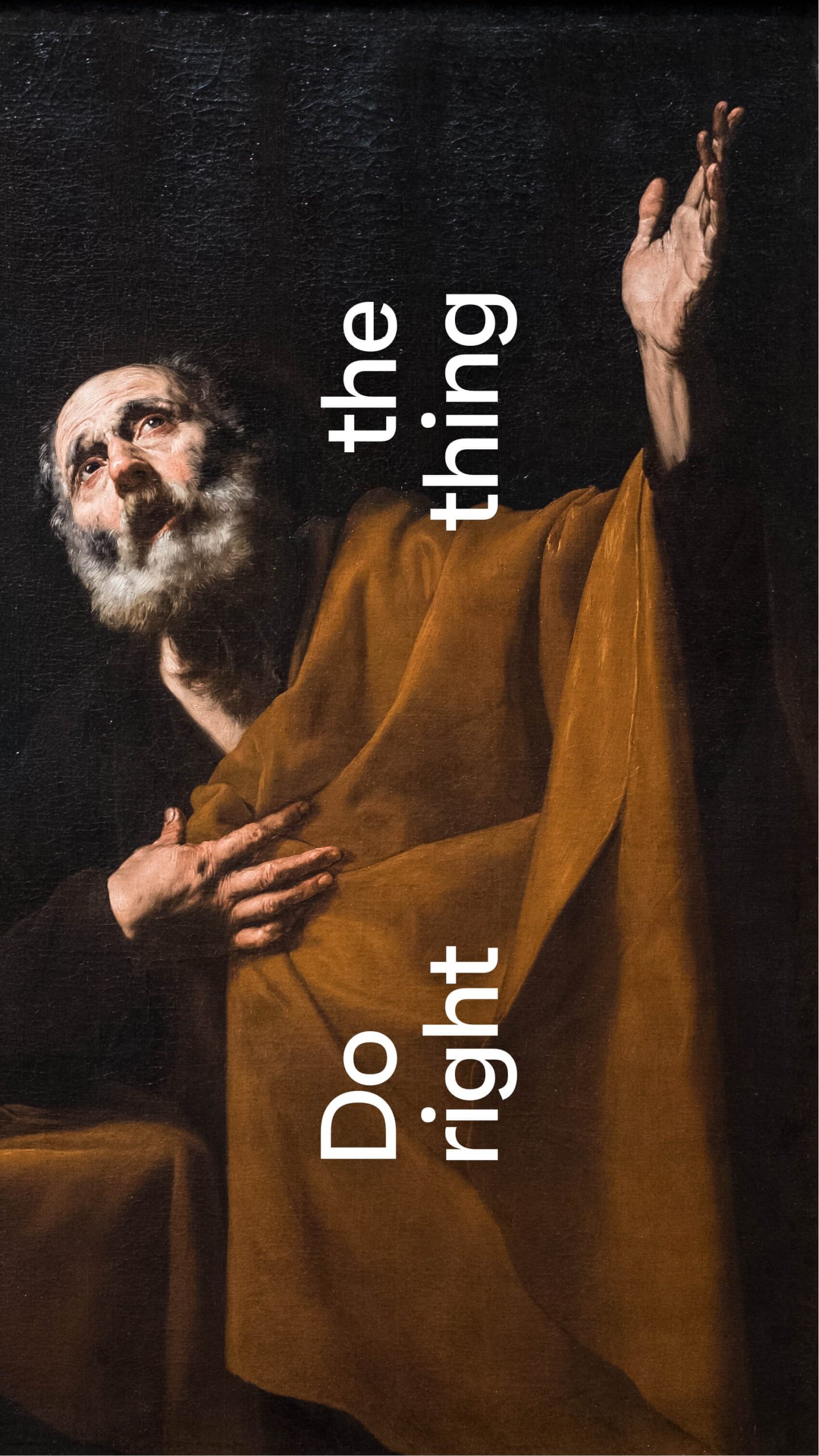
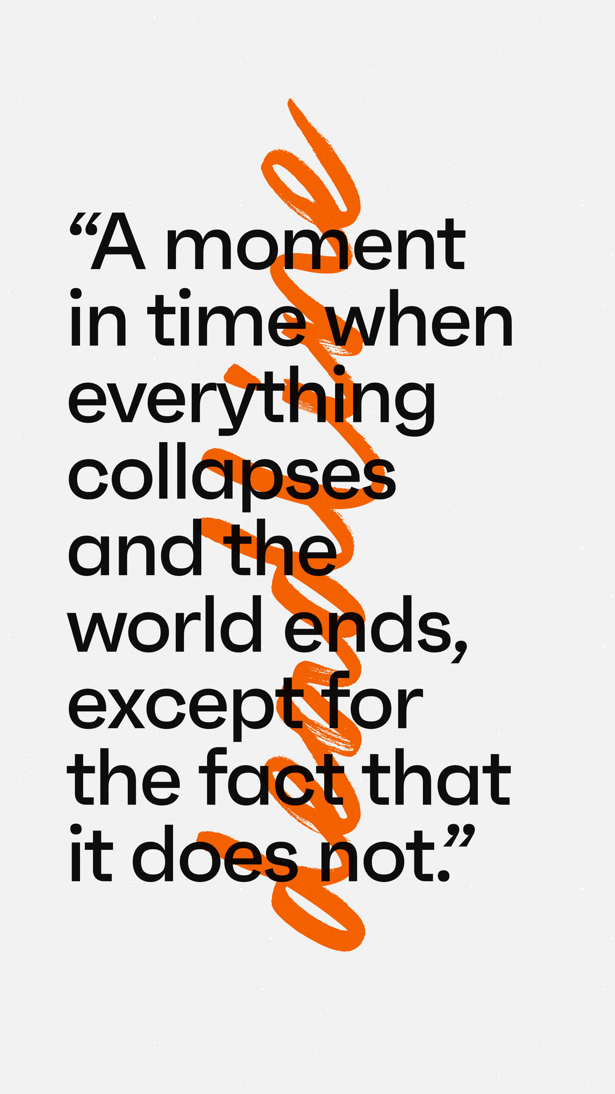
MessUp speaks in statements and it’s not afraid to be divisive (which, again, is not truly a best practice).
By adopting a provocative stance, we aimed to engage the brand’s audience and prospects in a more honest and human conversation.
Because life is too short to stay quiet.

Time to work on your project, now.
GET IN TOUCH

© 2009—2026 Sublimio


