
 by Matteo Modica
6 MIN. READ
12.06.2024
by Matteo Modica
6 MIN. READ
by Matteo Modica
6 MIN. READ
12.06.2024
by Matteo Modica
6 MIN. READ

Packaging premiumization can have a disproportionate impact on how your product and brand are perceived. How do you do that right?
Making a brand stand out as premium involves more than just a higher price—it’s about how consumers see and experience your products.
We already took a deep look at brand premiumization: it shifts consumer perception, creating loyalty and justifying higher prices. A key part of this is packaging premiumization, which can elevate a product’s status significantly.
In this article, we’ll explore how packaging impacts brand perception, using real-world examples and offering practical design tips.

The Key Role of Packaging Premiumization in Defining a Premium Perception
Packaging premiumization plays a crucial role in how consumers perceive a brand, especially when aiming for a premium image. It’s more than just a protective layer; it’s a sensory experience that communicates quality, exclusivity, and attention to detail.
First and foremost, packaging premiumization engages multiple senses. High-end packaging often involves the use of superior materials that feel substantial and luxurious. The tactile experience of handling a well-crafted box or container can significantly enhance the perceived value of the product inside. When consumers touch a sleek, sturdy package, they’re more likely to associate the product with quality and care.
Visual appeal is another critical factor in packaging premiumization. Premium packaging usually features elegant design elements such as clean lines, sophisticated color schemes, and high-quality printing. These visual cues help convey a sense of luxury and refinement. For instance, the minimalist and sleek design of Apple’s product packaging immediately signals that what’s inside is special and worth the investment.
Moreover, packaging premiumization often serves as a vital touchpoint in the customer experience (CX). A well-designed package can create anticipation and excitement, transforming the simple act of unboxing into a memorable event. This unboxing experience can be a powerful marketing tool, often shared on social media, further reinforcing the premium image. Brands like Chanel and Rituals excel in this aspect, turning unboxing into a ritual that enhances the overall consumer experience.
Attention to detail is another hallmark of packaging premiumization. Small touches like embossed logos, magnetic closures, and personalized messages can make a significant impact. These elements show that the brand goes above and beyond to create an exceptional experience, which can justify a higher price point and build stronger customer loyalty.
Packaging premiumization is a powerful tool in defining a premium brand perception. It engages multiple senses, enhances the visual appeal, enriches the customer experience, showcases attention to detail. All these factors combined can elevate a brand, making it stand out in a crowded market.
Examples of Brands That Have Achieved Premiumization Through Packaging Redesign
NikeLab
—
Nike, traditionally seen as a sports and activewear brand, ventured into premium territory with its NikeLab line. The packaging premiumization for NikeLab products played a pivotal role in this transformation.
The packaging features sleek, minimalist designs with high-quality materials. Nike even collaborated with designers to create limited edition packaging like Samuel Ross’s pack design for Nike Lab X Stone Island. This sophisticated packaging creates a stark contrast to their regular product lines, signaling exclusivity and luxury.
The tactile experience of unboxing NikeLab items, combined with the premium look and feel, helps to elevate the entire brand perception, making consumers see Nike not just as a sportswear brand, but as a purveyor of high-end, fashion-forward products.
Coca-Cola Signature Mixers
—
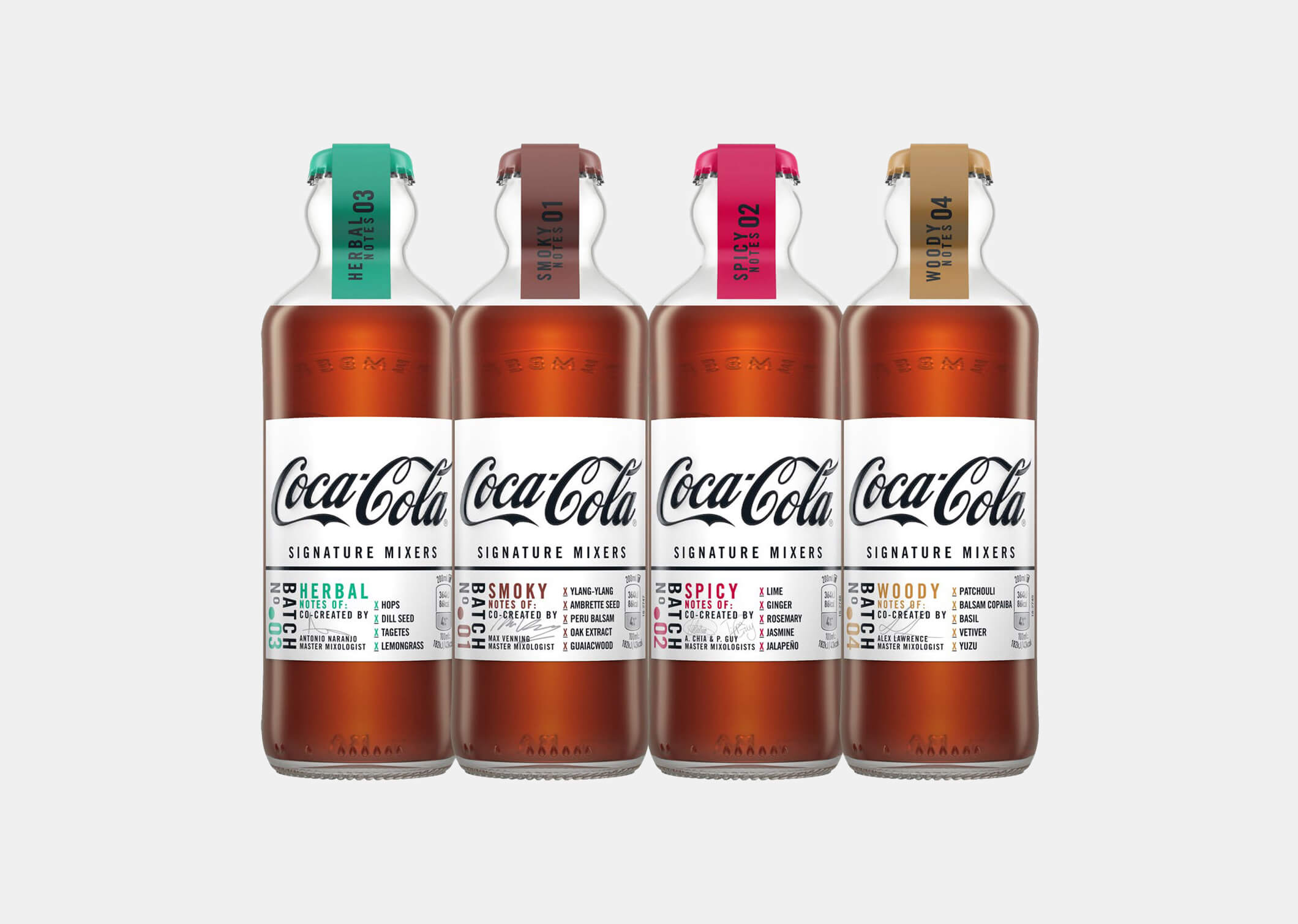
Coca-Cola, a brand synonymous with mainstream soft drinks, successfully introduced a premium product line with Coca-Cola Signature Mixers. Packaging premiumization played a crucial role in this shift.
The Signature Mixers come in elegantly designed glass bottles, each with a unique shape and premium labeling. The design includes textured labels, sophisticated typography, and a vintage aesthetic that appeals to a more discerning audience.
This packaging not only distinguishes the Signature Mixers from regular Coca-Cola products but also elevates the brand’s overall image, appealing to consumers looking for high-end beverage options to pair with spirits.
McDonald’s Signature Crafted Recipes
—
McDonald’s, a global fast-food giant, has introduced premium product lines such as the Signature Crafted Recipes collection. Packaging premiumization has helped differentiate these offerings from their standard menu items.
The Signature Crafted Recipes are presented in upscale packaging that features high-quality materials, elegant typography, and a more refined design. The use of sturdy boxes with clean lines and stylish graphics gives the impression of a gourmet experience.
This new packaging helps McDonald’s appeal to a more upscale market segment, enhancing the perceived value of their premium products and justifying a higher price point.
A Few Guidelines for Packaging Premiumization
Use High-Quality Materials
—
The foundation of packaging premiumization lies in the materials used. Opt for high-quality, durable materials that feel substantial and luxurious. For example, thick, textured paper, sturdy cardboard, glass, and metal are often associated with premium products.
Avoid flimsy or cheap materials, as they can diminish the perceived value of your product. Investing in superior materials not only enhances the tactile experience but also signals to consumers that your brand values quality and excellence.
Put Extra Care Into Visual Design
—
The visual appeal of your packaging is crucial in conveying a premium image. Aim for elegant and sophisticated design elements, such as clean lines, and refined color palettes.
Minimalist designs often work well for premium products, but intricate and well-executed designs can also be effective. Pay close attention to typography, ensuring that fonts and text layouts are consistent with a high-end aesthetic.
Create a Memorable Unboxing Experience
—
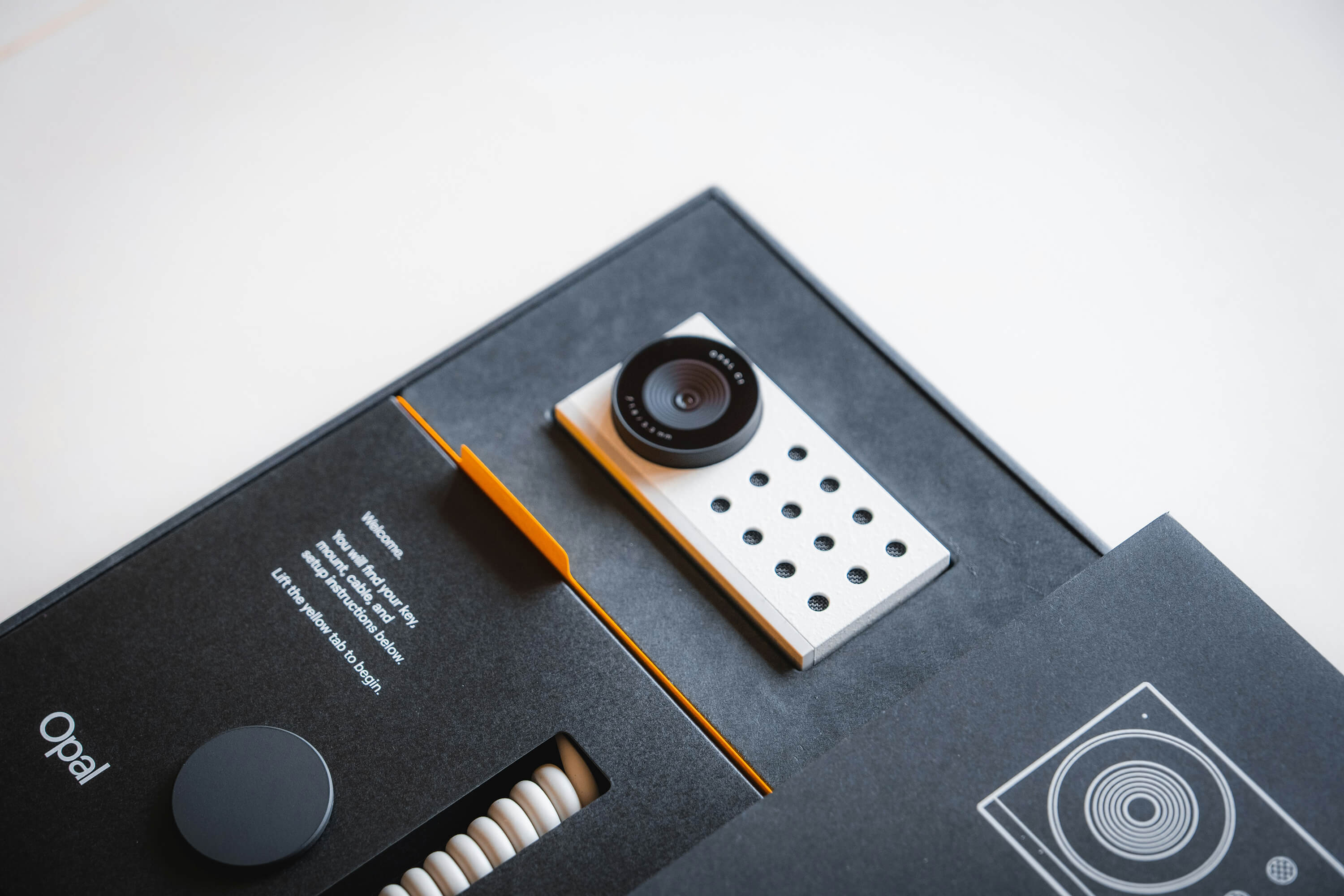
A significant aspect of packaging premiumization is the unboxing experience. Design your packaging in a way that makes unboxing a memorable and enjoyable event.
Consider incorporating unique opening mechanisms, such as magnetic closures, pull tabs, or layered packaging. Adding personalized elements like thank-you notes or branded tissue paper can also enhance the experience.
A well-thought-out unboxing process can leave a lasting impression on consumers and encourage them to share their experiences on social media, further reinforcing your brand’s premium image.
Incorporate Custom Die-Cuts and Unique Shapes
—
Utilizing custom die-cuts and unique shapes can instantly set your packaging apart from the competition. Instead of traditional rectangular boxes, consider bespoke shapes that reflect your brand’s identity and create visual interest.
For example, a triangular box for a premium chocolate brand or a curved bottle for a luxury skincare product can add a layer of sophistication. Custom die-cuts can also be used within the packaging to create windows that showcase the product inside, adding an element of surprise and delight.
Use Specialty Finishes
—
Specialty finishes like embossing, debossing, foil stamping, and spot UV coating can significantly elevate the perceived quality of your packaging. These techniques add texture and visual appeal, making the package stand out.
For instance, embossing your logo onto the box gives it a tactile element that feels luxurious to the touch, while foil stamping can highlight specific areas with a metallic sheen that catches the eye. Spot UV coating can be applied to certain parts of the packaging to create a glossy contrast against a matte background, adding depth and interest.
Utilize High-Resolution Graphics and Custom Illustrations
—
Invest in high-resolution graphics and custom illustrations that align with your brand’s story and aesthetics.
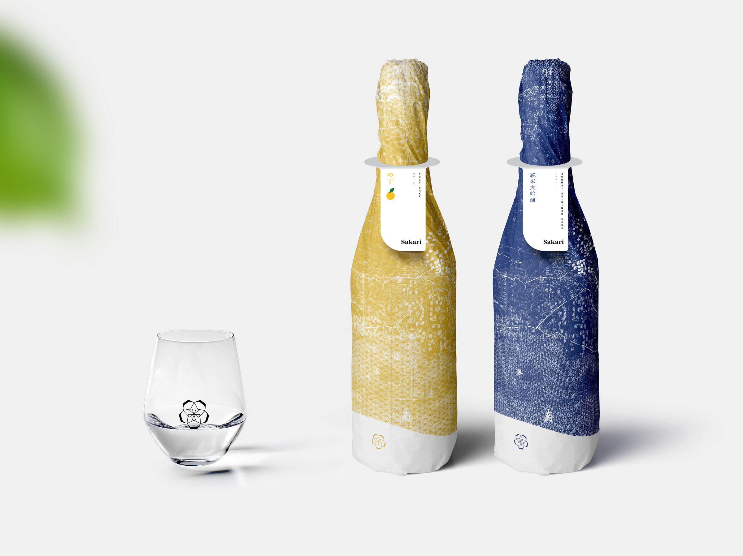
These visuals should be sharp, detailed, and printed with high-quality inks to ensure vibrant and accurate colors. Custom illustrations can add a unique touch that sets your brand apart, whether it’s intricate patterns for a premium tea brand or artistic renderings for a luxury perfume.
Packaging Premiumization: proceed with caution
As with all brand premiumization efforts, you should always be cautious and considerate. Introducing a new premium product line can be a welcome addition to your shelf presence, while redesigning the pack of an existing product can come with its own challenges in terms of recognition and familiarity.
Also, make sure the new product line won’t put the old one to shame. After all, it’s all one big family.
READ MORE ON

Before you hire a branding agency, ask to see the drafts
A while ago, at Sublimio we started sharing with potential clients not just our portfolio, but our past presentation. Here’s why.

Can AI do your brand strategy?
AI can craft a pretty believable brand strategy, but will it hold? Here are some things to know before you forward it to the team.
Rejected Logo Designs We Still Love
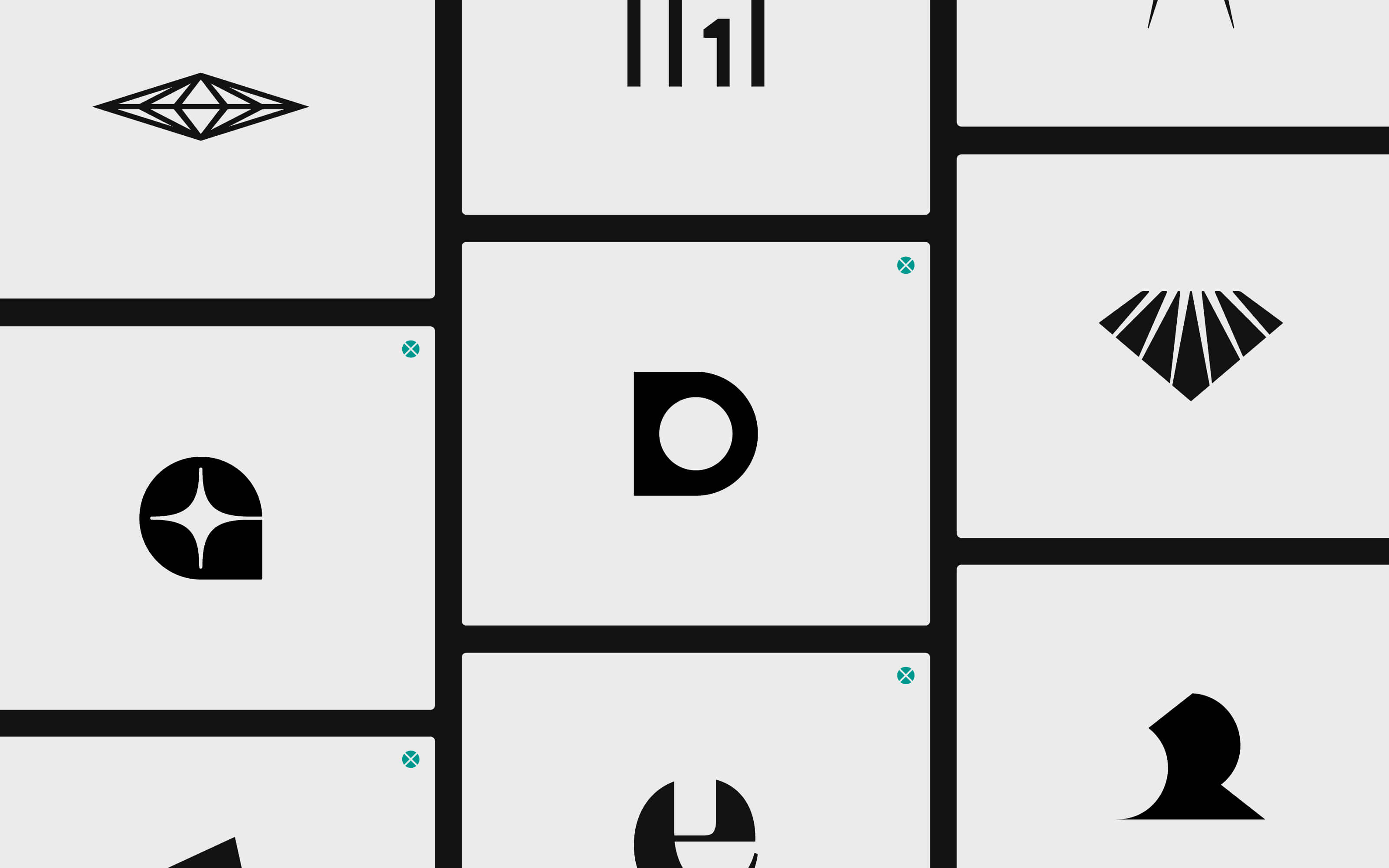
Not all logo designs get accepted. Actually, most of them get rejected, and that’s ok. Here’s why we don’t throw ours away.

Do you have a brand architecture? Here’s why you should
If you find the term “brand architecture” intimidating, you might want to do this. Because the right one makes all the difference for your business.
our newsletter
SUMO is one of the few newsletters I don’t archive when my inbox gets full. Each edition feels crafted with care - the links are genuinely interesting, the curation is thoughtful, and the newsletter design itself is a delight to consume.

Content curation at its finest. Doesn't overdo it on commentary, and has probably the highest signal-to-noise ratio among the design newsletters out there. Never a dull entry! Every issue feels handpicked rather than churned out.

Sublimio Monthly is always a breath of fresh air. I especially like how each issue explores one timely theme, turning Andrea and Matteo’s perspectives into a clear takeaway I can immediately apply to my work—often before the topic becomes mainstream.

You know that feeling as a kid, waiting for your favorite magazine to hit the stands? That's what SUMO is for me.

SUMO is much more than a newsletter: it's a guide. In a world of information overload, having someone who does real curation work is invaluable. What I find there is always worth my time. I read it eagerly every time, and I often share it with friends and colleagues because there's always something useful and genuinely interesting.

SUMO has a level of intentionality that sets it apart from most newsletters I read. Each edition is built around a theme that feels considered without being overworked, with Matteo and Andrea’s dual perspectives adding depth and a set of curated links that feel carefully chosen. It’s a newsletter worth reading properly.

SUMO has quickly become one of my favourite newsletters. Every issue leaves me with a fresh perspective on how I see my brand and the world around it.




© 2009—2026 Sublimio


